

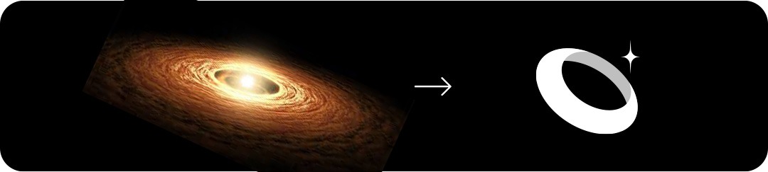
Concept 2
"Nova Orbit"

Concept:
The tilted ring (orbit) gives a sense of depth, vision, and global movement.
The added sparkle/star accent signifies excellence, aspiration, and a stellar standard of service.
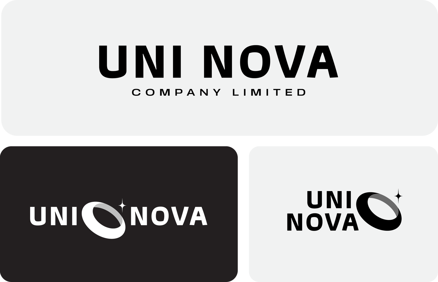
Typography:
Modern bold uppercase sans-serif retains seriousness.
Clean spacing makes it approachable, future-facing, and adaptable across digital and print use.

Colors Psychology
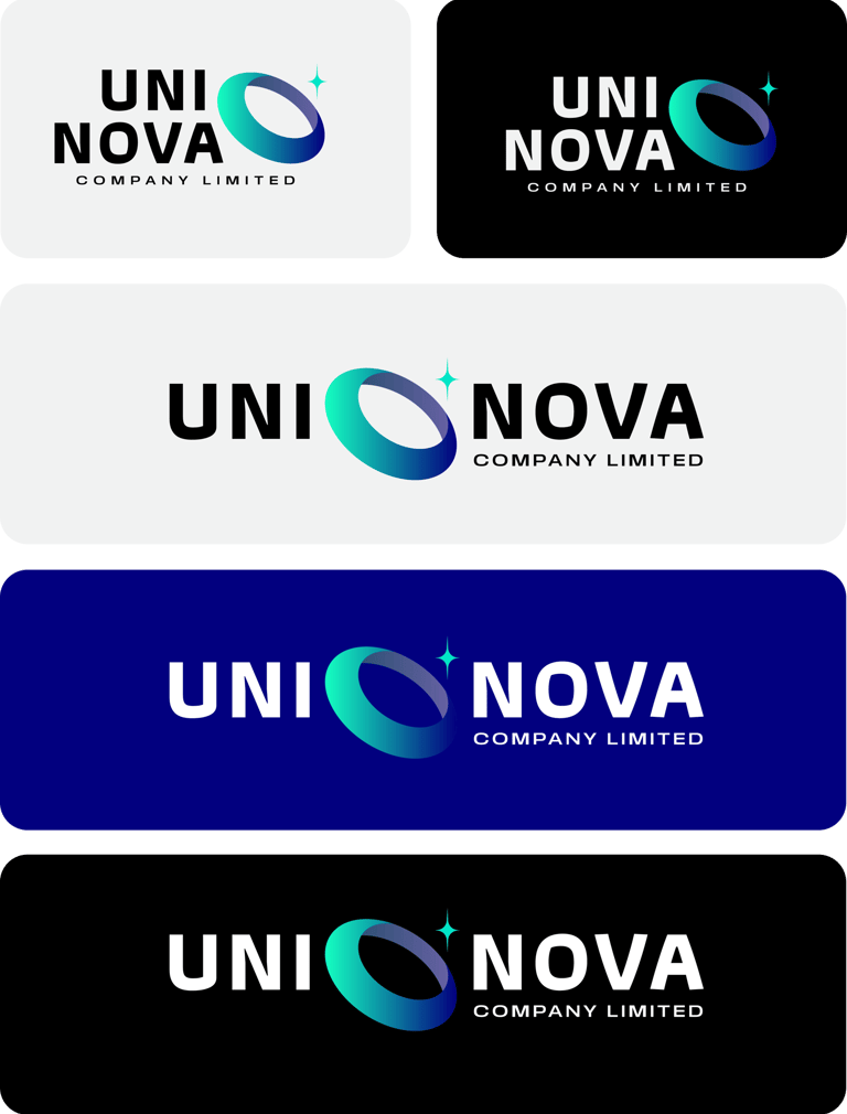

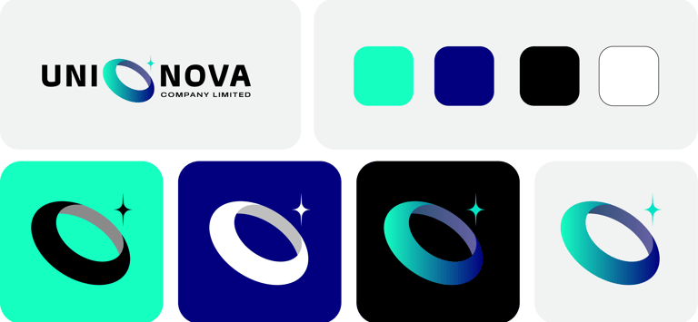
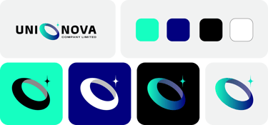
Mint Green – Conveys freshness, adaptability, and growth, introducing a modern feel not often seen in trading.
Royal Blue – Maintains professionalism and trustworthiness.
Gradient transitions (green to blue) subtly express transformation, innovation, and global scale.
Emotional Tone :
Aspirational: The sparkle accent hints at high standards and ambition.
Innovative & Future-Ready: Gradients and clean shapes feel modern and agile.
Approachable yet Refined: The mint hue tempers the boldness, offering a warm, engaging front.
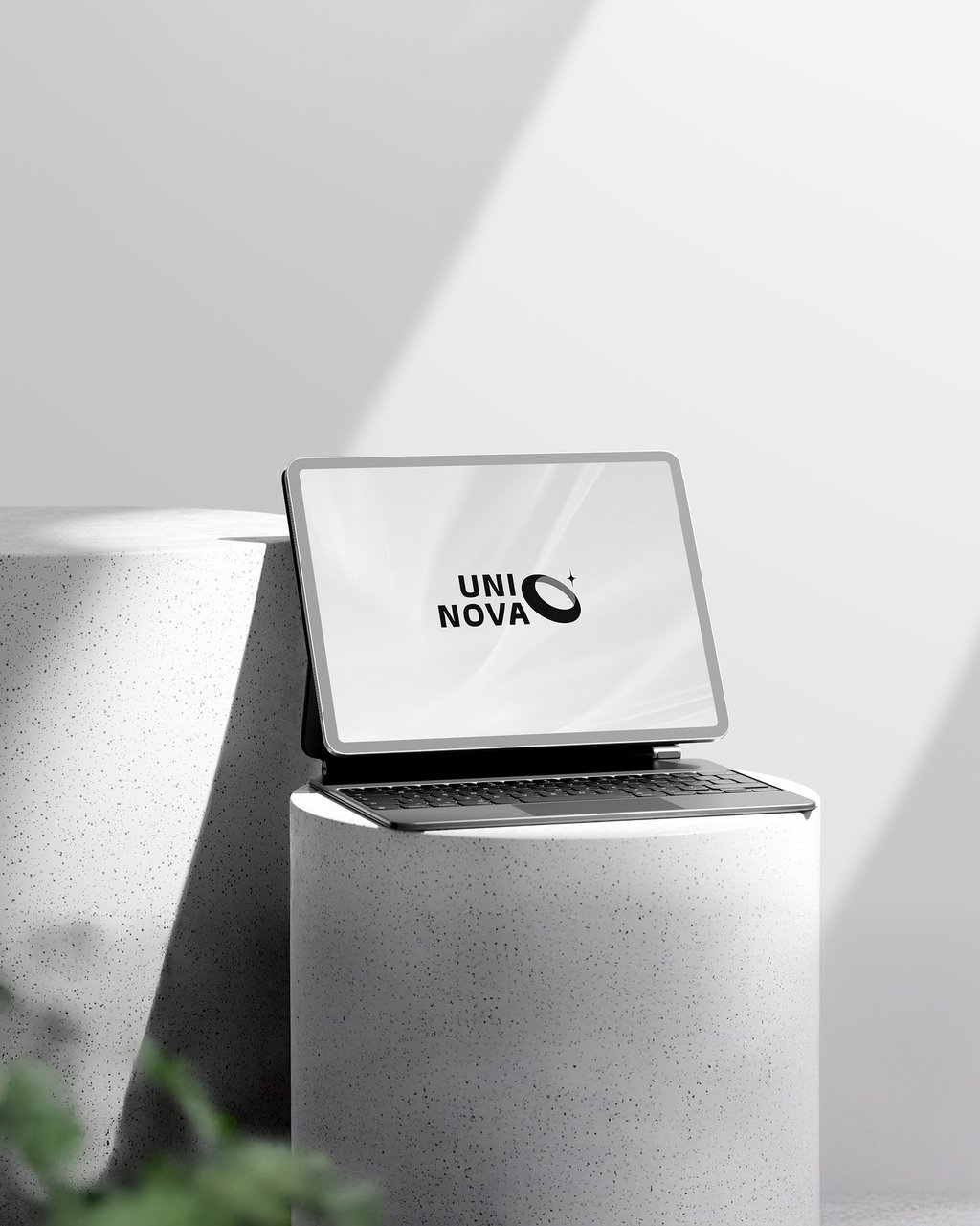
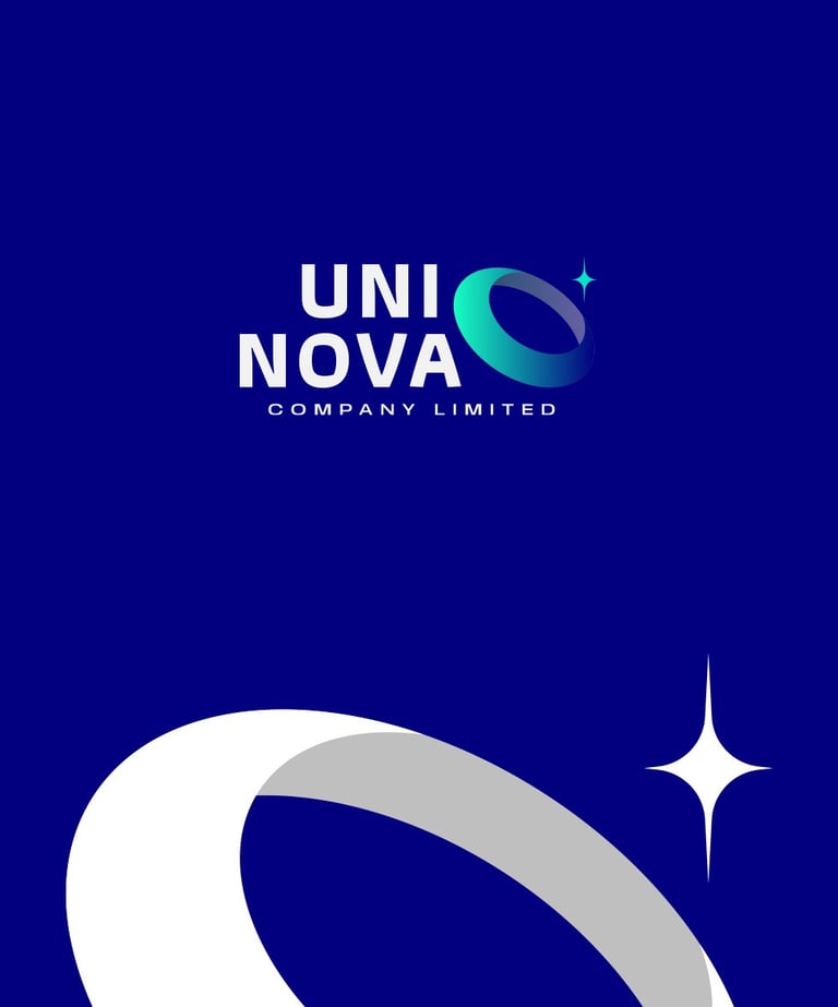
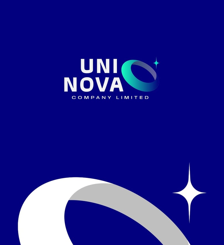


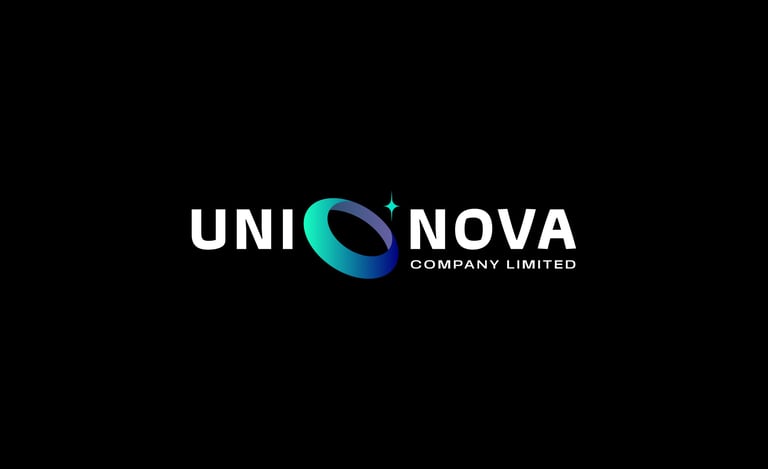
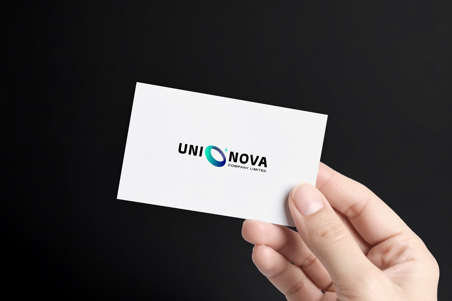
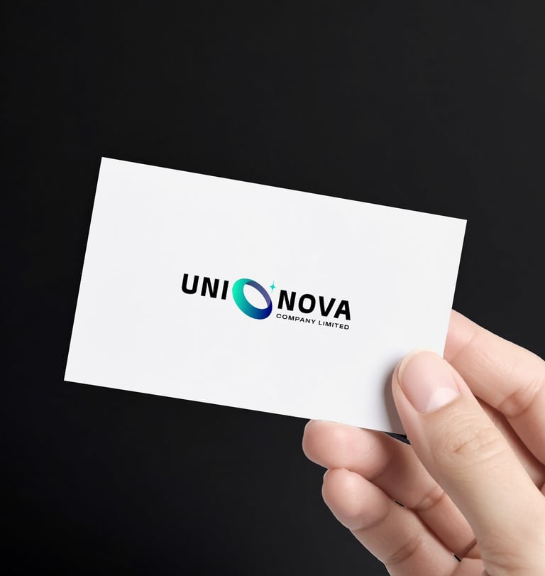
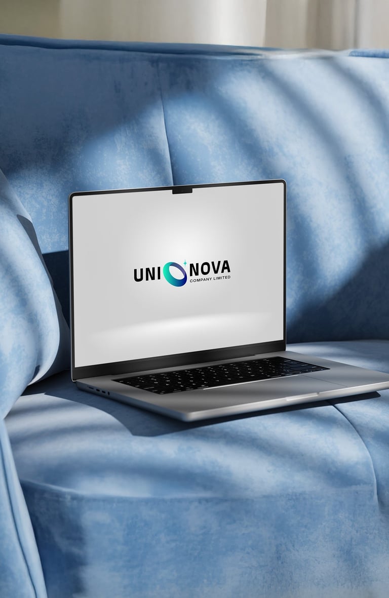
Concept 2: A modern, dynamic logo representing innovation and global reach. The orbital ring and star evoke movement, ambition, and a futuristic trading vision.


Pikstudio - A studio with heart!
Showcasing premium design for diverse industries.
service@pikstudio.website
+6660685217
© 2024. All rights reserved.