

Concept 3
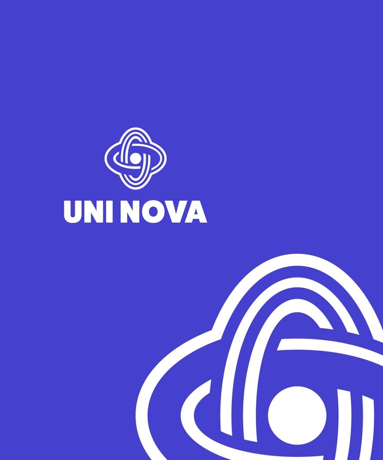
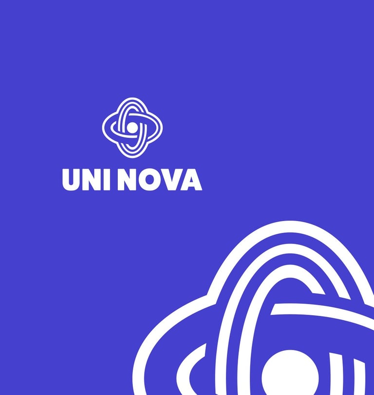
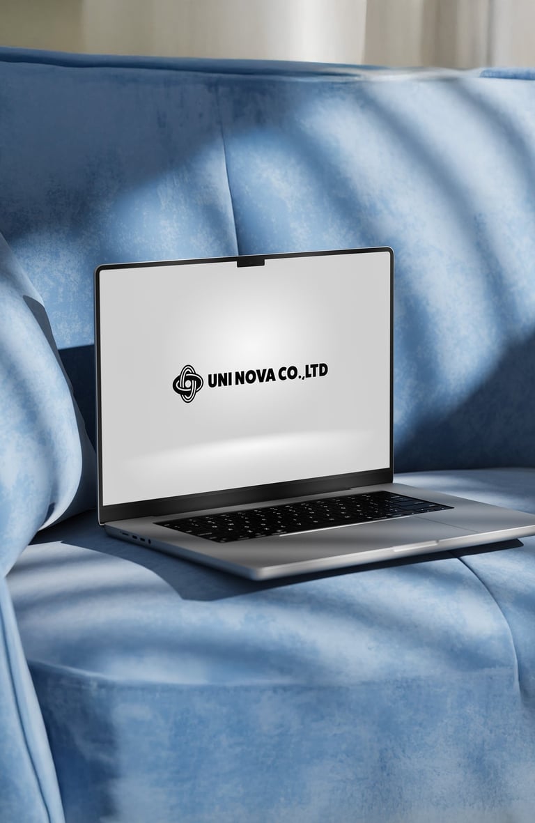
"Nova Knot"

Concept:
The interwoven loops create a sense of unity and stability, while also suggesting movement and expansion—key traits of a trading company. It feels both modern and timeless, echoing a promise of reliability and innovation.
Typography:
Bold, sans-serif typography.
Boldness: Demonstrates confidence and strength, a critical factor in the competitive trading industry.
Sans-serif: Clean and modern, complementing the intricate logo without overshadowing it.


Colors Psychology

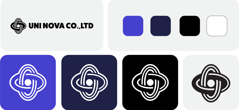
Bright Violet - Evokes creativity, ambition, and the excitement of new opportunities. Provides a youthful, modern energy that feels confident and trustworthy.
Deep Navy Blue - Conveys reliability, strength, and professionalism. Establishes a solid foundation of stability in the trading industry.
Black & White - Adds a timeless sophistication and depth. Works as a bold anchor, balancing the vibrant violet. White color represents clarity, openness, and transparency.
Emotional tone :
The Nova Knot conveys a tone of dynamic stability and boundless ambition. It resonates with trust (through its symmetrical and balanced form), and excitement (through its orbital, almost celestial motion). The brand feels both grounded and forward-looking, promising reliability in every venture while embracing the thrill of new opportunities.
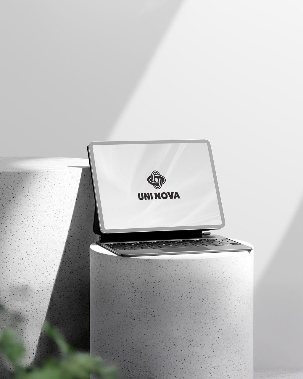
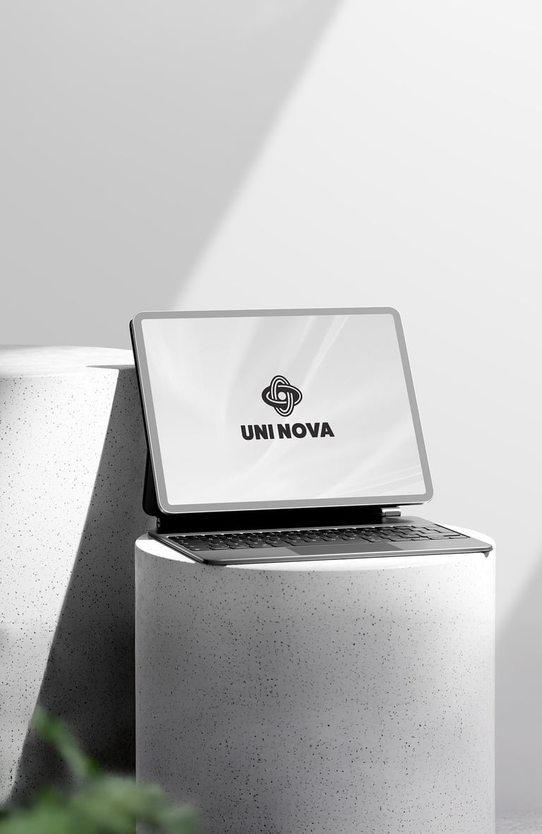
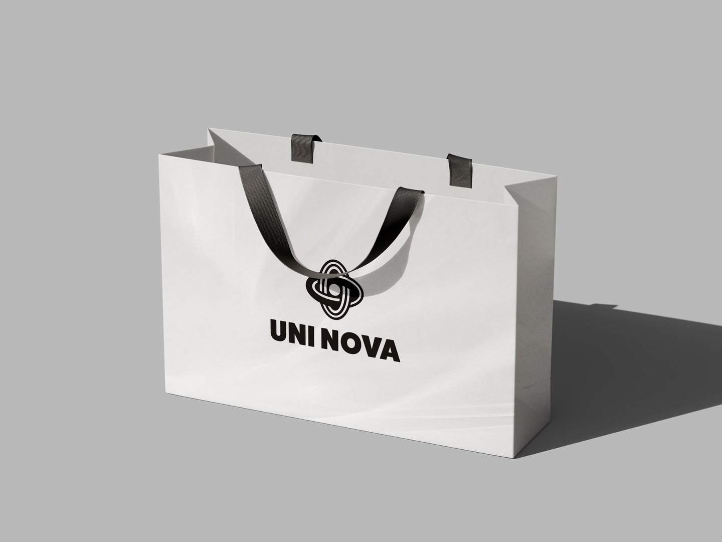
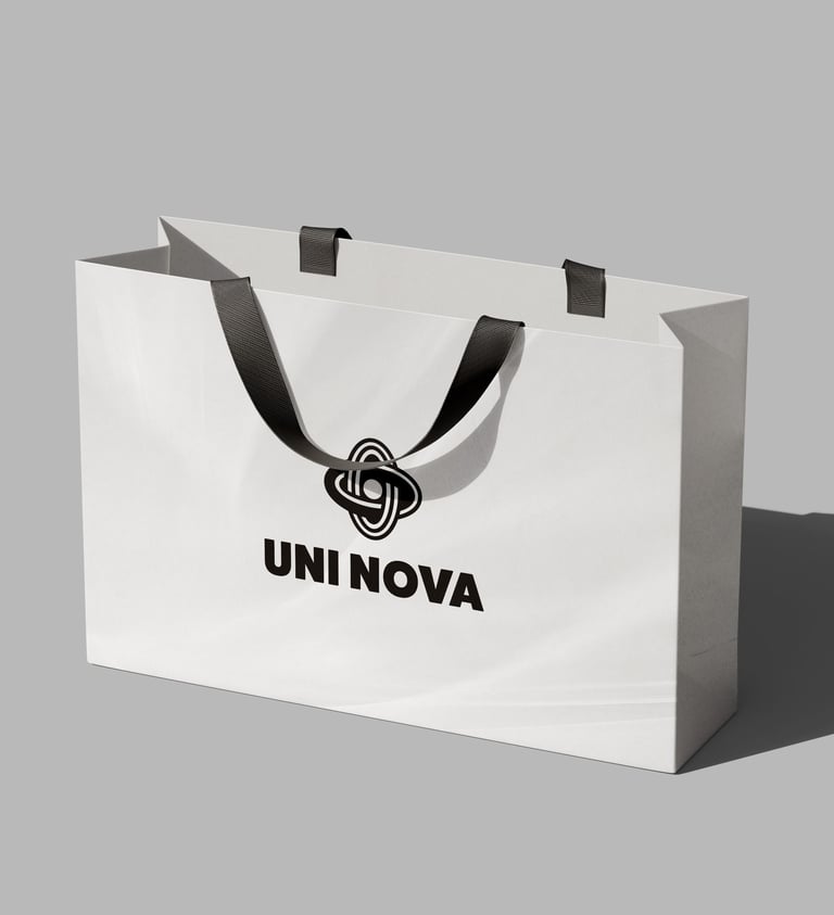
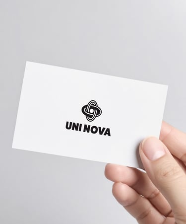

Concept 3: UNI NOVA CO., LTD logo captures our drive for progress, balance, and long-lasting partnerships.


Pikstudio - A studio with heart!
Showcasing premium design for diverse industries.
service@pikstudio.website
+6660685217
© 2024. All rights reserved.