

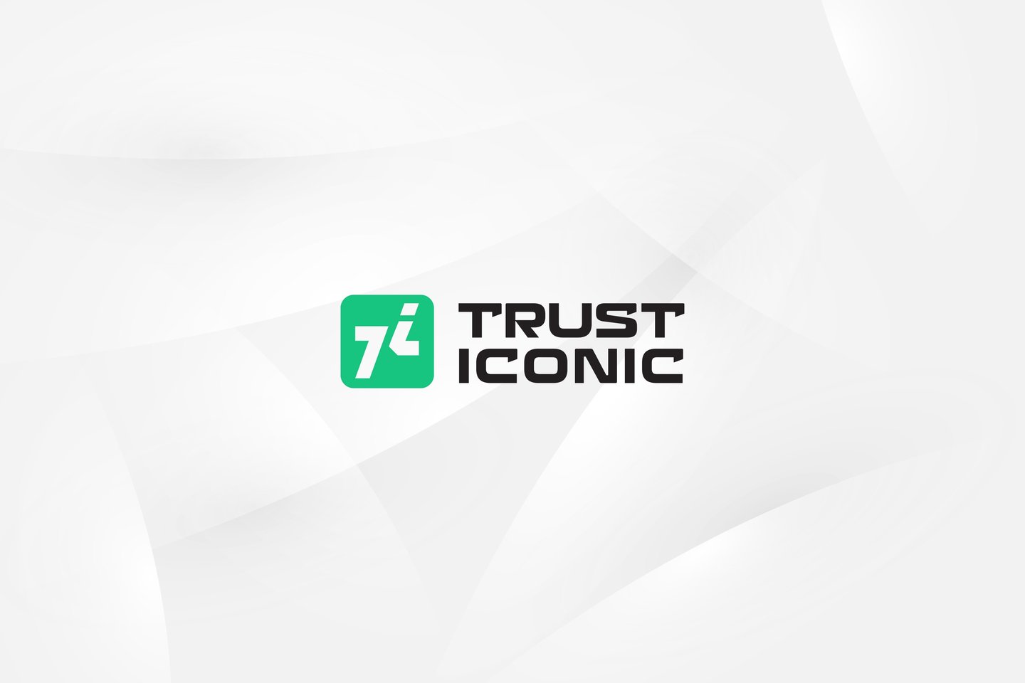
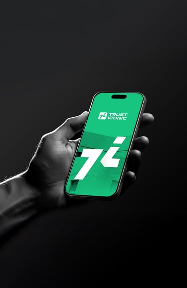
Concept 3
"Swifture"
(Energetic & Forward-Driven)

Concept:
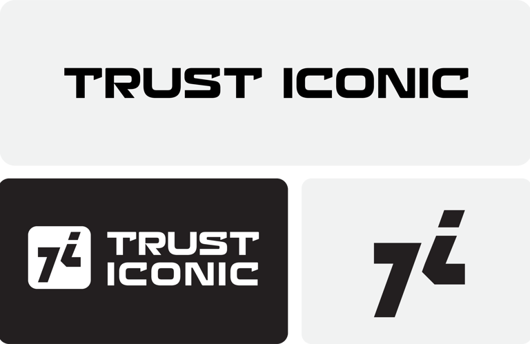
The logo cleverly combines the letters "T" and "I" in a way that creates a bold, progressive symbol.
The diagonal cut and forward-leaning angles add a sense of movement and direction.
It delivers a powerful, futuristic impression.
Typography:
A sleek, stylized sans-serif font with tech-style notches.
Appears modern and optimized for a fintech-forward brand.


Colors Psychology
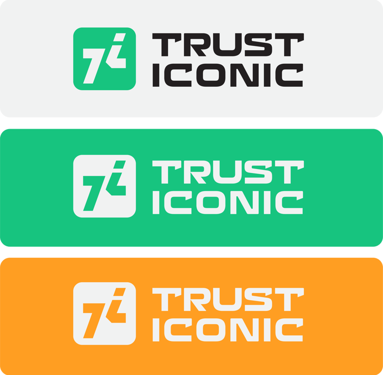


Green symbolizes growth, trustworthy, and luck, ideal for currency exchange brand.
Orange reflects energy, excitement, and confidence, encouraging a modern and approachable look.
Impression :
Energetic and globally scalable.
Best for a brand wanting to disrupt the old systems and modernize the currency exchange experience.


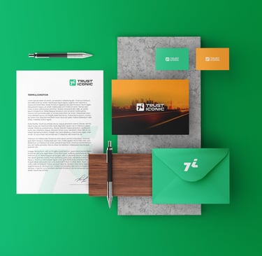
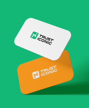


Concept 3: "Swifture": Ambitious and dynamic, ideal for rapid growth and market penetration.


Pikstudio - A studio with heart!
Showcasing premium design for diverse industries.
service@pikstudio.website
+6660685217
© 2024. All rights reserved.