

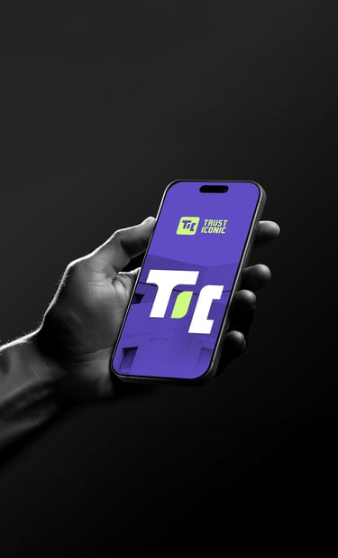
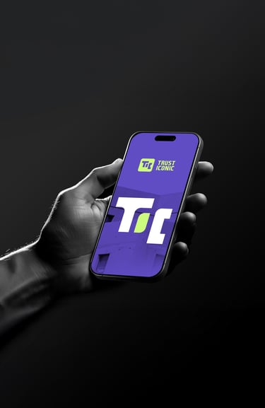
Concept 2
"Vaultik"
( Retro-Tech Inspired & Iconic )
Concept:
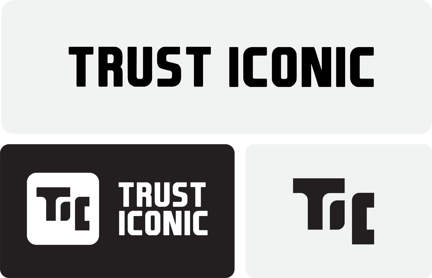
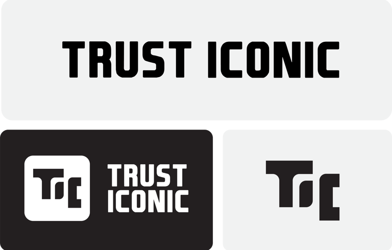
The symbol merges the initials "T" and "I" in a monogram-style emblem with a retro tech twist.
Rounded rectangle creates a digital screen effect, suggesting security, tech-savviness, and heritage.
Typography:
A blocky and semi-futuristic sans-serif typeface.
Vertical alignment emphasizes structure and formality.


Colors Psychology
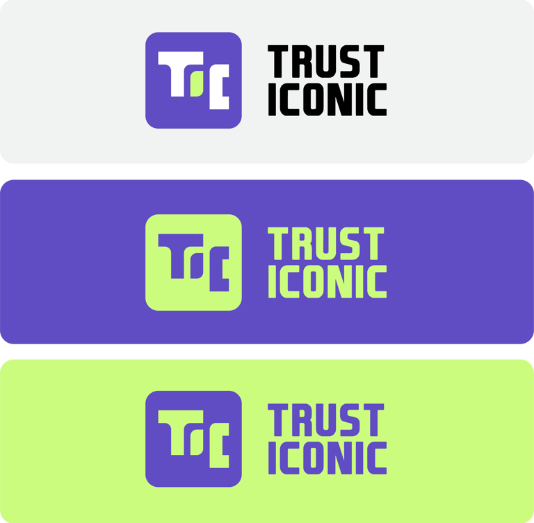
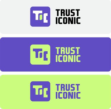
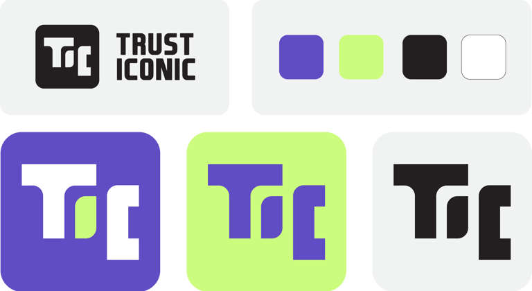

Purple evokes premium service, high-level trust, and a sense of wisdom and depth—resonating with experienced users seeking reliability.
Neon Green delivers energy, speed, and digital connectivity, signaling a tech-forward brand that’s ready for the future.
Impression :
Bold and distinctive.
Appeals to younger, digital-native users who value innovation and cutting-edge services.
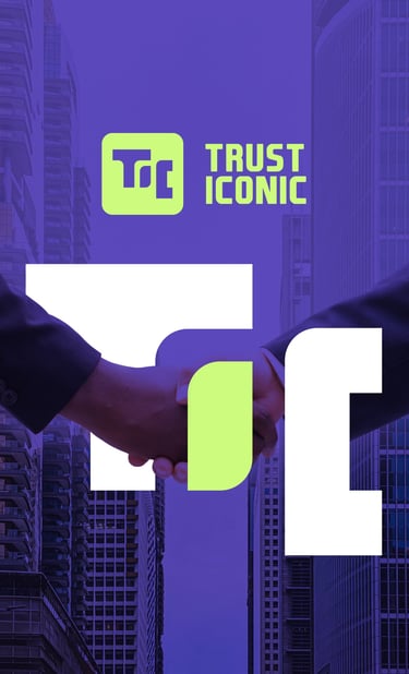
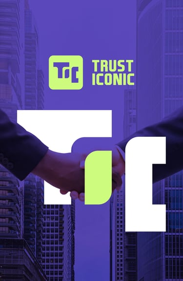
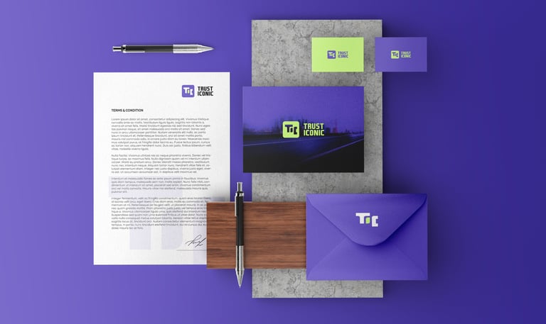
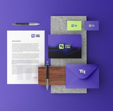


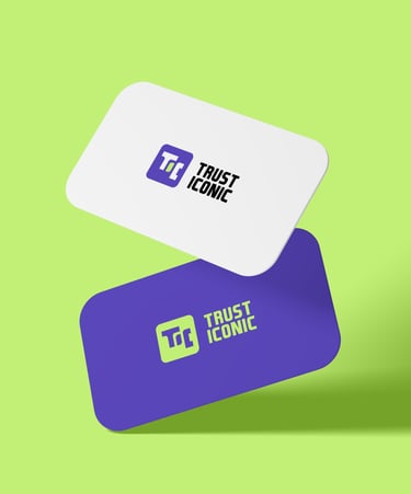
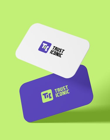

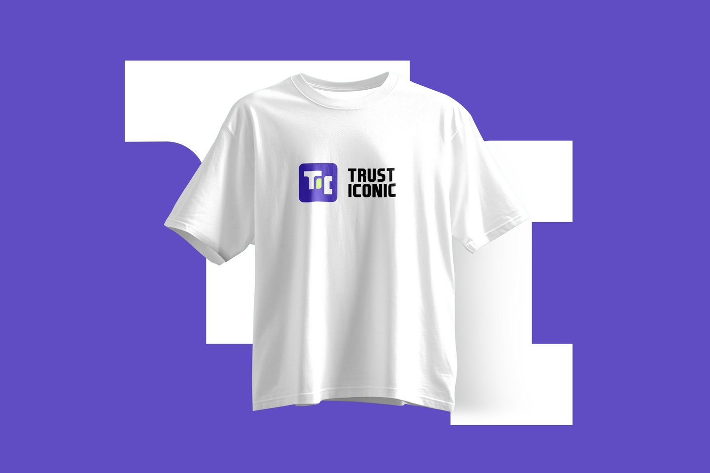

Concept 2: "Vaultik": Bold, unique, and fit for a fintech brand appealing to younger generations.


Pikstudio - A studio with heart!
Showcasing premium design for diverse industries.
service@pikstudio.website
+6660685217
© 2024. All rights reserved.