

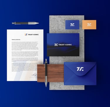
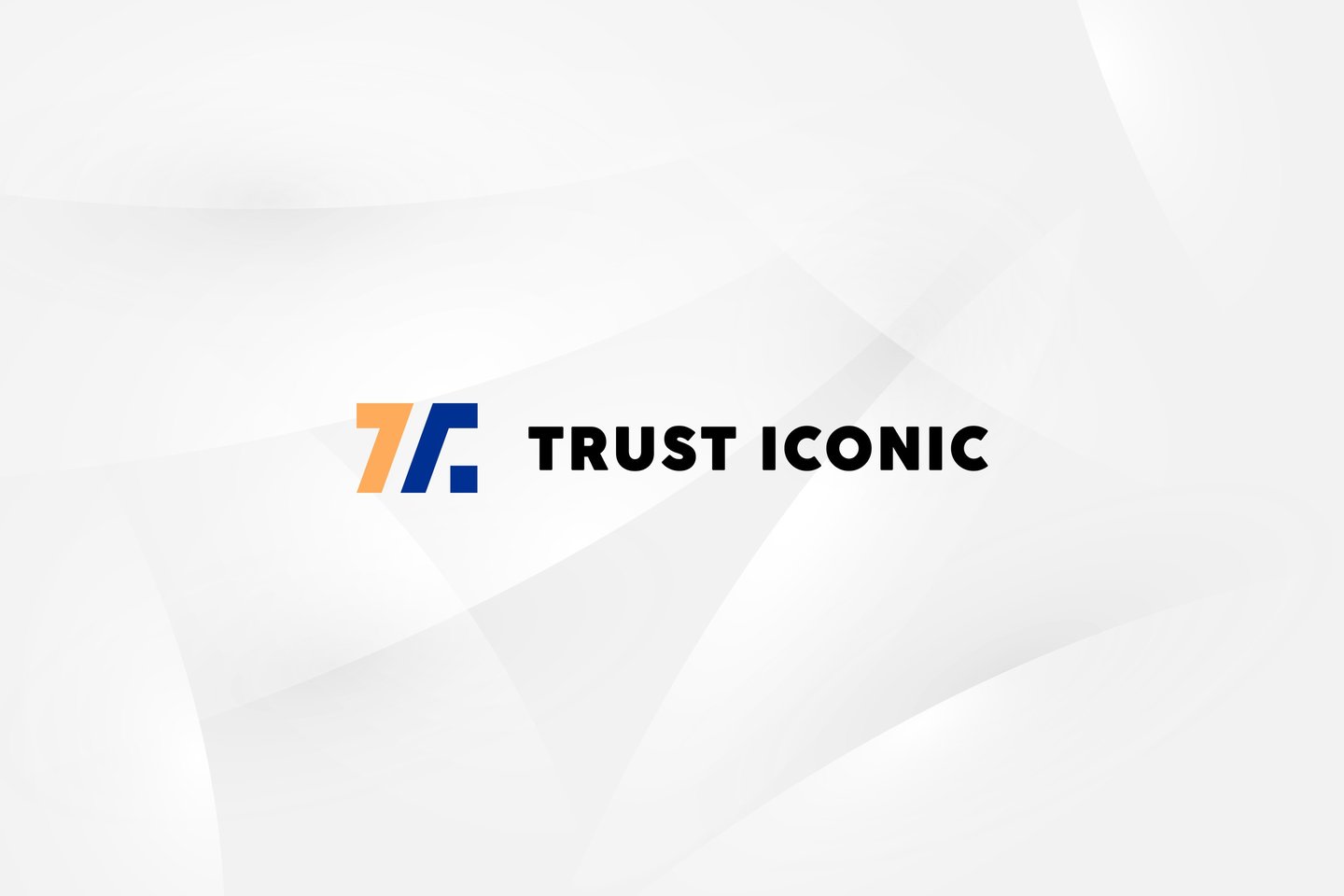
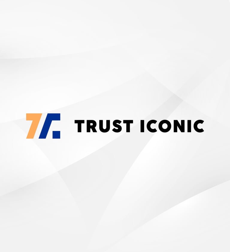
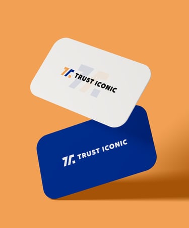
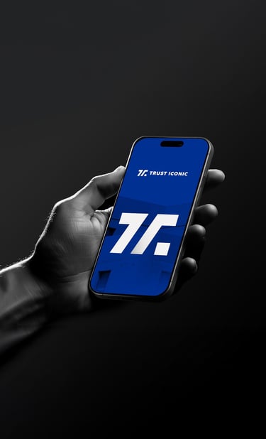
Concept 1
"Trustline"
(Clean Modern & Geometric)
Concept:
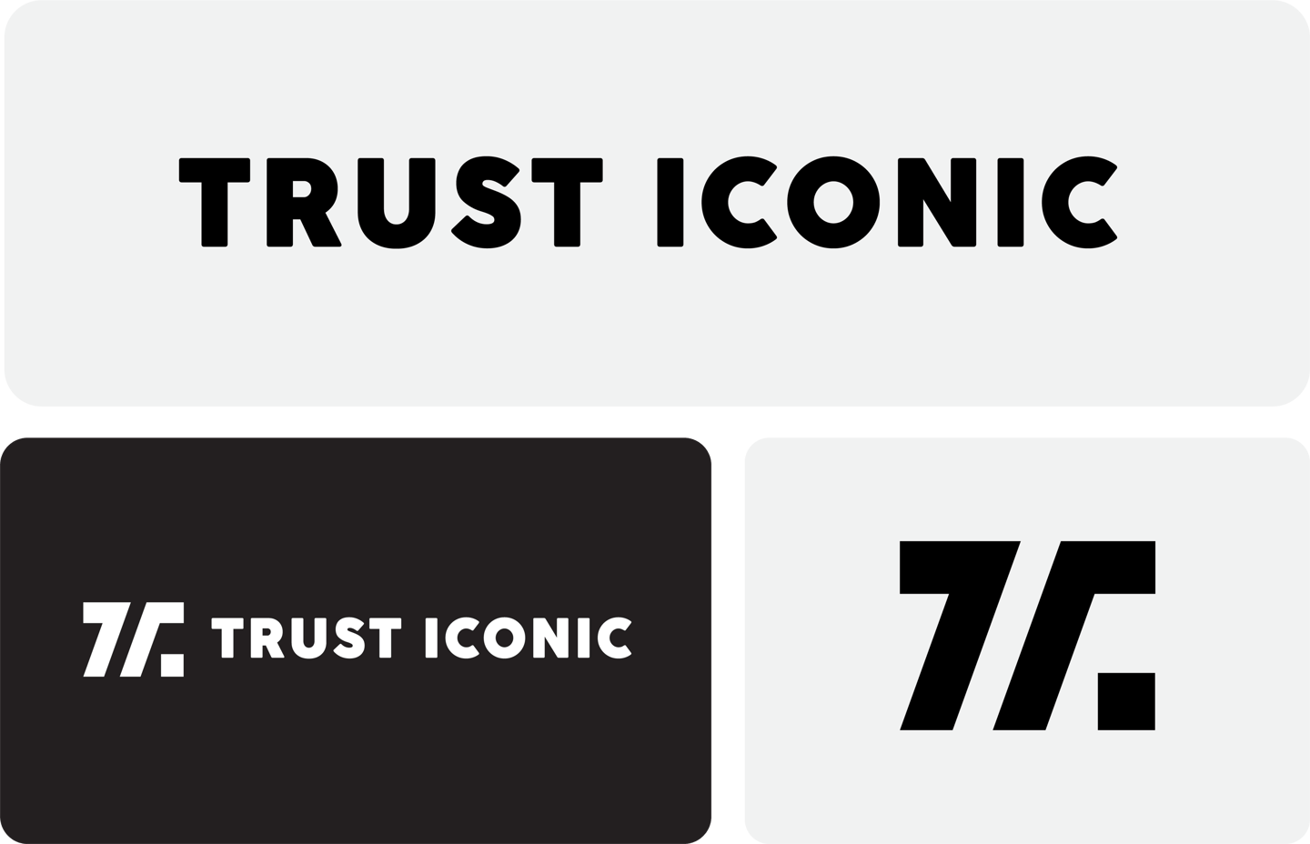
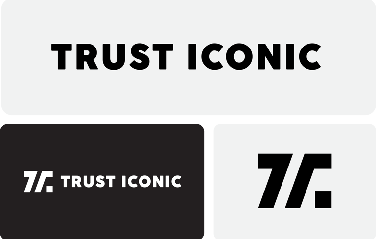
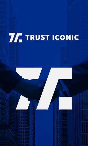
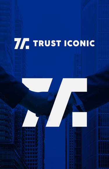
The symbol is a minimalistic combination of the letters "T" and "I," cleverly integrated to appear as a unified, stylized letter "T."
This approach enhances brand memorability while keeping the mark visually clean and professional.
The subtle inclusion of "I" within the structure of "T" reflects the unity of Trust and Iconic, emphasizing the brand’s core values.
Typography:
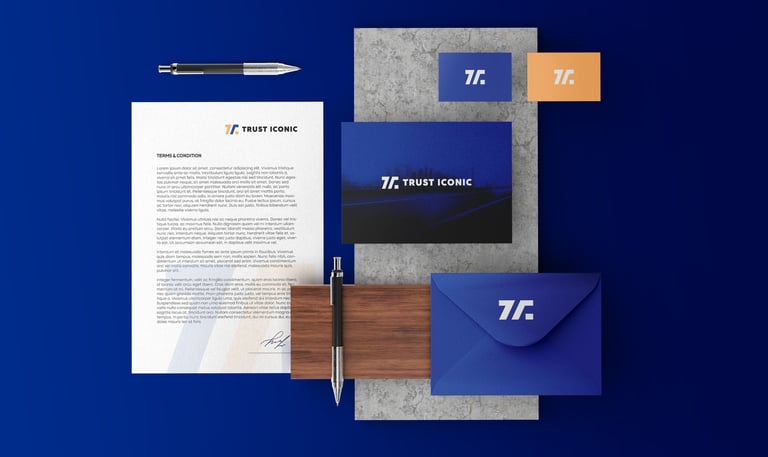
Bold, sans-serif typography.
Round corners provide a friendly and modern look while still keeping the weight strong enough to appear trustworthy.


Colors Psychology
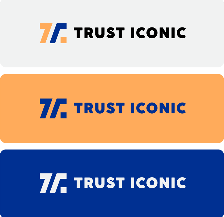
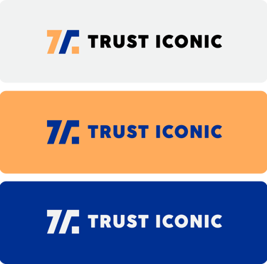

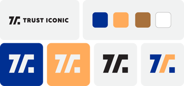
Blue : signifies trust, integrity, intelligence, and professionalism—ideal for establishing long-term relationships with clients in a financial space.
Orange : introduces friendliness, energy, and optimism—balancing the seriousness of blue with a more human-centered touch.
Impression :
Youthful, bold, and very trustworthy.
Suitable for global appeal due to color neutrality and simplicity.
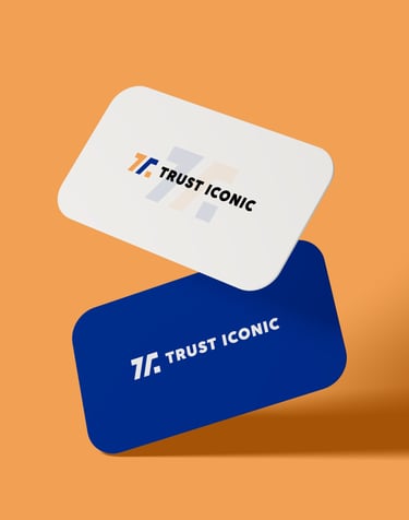

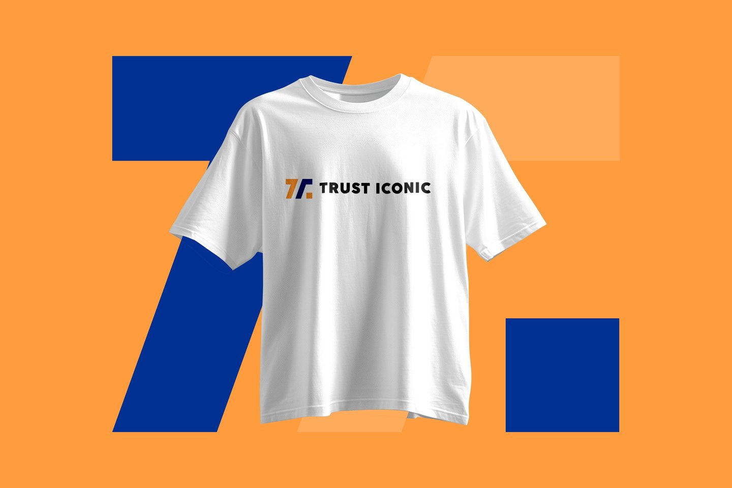
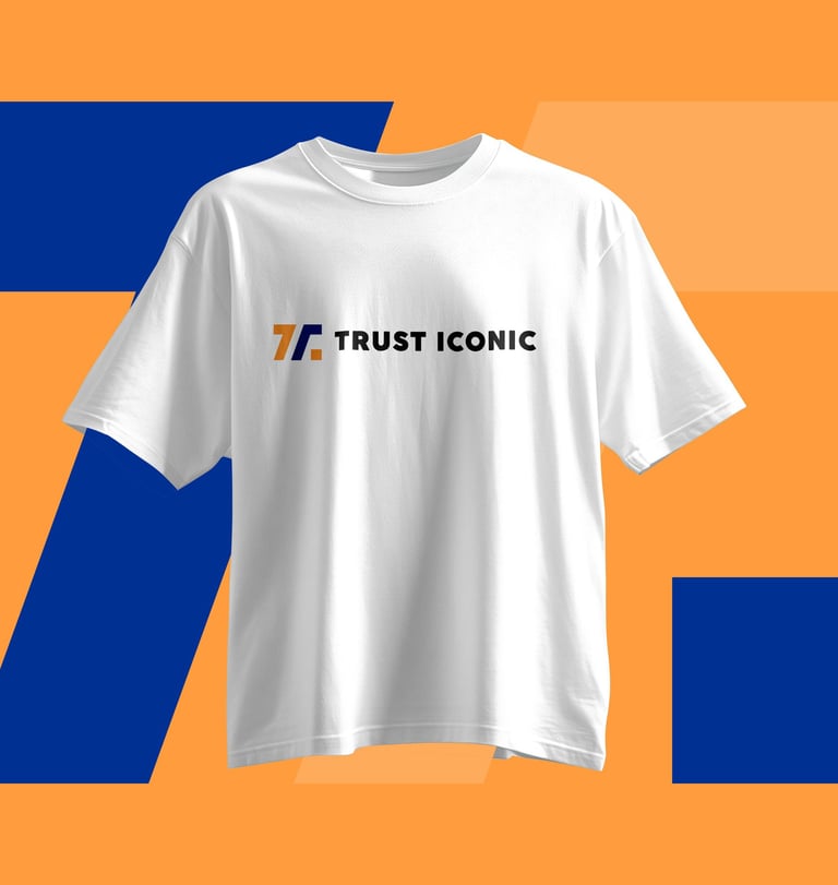
Concept 1: "Trustline": Balanced and modern, perfect for trustworthy, corporate appeal.


Pikstudio - A studio with heart!
Showcasing premium design for diverse industries.
service@pikstudio.website
+6660685217
© 2024. All rights reserved.