

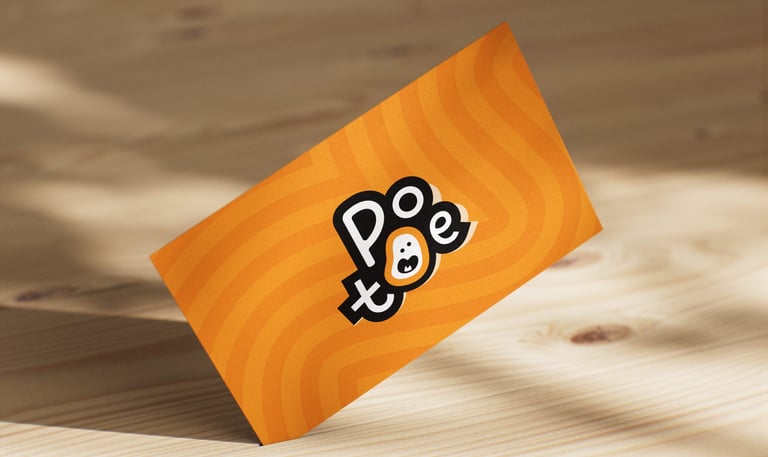
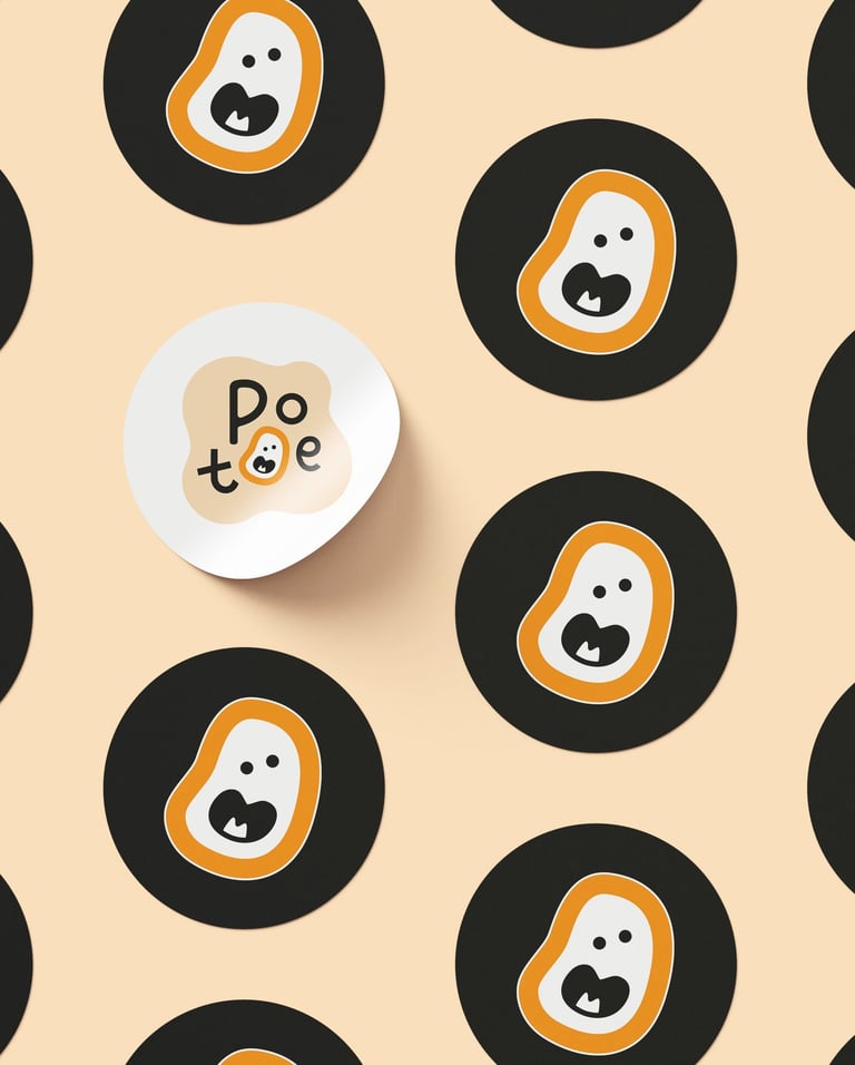
Concept 3
"Silly Spud"
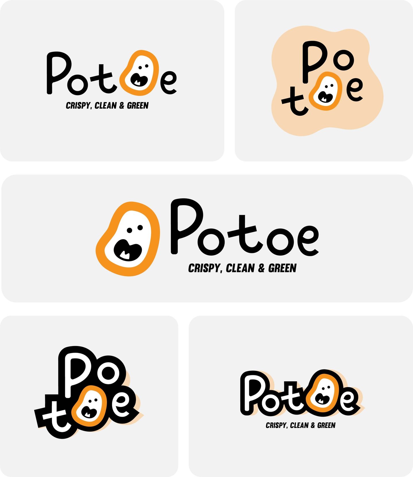
Concept:
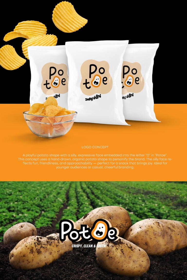
This concept uses a hand-drawn, organic potato shape to personify the brand. The silly face reflects fun, friendliness, and approachability — perfect for a snack that brings joy. Ideal for younger audiences or casual, cheerful branding.
Typography:
A soft, rounded sans-serif font adds to the friendliness and playfulness. The slightly quirky character styling aligns well with the silly mascot face.
Custom rounded sans-serif typeface.
Whimsical balance of letter sizes conveys friendliness.
The hand-drawn "t" mimics a child-like craft, making it feel organic and less corporate.


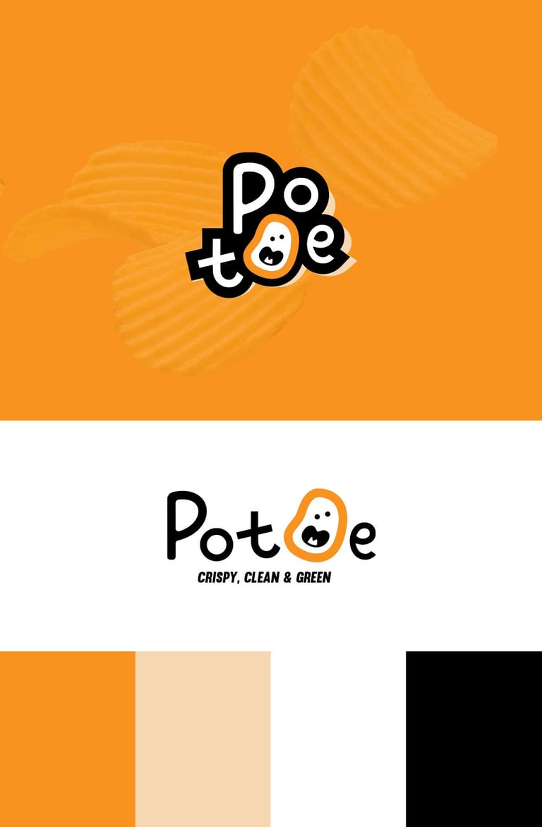
Colors Psychology
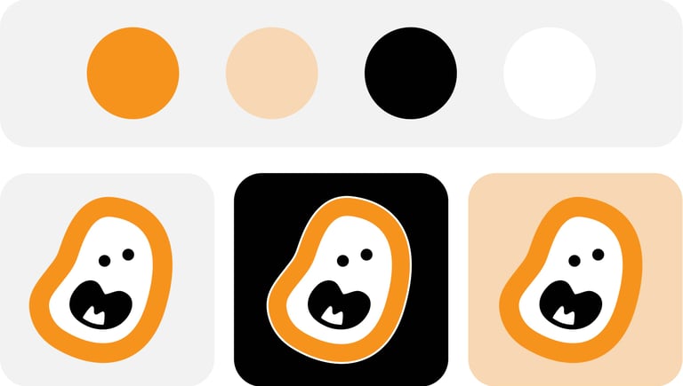
Orange : Evokes appetite and energy. Commonly used in snack branding to stimulate hunger.
Beige : Represents natural and healthy tones, reinforcing the idea of clean, wholesome ingredients.
Black & White : Brings clarity and visual contrast while keeping the branding approachable and legible.
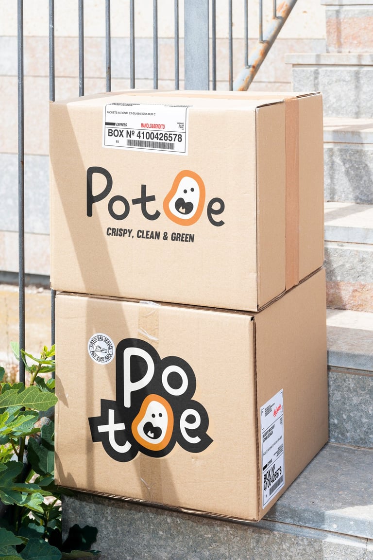
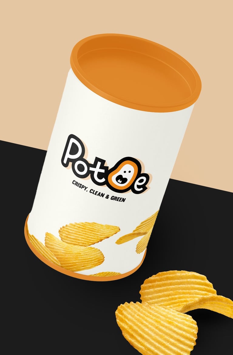

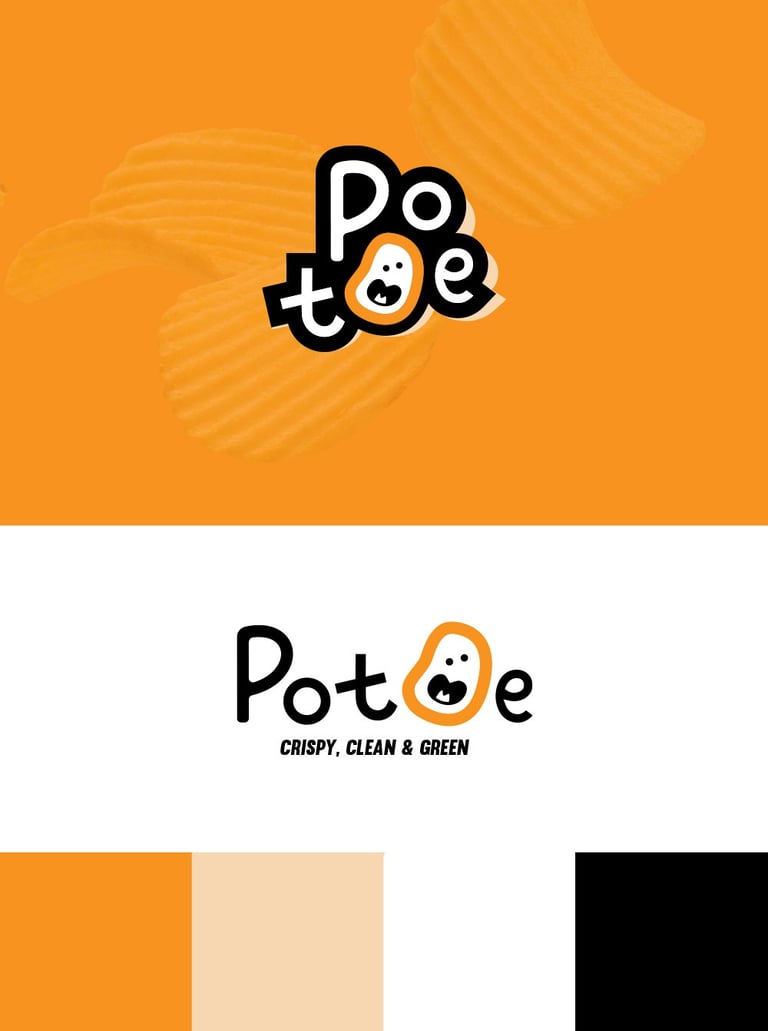


Concept 3: A fun and modern identity aimed at younger audiences and health-conscious snackers. The irregular potato mascot and hand-drawn type deliver a fresh, friendly, and clean look that matches the tagline: Crispy, Clean & Green.


Pikstudio - A studio with heart!
Showcasing premium design for diverse industries.
service@pikstudio.website
+6660685217
© 2024. All rights reserved.