

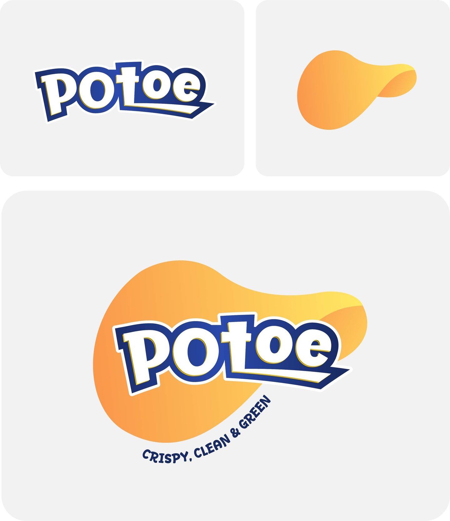
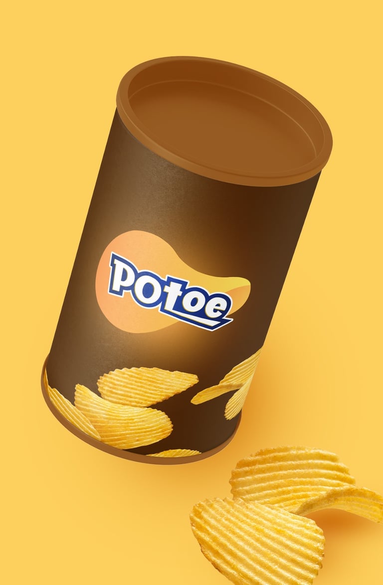
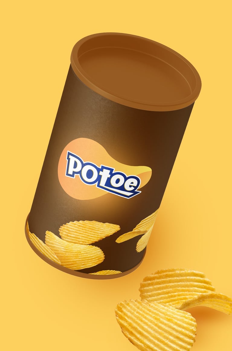
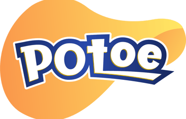
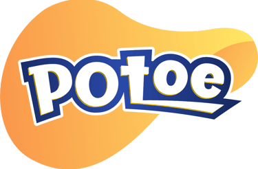
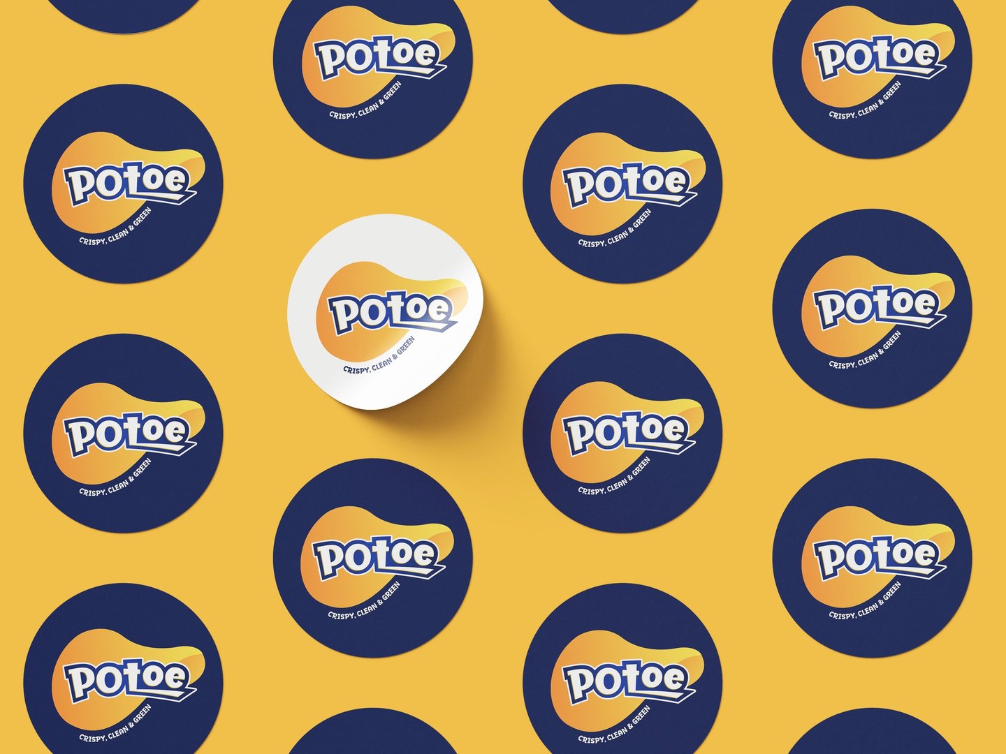
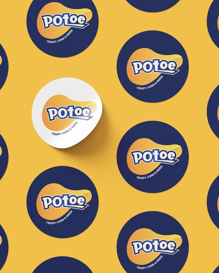
Concept 2
"Playful Crunch"

Concept:
This design focuses on the core product – the chip. The flowing potato chip shape evokes a sense of crispiness and crunch. The font style mimics bold, impactful packaging often seen in snack aisles, aiming to grab attention quickly.
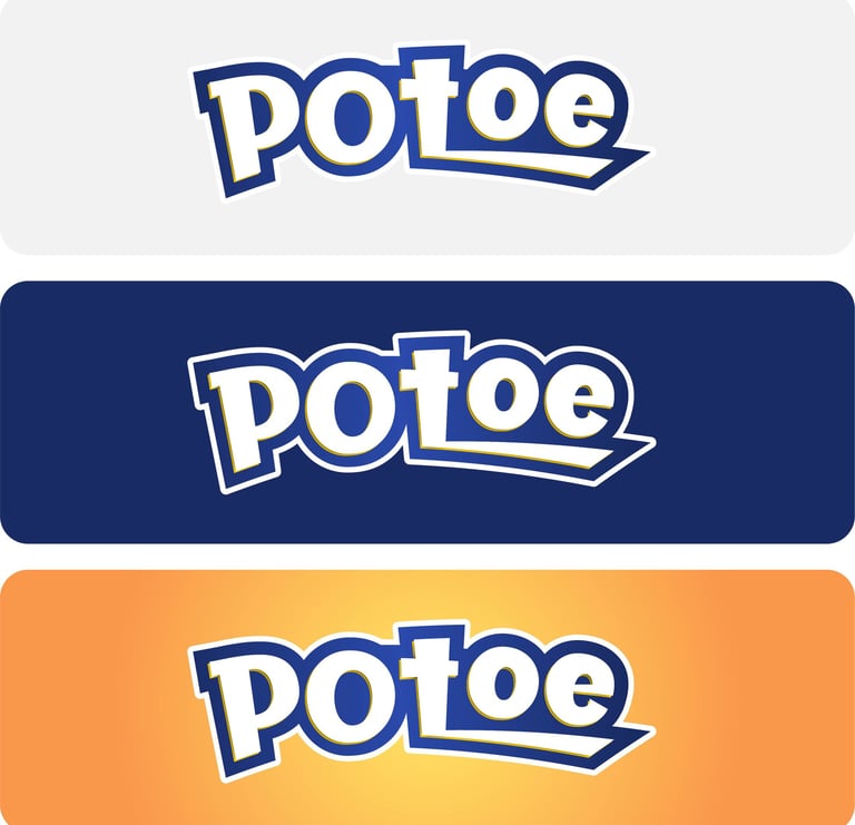
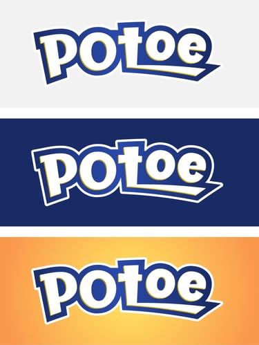
Typography:
Bold and chunky letterforms convey fun and energy. The slight tilt and layered shadow make the brand dynamic and youthful.

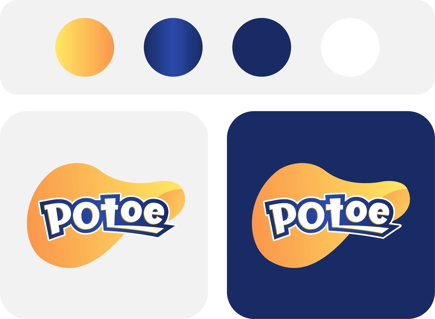
Colors Psychology
Yellow-Orange Gradient: Hunger-inducing, joyful, and vibrant.
Deep Blue: Trust, boldness, and refreshment.
White: Clean and fresh.
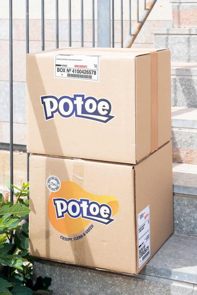
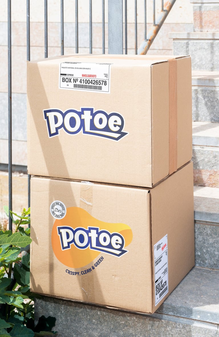
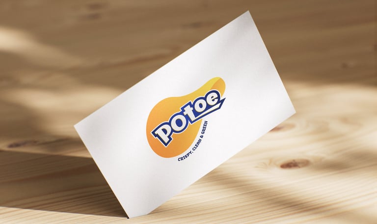
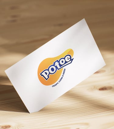
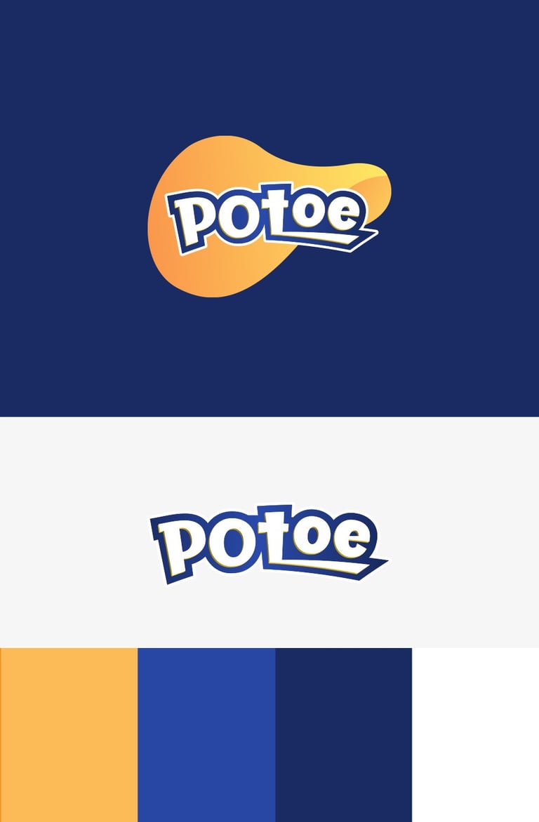
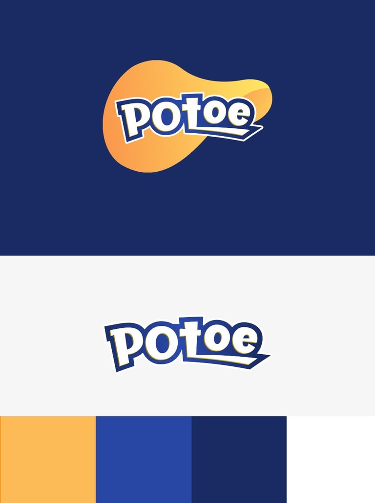
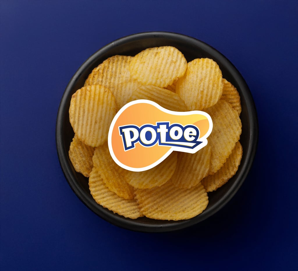
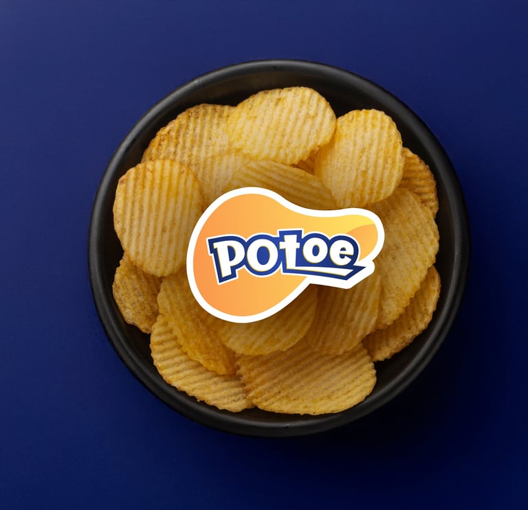
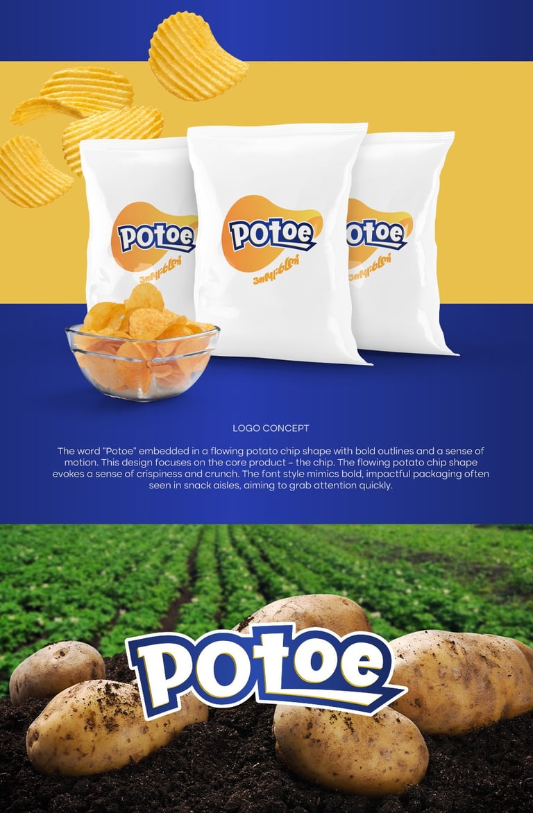
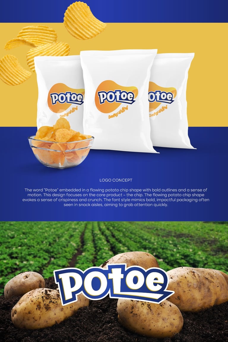
Concept 2: The word “Potoe” embedded in a flowing potato chip shape with bold outlines and a sense of motion.
Pikstudio - A studio with heart!
Showcasing premium design for diverse industries.
service@pikstudio.website
+6660685217
© 2024. All rights reserved.