

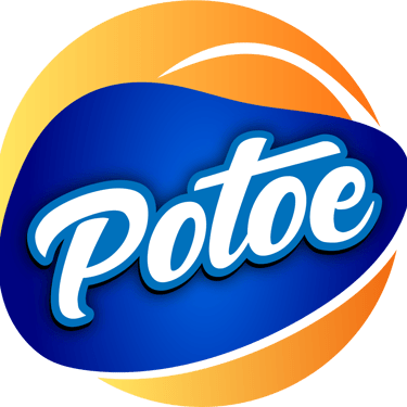
Concept 1
"Crunch Orbit"
Concept:
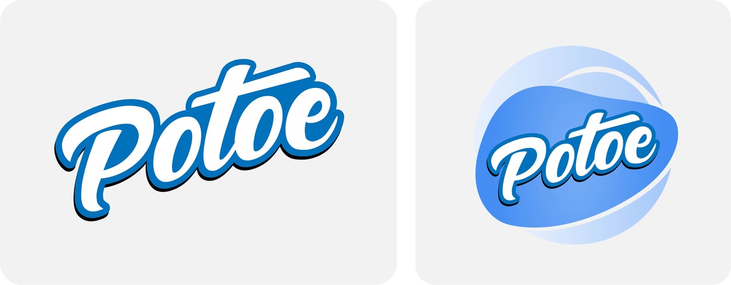
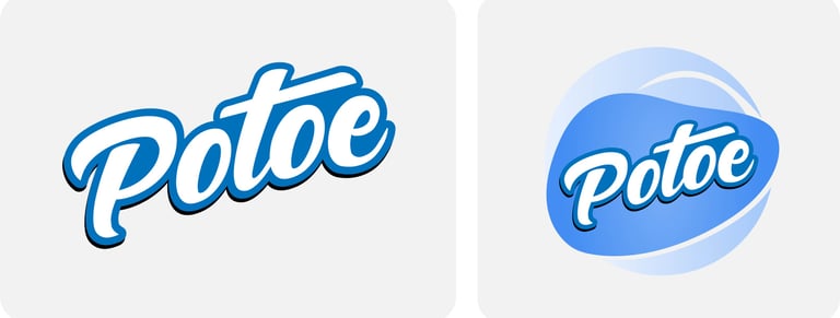
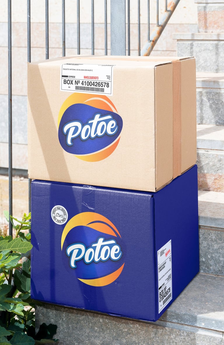
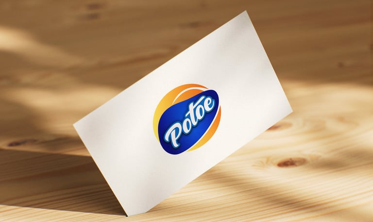
This version presents “Potoe” as an iconic brand with a modern twist. The circular composition and gradient give a sense of global movement and snacking satisfaction. This look is suited for packaging with a bold presence and a slightly premium edge.
Typography:
Rounded, bold script type conveys friendliness and familiarity, similar to classic snack brands like Lay’s or Pepsi.
A script-style display font.
Rounded and flowing with a bold outline, suggesting a legacy or heritage brand — like a snack that has "always been around."
Slight italic slant reflects motion and crispness.
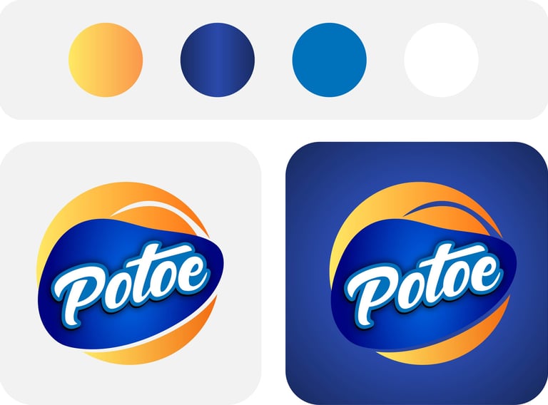
Colors Psychology :
Deep Blue : Conveys confidence, depth, and professionalism.
Orange–Yellow Gradient : Adds excitement and a sun-baked freshness.
White : Keeps it clean, ensuring the wordmark remains legible even at a distance.

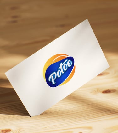

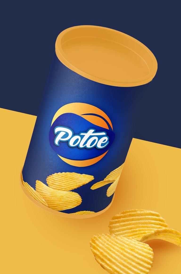
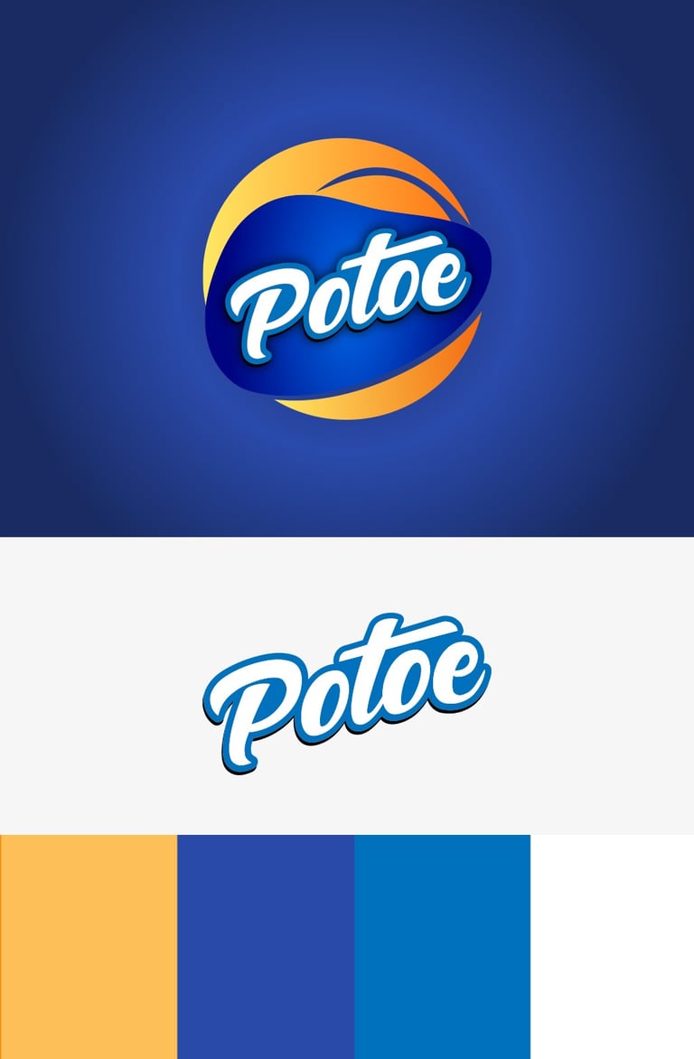
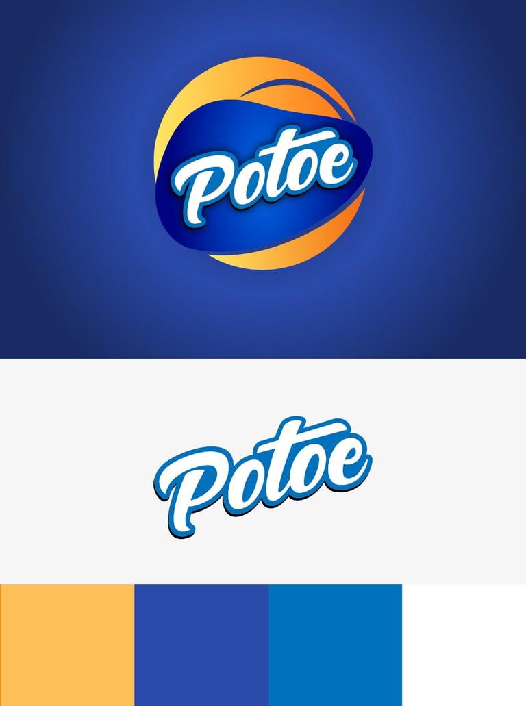
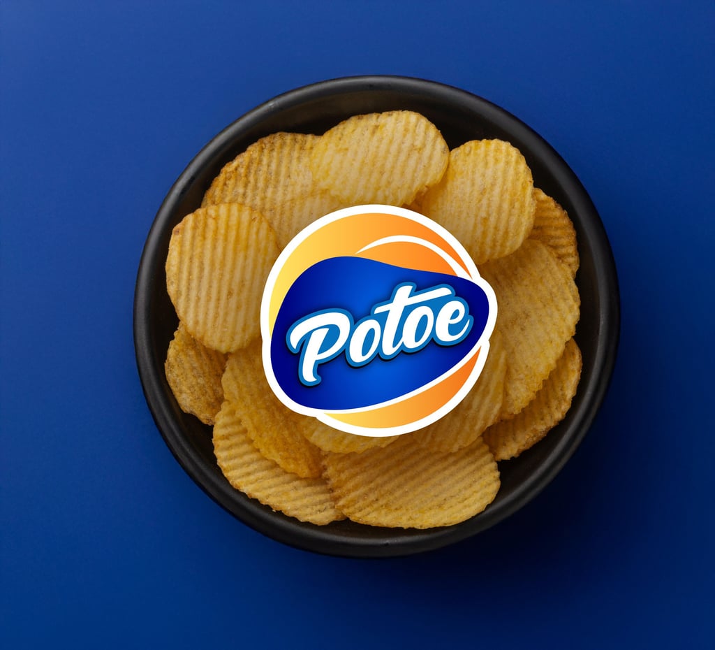
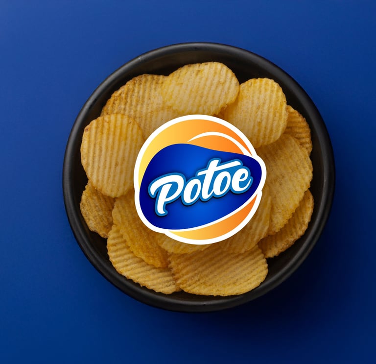
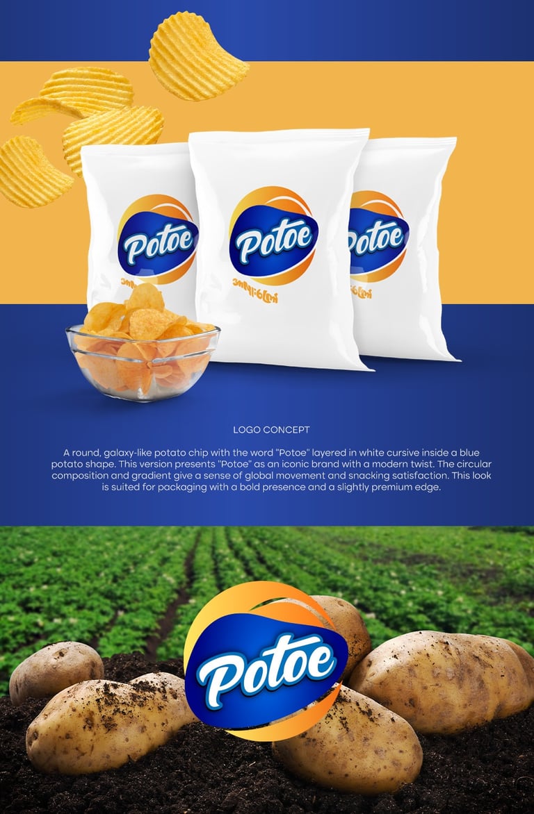
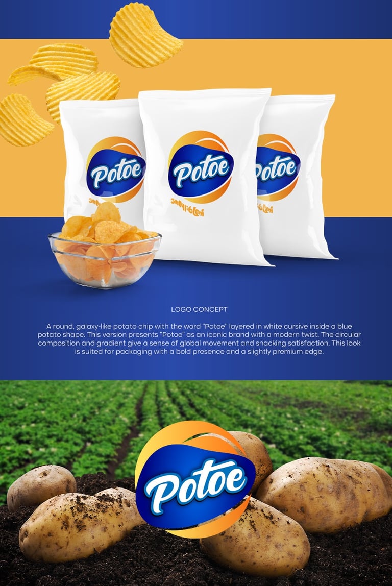
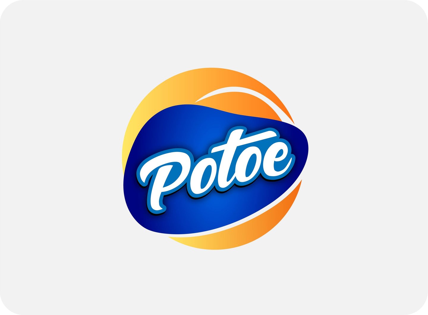
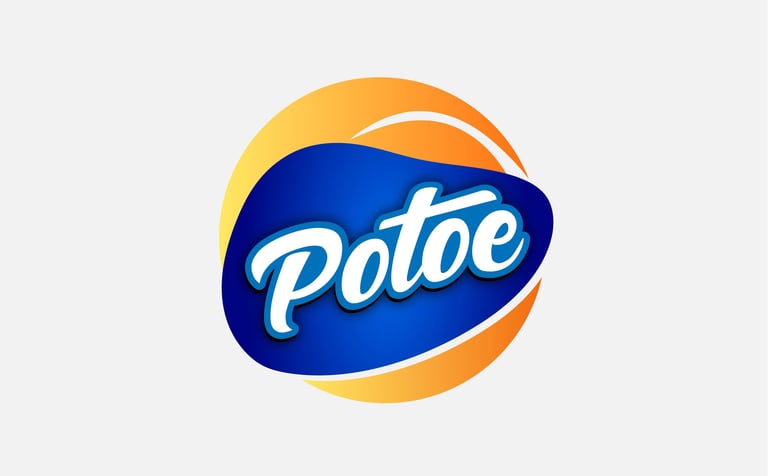
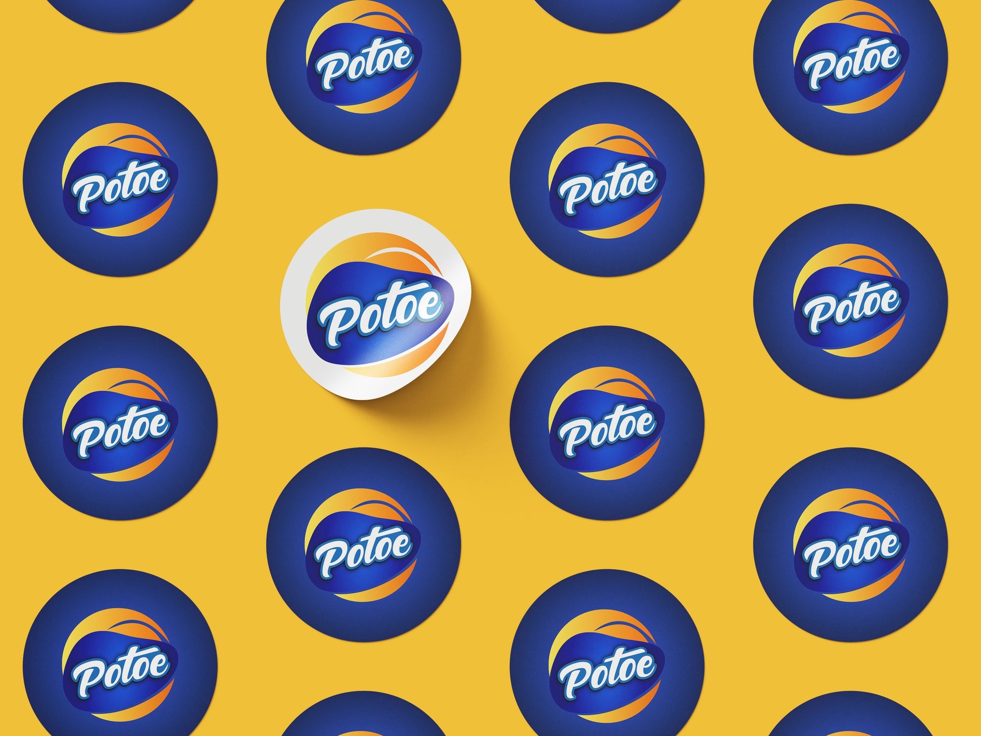
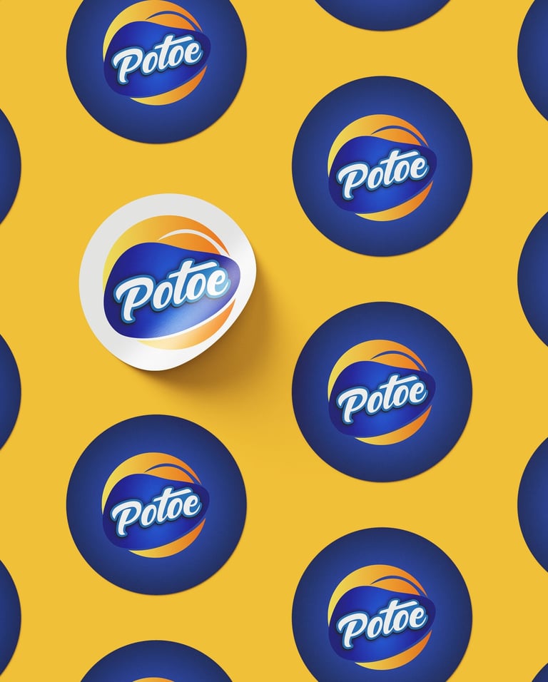
Concept 1: A round, galaxy-like potato chip with the word “Potoe” layered in white cursive inside a blue potato shape.

Pikstudio - A studio with heart!
Showcasing premium design for diverse industries.
service@pikstudio.website
+6660685217
© 2024. All rights reserved.