

Concept 3
The Bowl of Harmony

Concept:
“The Bowl of Harmony” centers around the universal symbol of comfort and togetherness — a steaming bowl. Rather than simply representing food, the icon embodies the emotional connection shared meals create. The flowing steam lines reference harmony and cultural blending, capturing how Burmese, Thai, and Chinese flavors come together under one roof in Chiang Mai. This concept also gives a warm, homely, and trustworthy impression, ideal for a restaurant that wants people to feel welcome and cared for.
Typography:
The slightly hand-drawn, character-rich typeface enhances personality and warmth. The uneven rhythm of the letterforms mirrors the organic nature of handmade dishes, while still maintaining readability and structure. It supports the brand’s promise of honest cooking and authentic flavors.
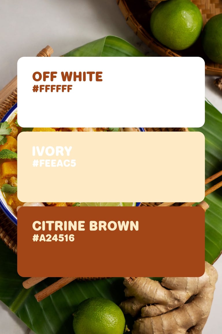
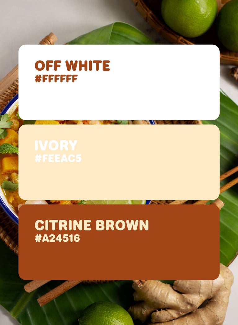
Colors Psychology
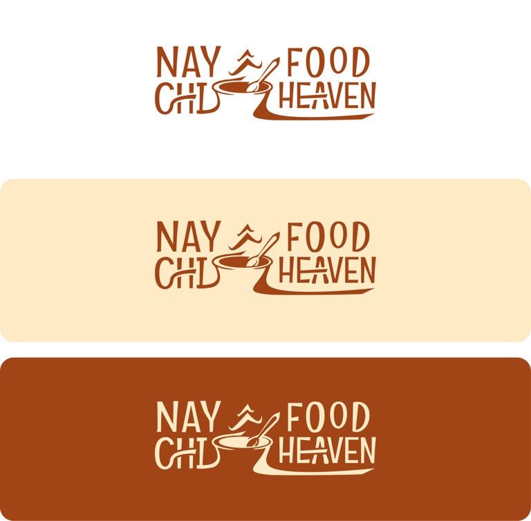
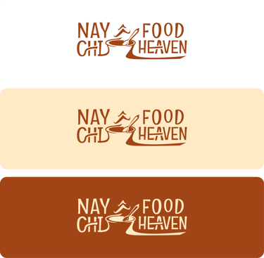
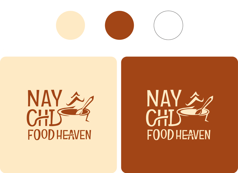
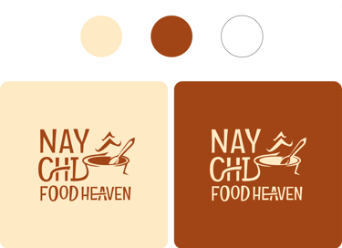
Citric Brown – evokes natural ingredients, slow cooking, and grounding comfort.
Ivory – stimulate appetite while suggesting an artisanal, homemade approach.
Off White – adds balance, purity, and approachability, keeping the brand friendly.


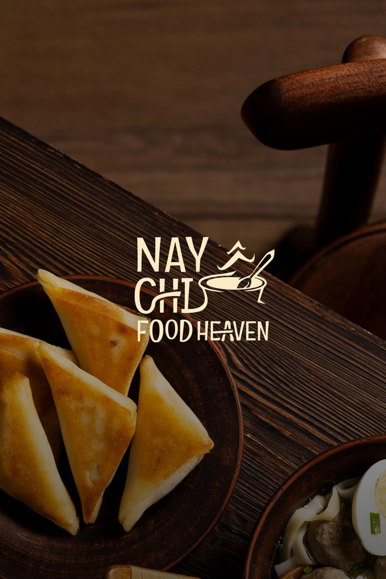
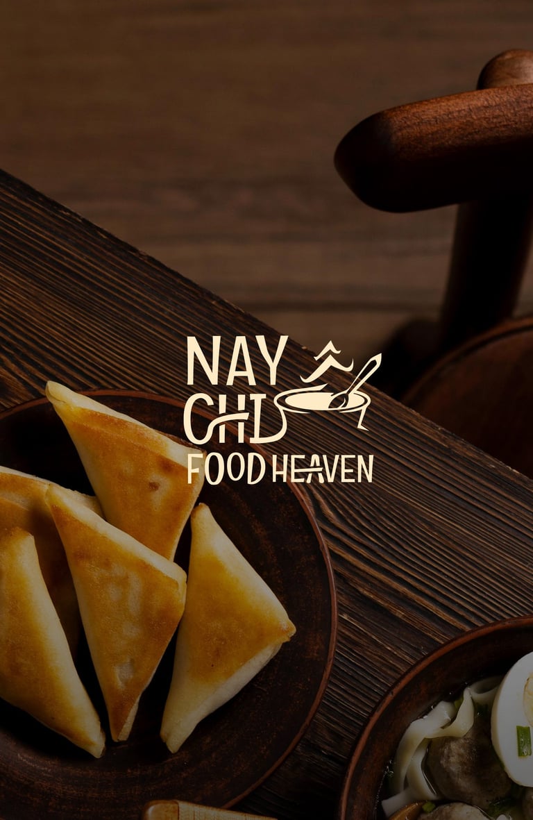
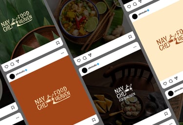


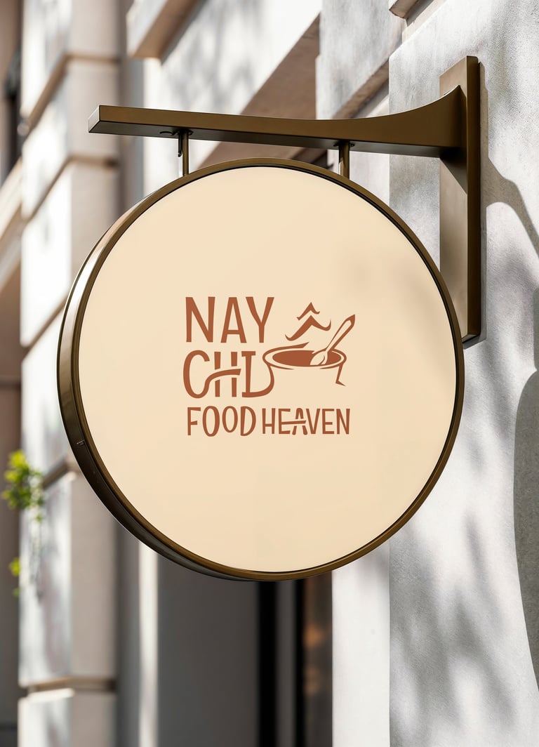

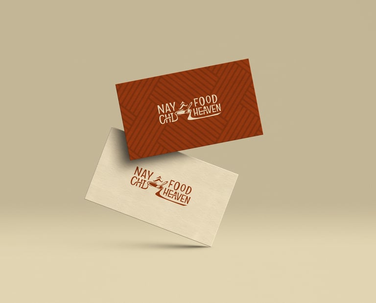


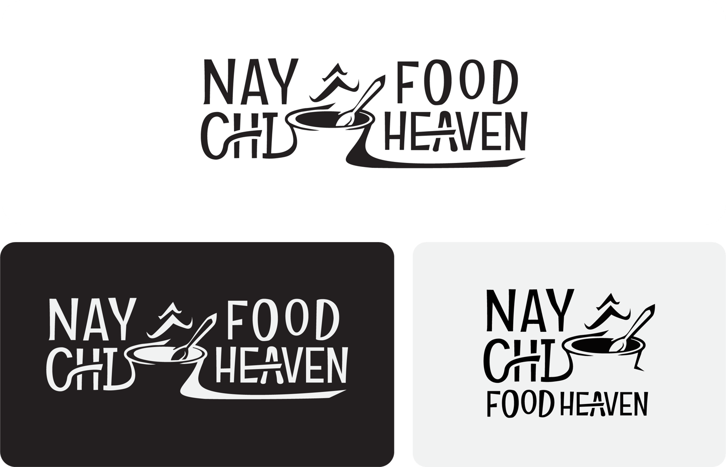
Concept 3: An expressive, hand-drawn bowl with rising steam integrated into playful lettering, capturing the soul of home-cooked warmth, street-food charm, and the heartwarming experience of comforting Asian cuisine.


Pikstudio - A studio with heart!
Showcasing premium design for diverse industries.
service@pikstudio.website
+6660685217
© 2024. All rights reserved.