

Concept 1
The Flavor Stroke

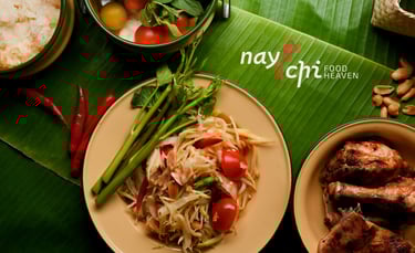
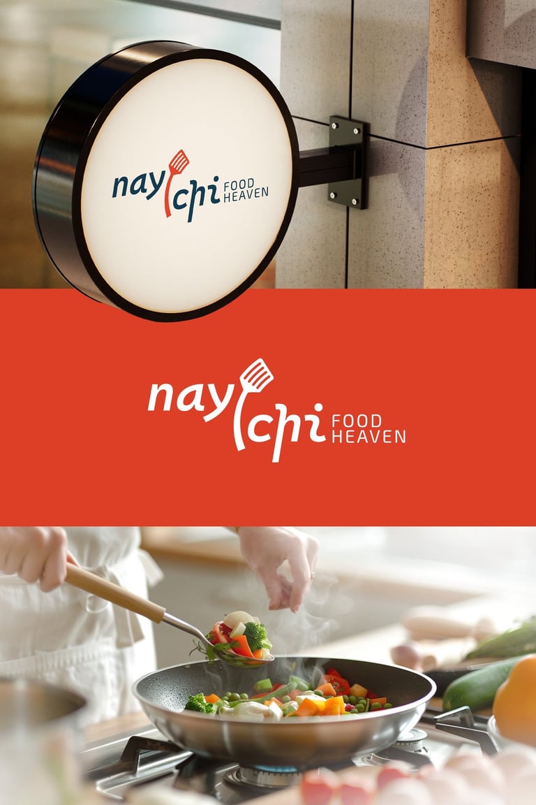
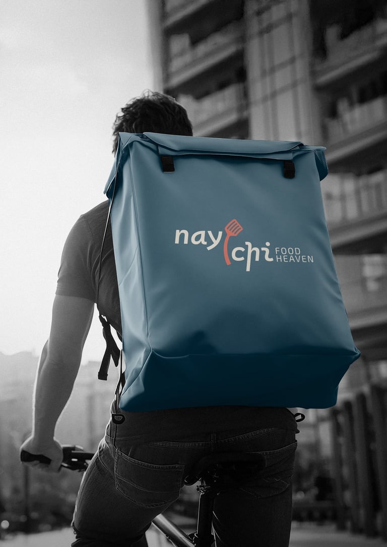
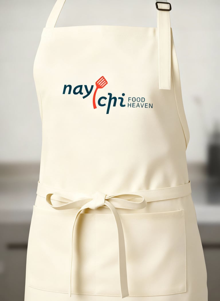
Concept:
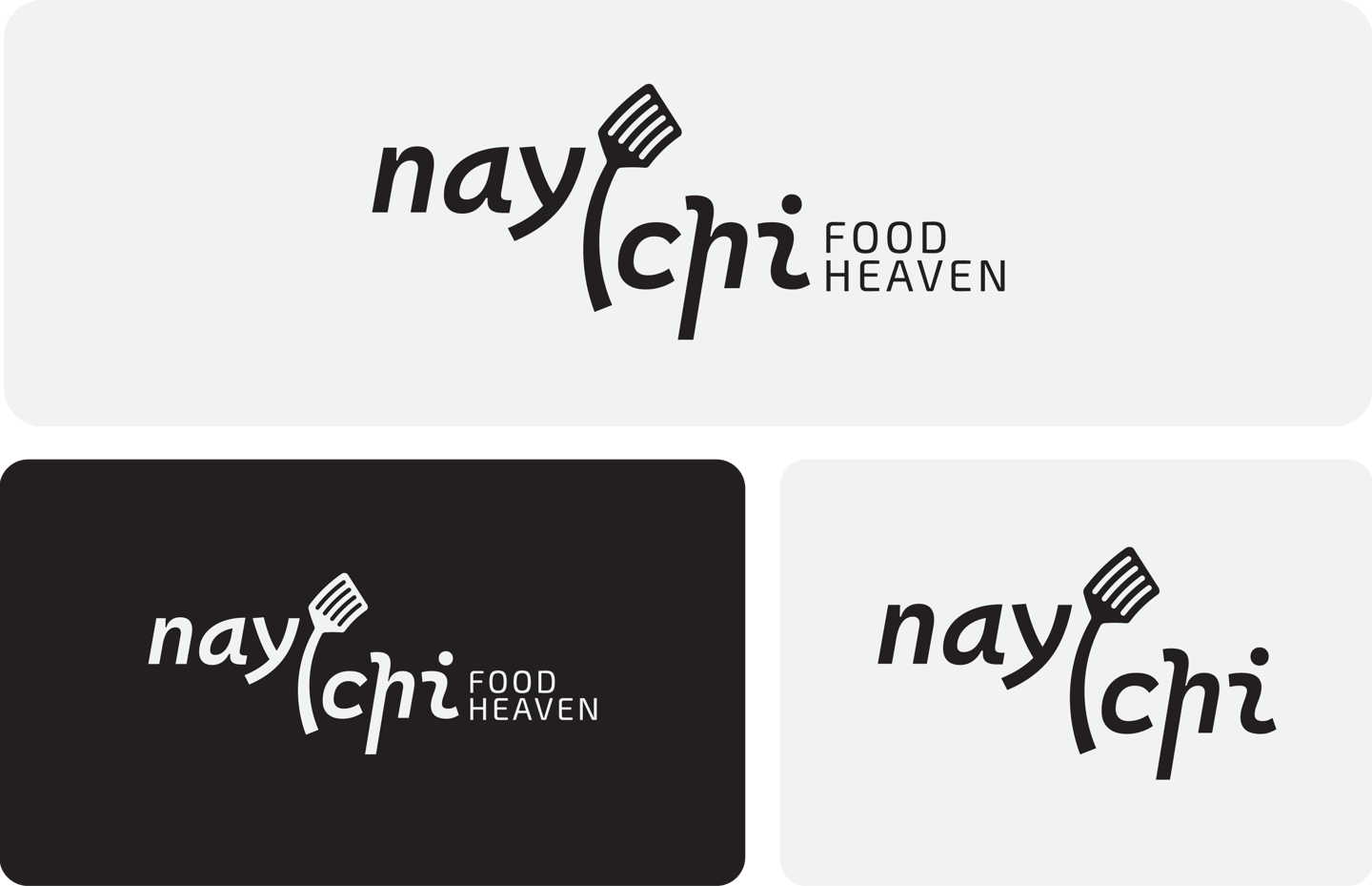
The Flavor Stroke draws inspiration from the fluid motion of cooking and the rhythmic gesture of Asian calligraphy. The fork integrated into the letterform symbolizes dining, while the sweeping curved stroke suggests aroma, warmth, and delicious movement. This concept reflects a modern Asian identity infused with energy, friendliness, and feels modern yet culturally grounded, appealing to both locals and tourists in Chiang Mai.
Typography:
Custom type with rounded edges reflects friendliness and approachability. The strokes feel organic and hand-drawn, echoing Asian script without copying traditional characters. This pairing keeps the brand modern and contemporary.
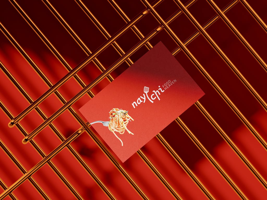
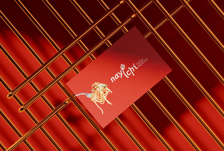
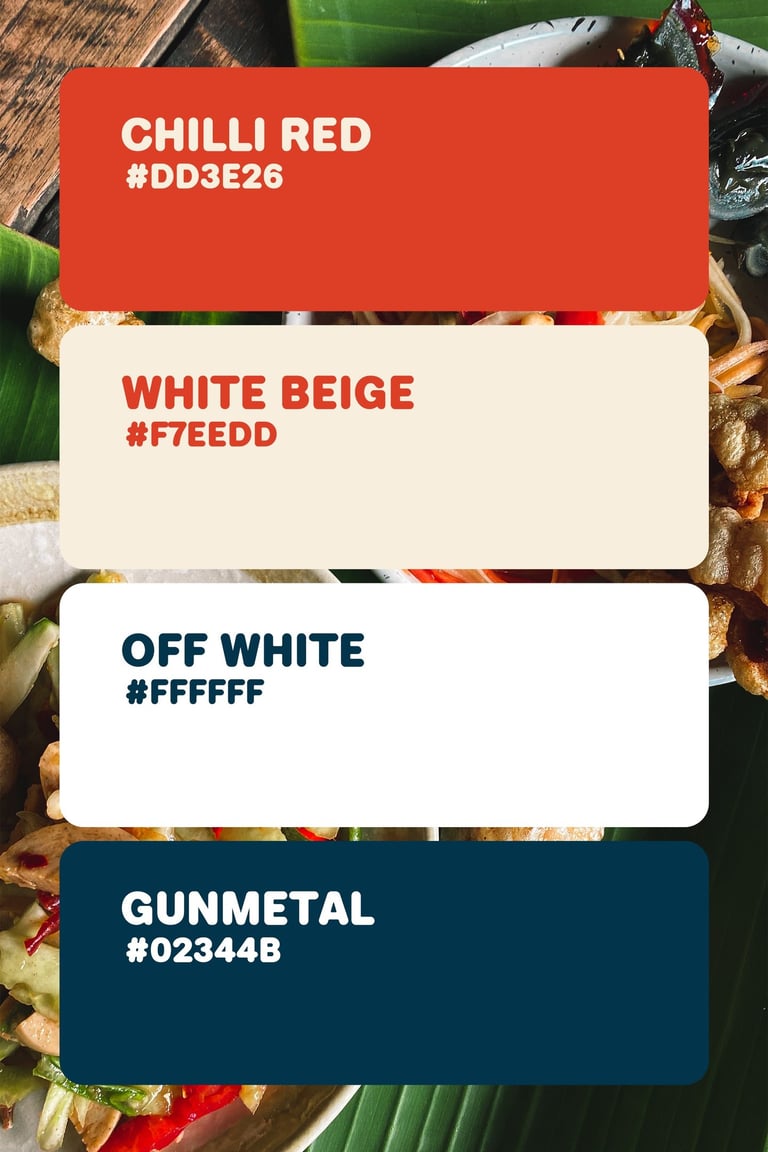
Colors Psychology
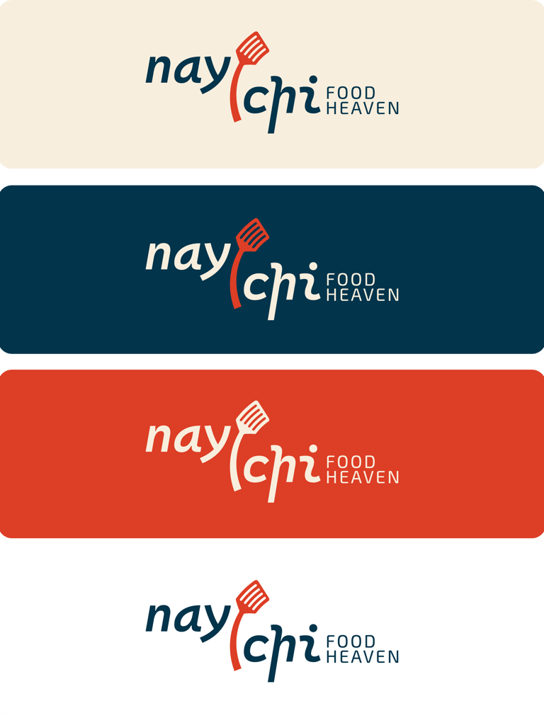
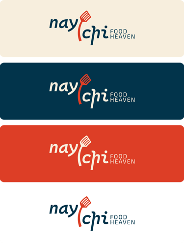
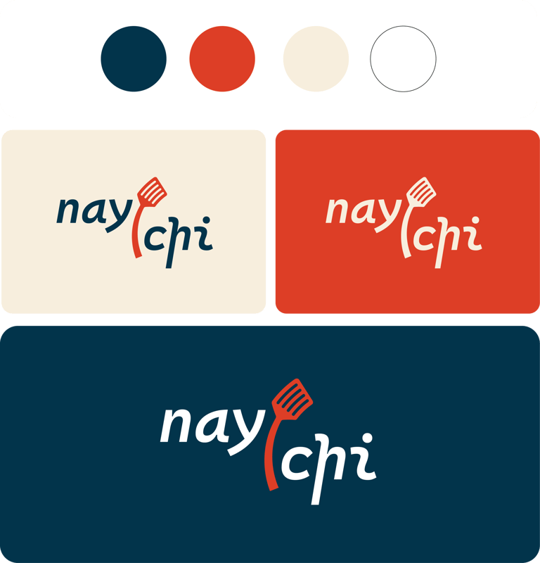
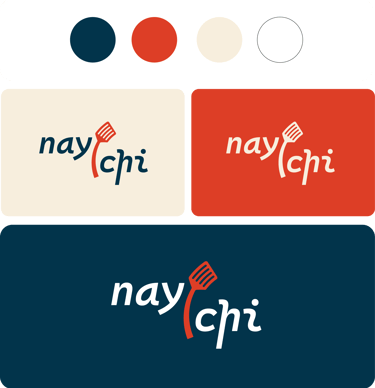
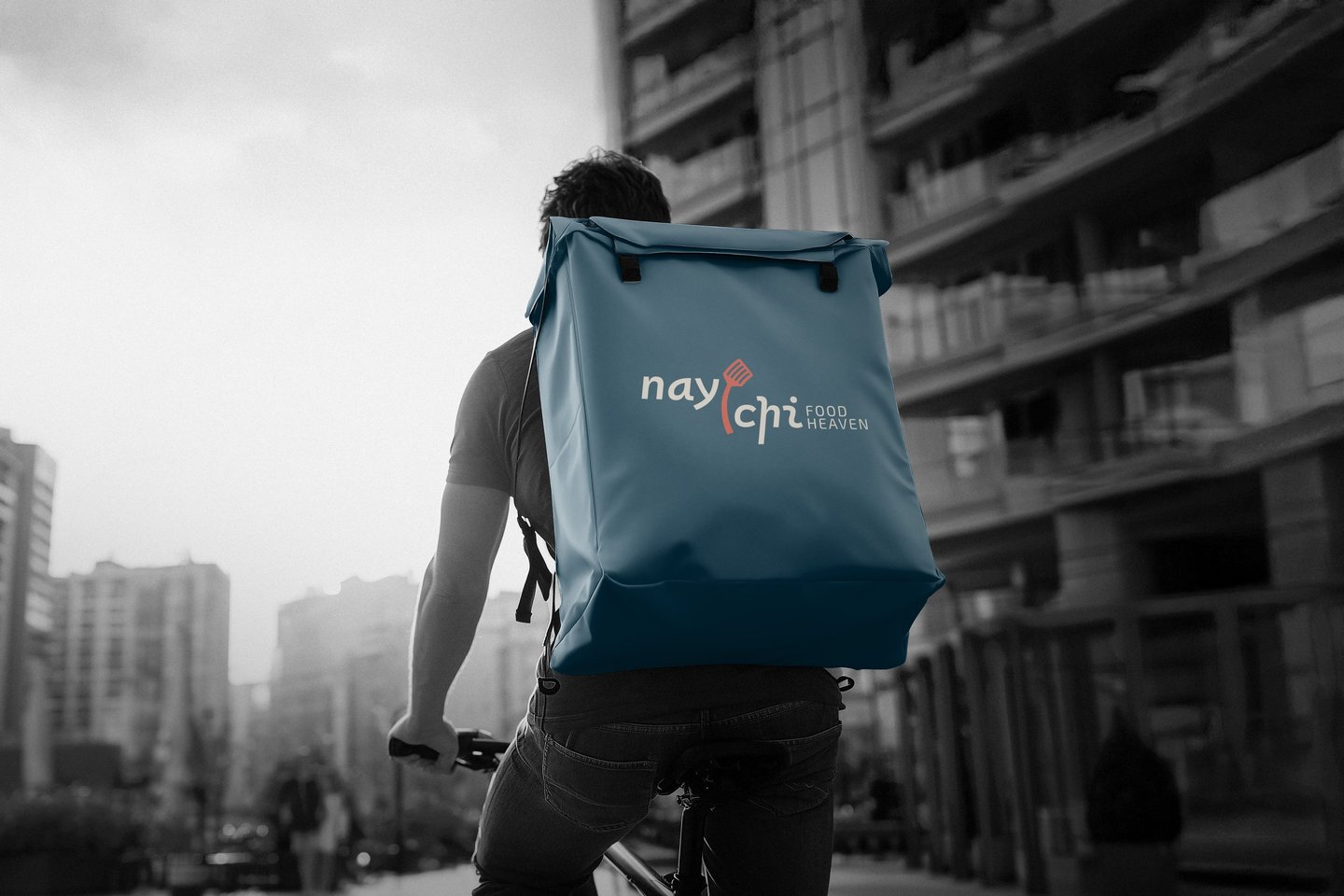
Chilli Red – symbolizes appetite, warmth, and inviting energy. It stimulates hunger and highlights signature flavor.
Gunmetal – represents trust, stability, and professionalism, balancing the playful coral.
Beige & Off-White – adds softness and offers a clean, neutral background for universal appeal.
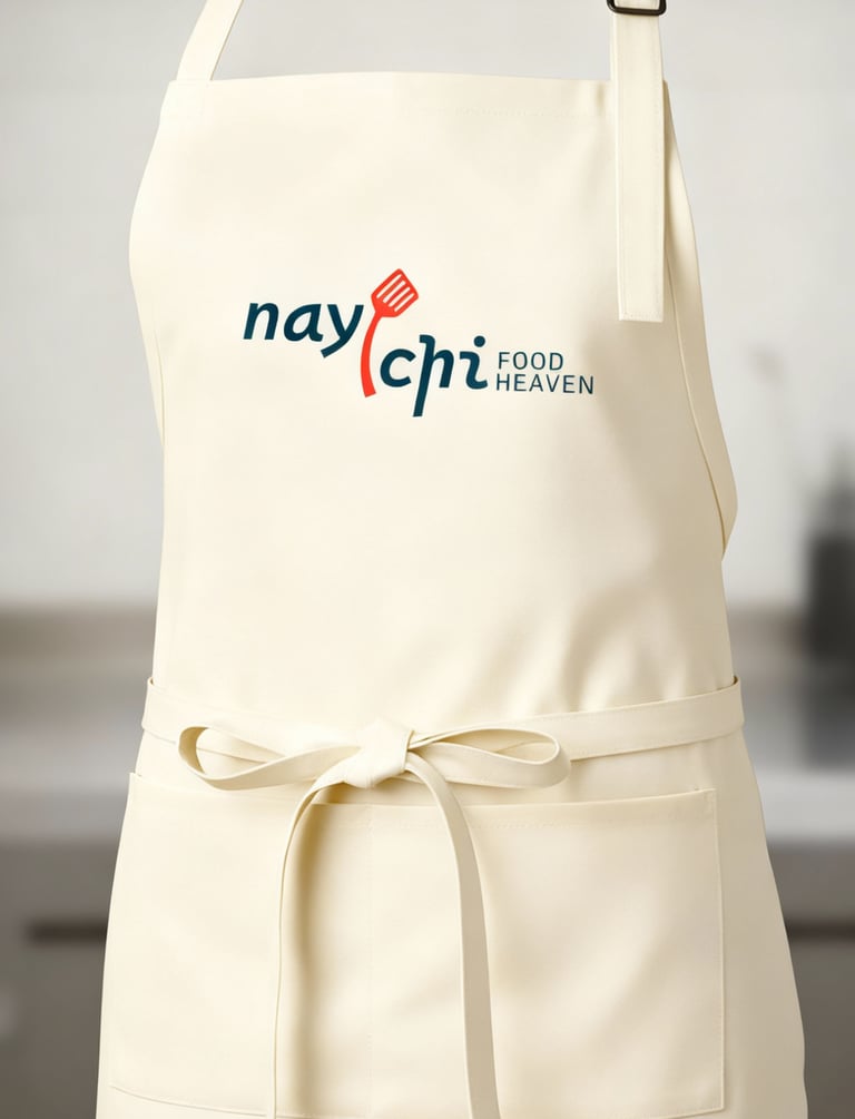
Concept 1: A clean, contemporary logo combining a stylized spoon with soft, rounded typography to reflect comfort, approachability, and the blend of Burmese, Thai, and Chinese flavors in a modern dining experience.


Pikstudio - A studio with heart!
Showcasing premium design for diverse industries.
service@pikstudio.website
+6660685217
© 2024. All rights reserved.