

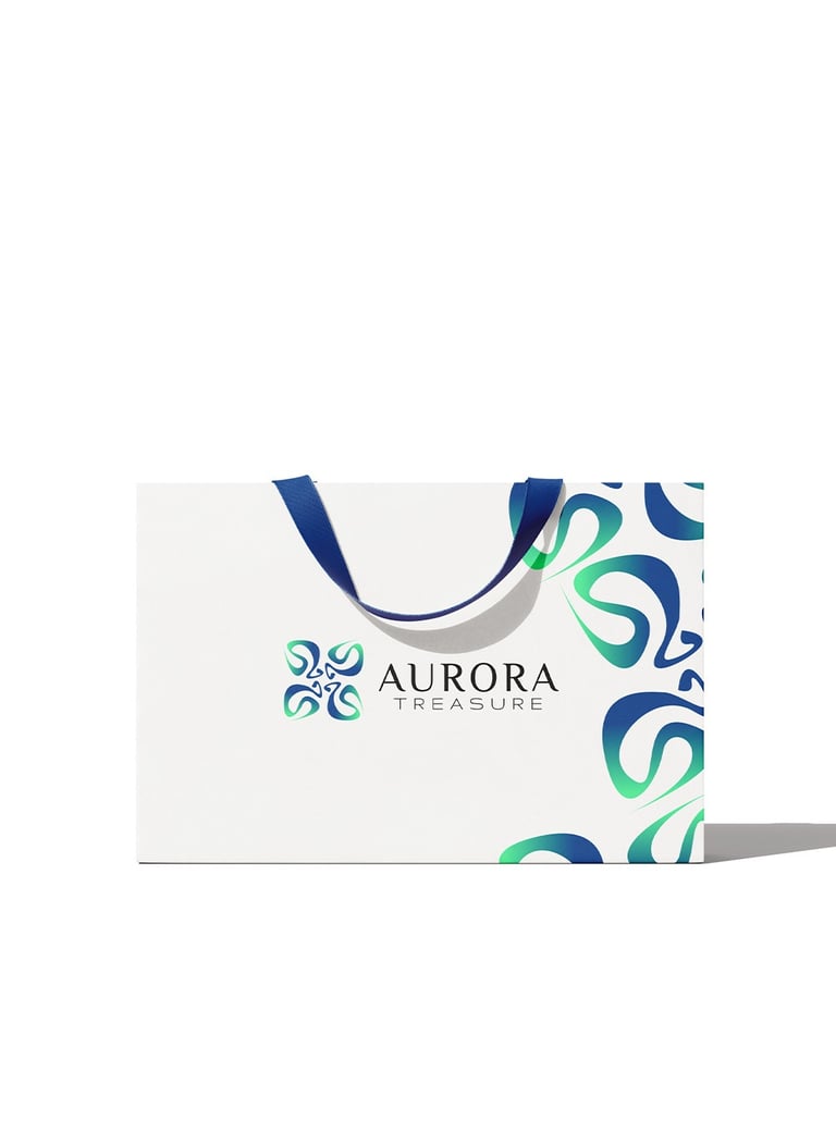
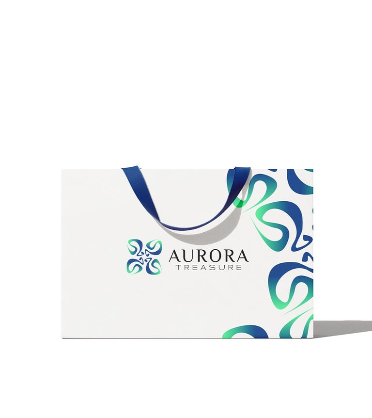
Concept 3
Aurora Flow
Concept:
This logo radiates freshness, fluidity, and modern craftsmanship. Its form feels dynamic and expressive — like light in motion — giving the brand an aura of vitality and sophistication. It suggests that every product from Aurora Treasure is alive with creativity and effortless beauty.
Typography:
The serif typography contrasts with the organic symbol, balancing nature with refinement. The letter spacing and slim forms communicate airiness and clarity, while the serif details suggest craftsmanship and tradition — linking Aurora Treasure’s modern aesthetics with timeless values.
Colors Psychology
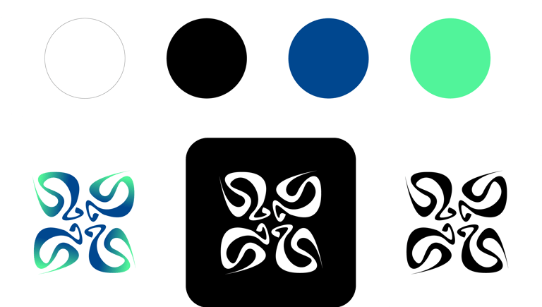
White — balance, space, and harmony; gives lightness and modern clarity.
Black — timeless contrast, grounding the flow with elegance and depth.
Teal Blue — sophistication, intelligence, and emotional calm; it carries trust and clarity.
Mint Green — renewal, freshness, and youthful energy; it adds a spark of innovation.
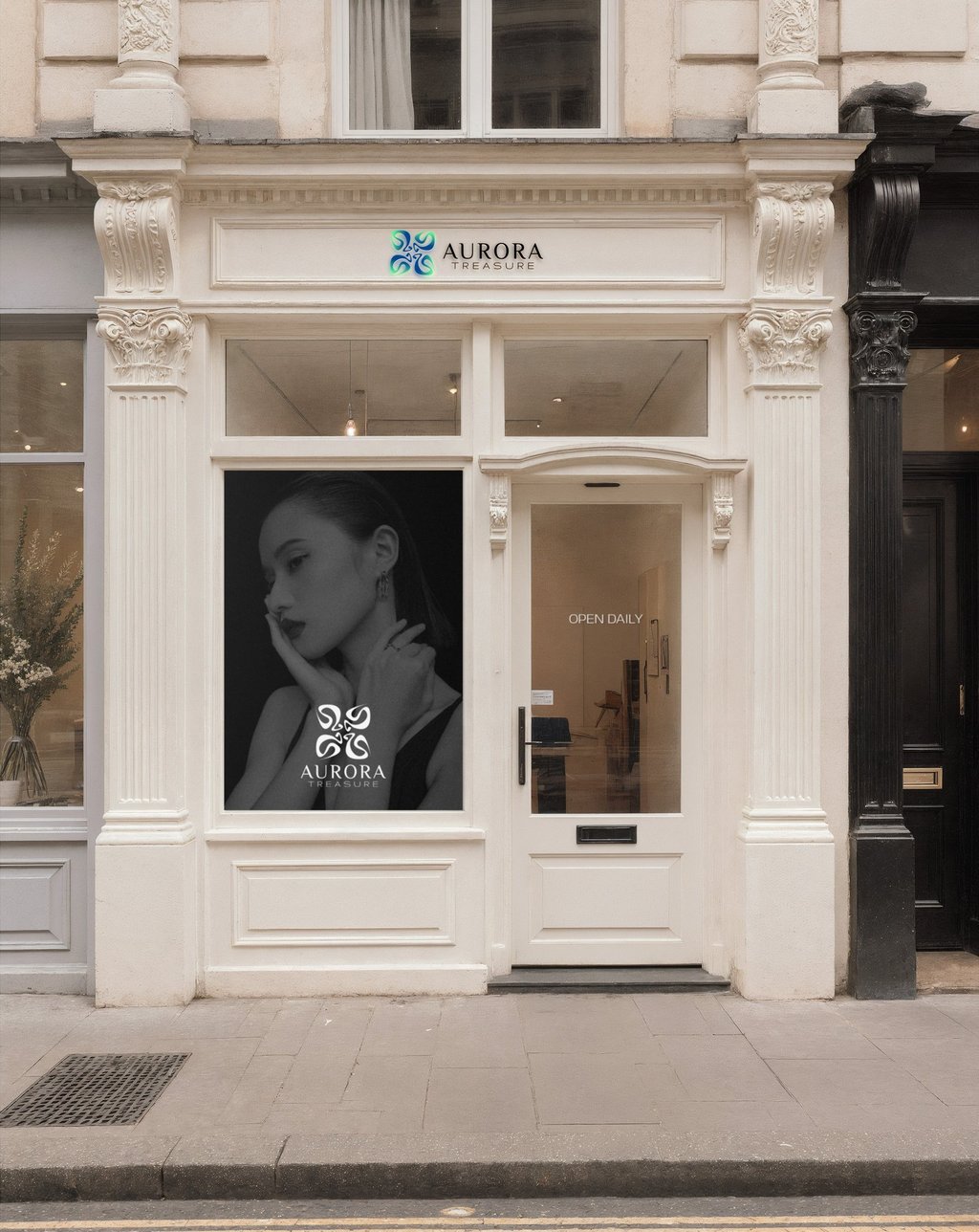
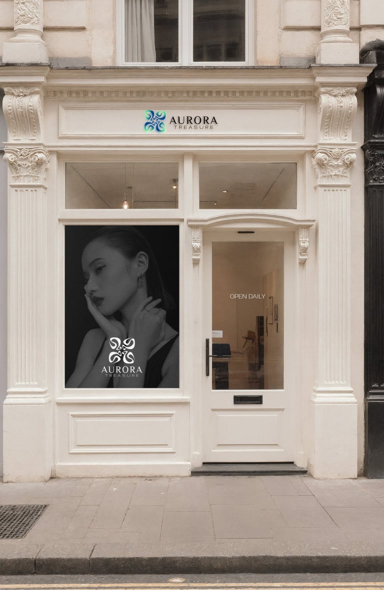
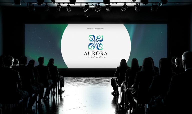
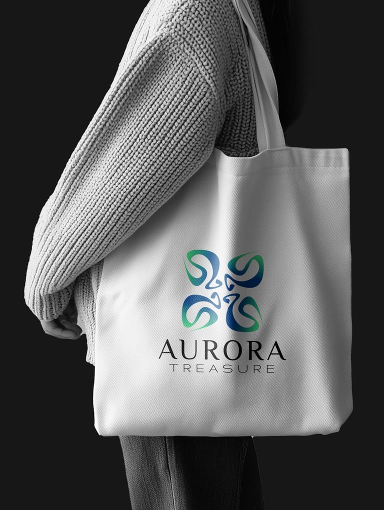

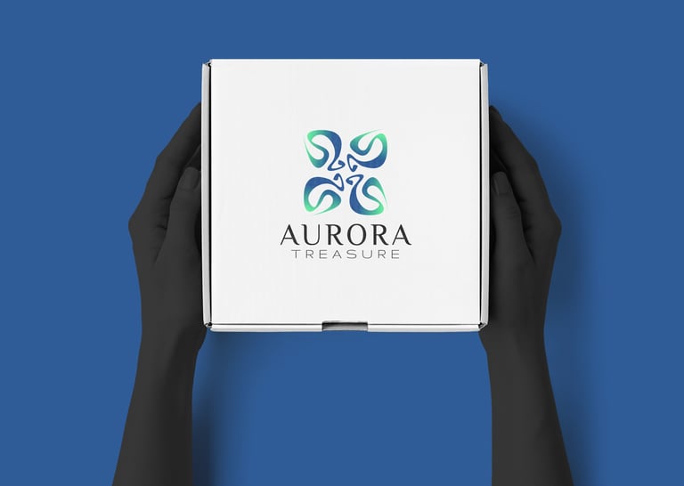
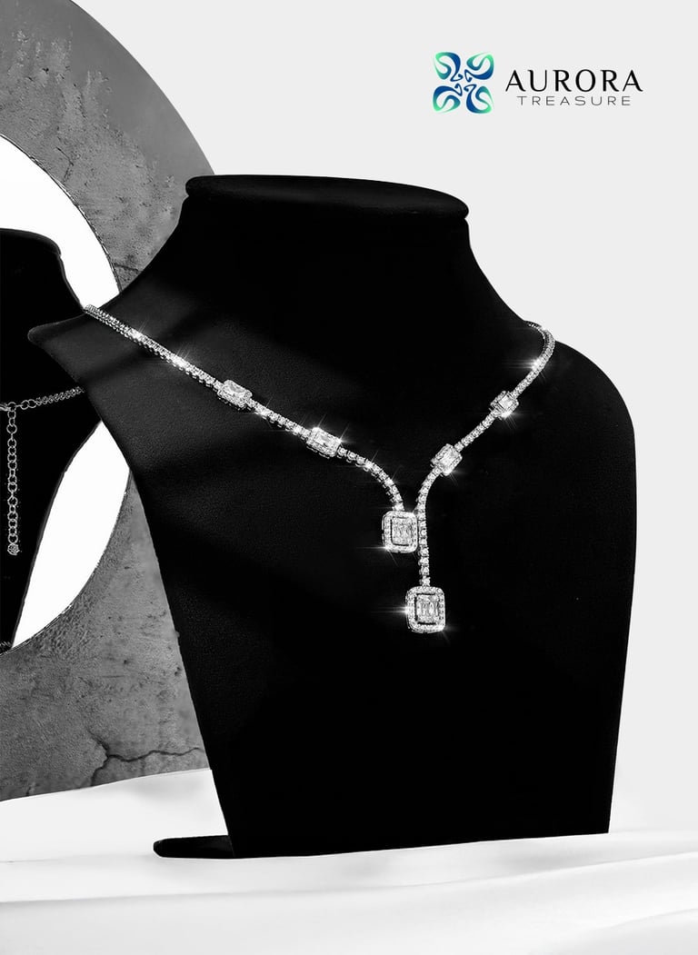
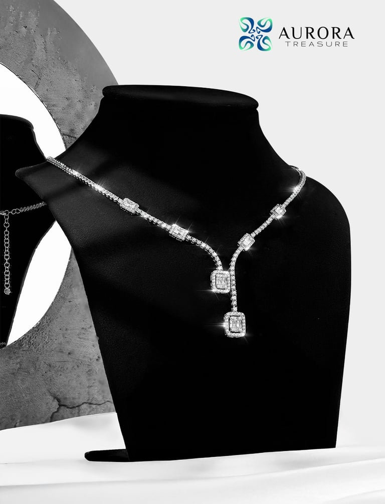
Concept 3: A fluid emblem inspired by aurora lines, expressing creativity, motion, and contemporary beauty.


Pikstudio - A studio with heart!
Showcasing premium design for diverse industries.
service@pikstudio.website
+6660685217
© 2024. All rights reserved.