

Concept I
Playful & Colorful
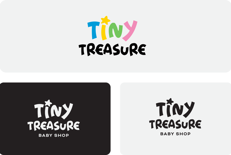
Concept:
The playful, multicolored letters convey the innocence and energy of childhood.
Typography:
Handwritten-style font – Gives a fun and informal feel, mimicking a child's handwriting.
Bold, slightly irregular strokes – Make the text look playful and spontaneous.
Colors:
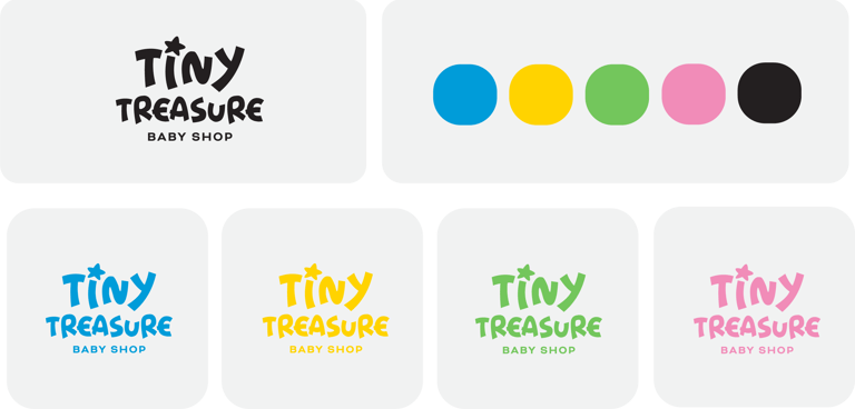
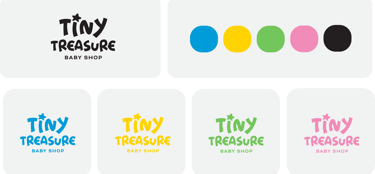
Blue – Trust, security, and calmness, making parents feel at ease.
Yellow – Happiness, warmth, and energy, evoking a playful mood.
Green – Growth, health, and safety, aligning with baby care products.
Pink – Love, kindness, and softness, enhancing the nurturing aspect.
Overall Psychology:
This mix of bright and cheerful colors makes the brand feel fun, inviting, and full of positive energy, appealing to parents who want a joyful shopping experience for their little ones.
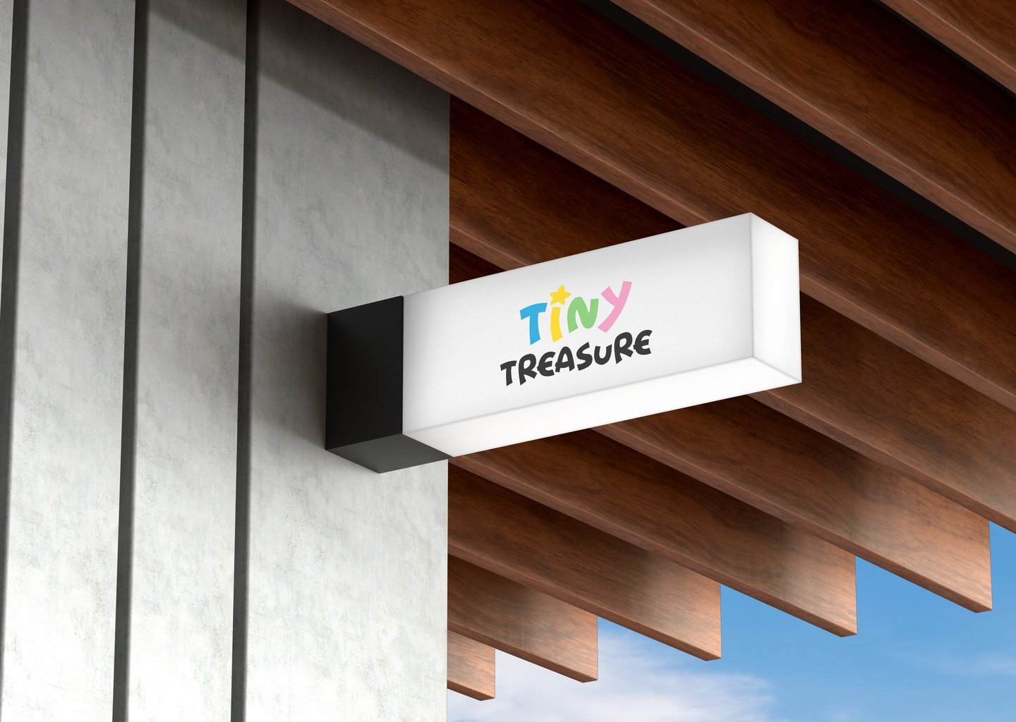
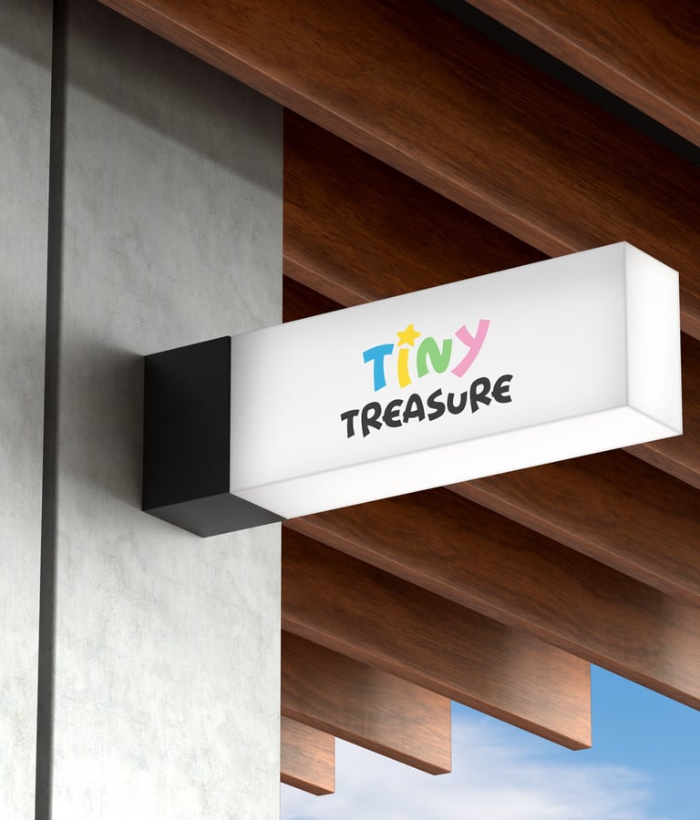
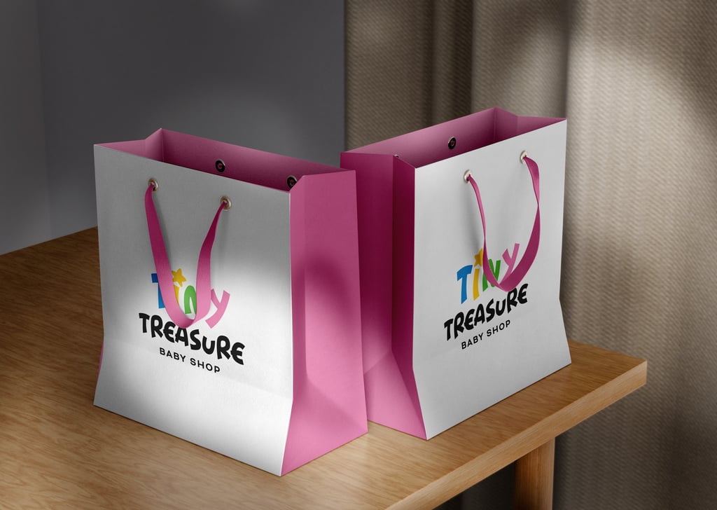

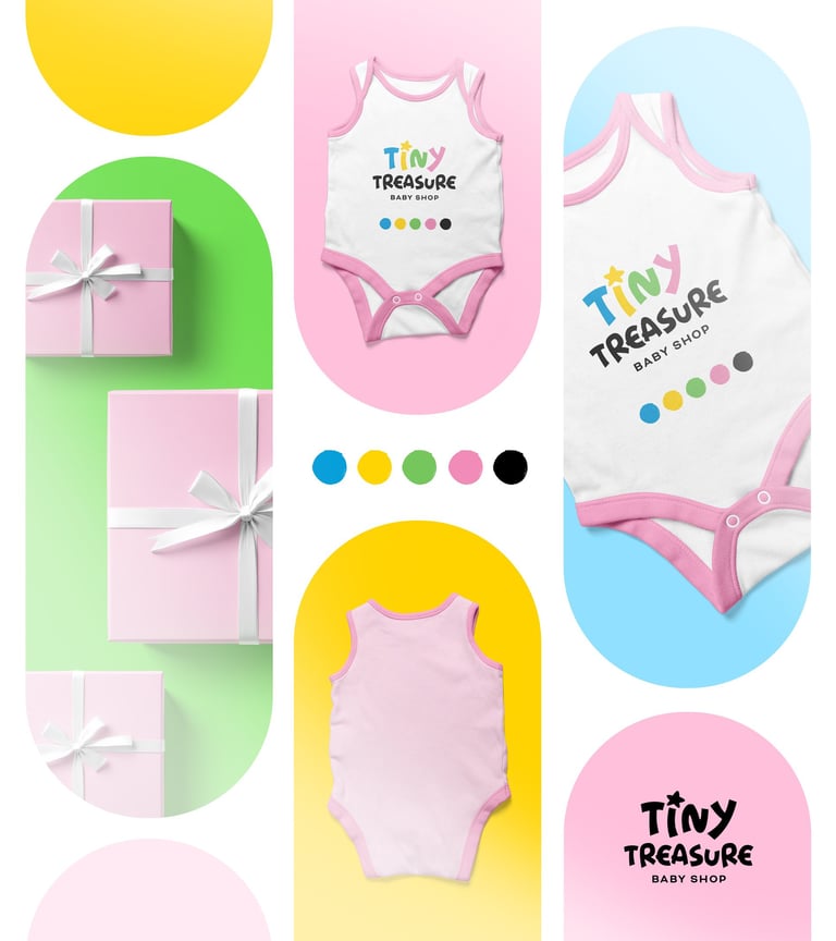
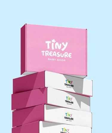
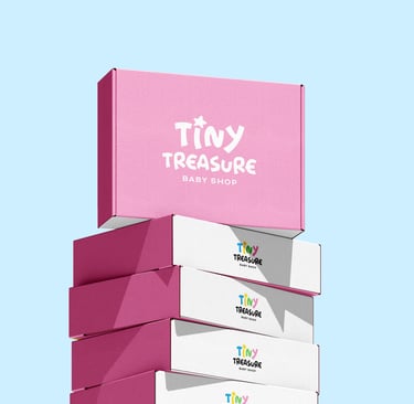


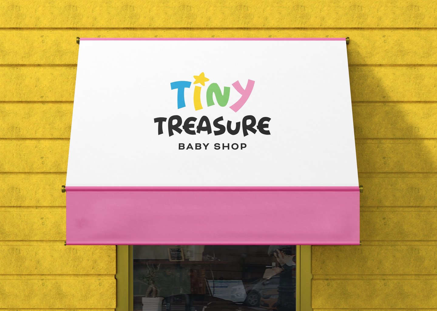
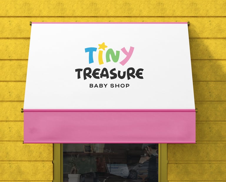
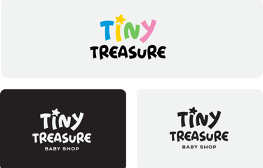
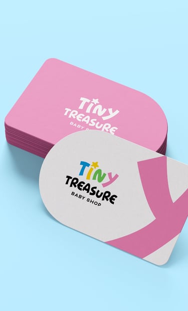
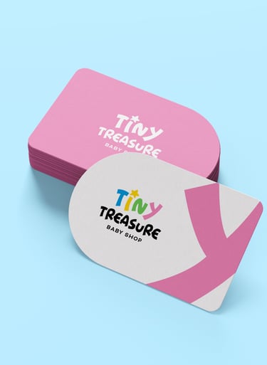
Concept 1: This logo is designed to capture the excitement of childhood, with bold, bright colors and a playful font that makes it fun, friendly, and energetic—ideal for a baby brand that focuses on joy and adventure.


Pikstudio - A studio with heart!
Showcasing premium design for diverse industries.
service@pikstudio.website
+6660685217
© 2024. All rights reserved.