

Concept 2
The Knowledge Mark
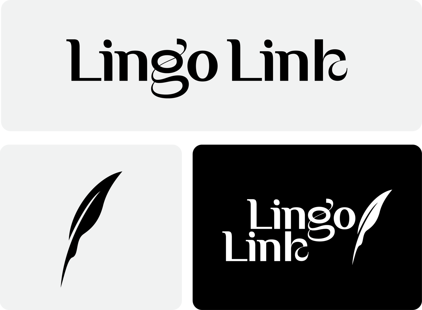
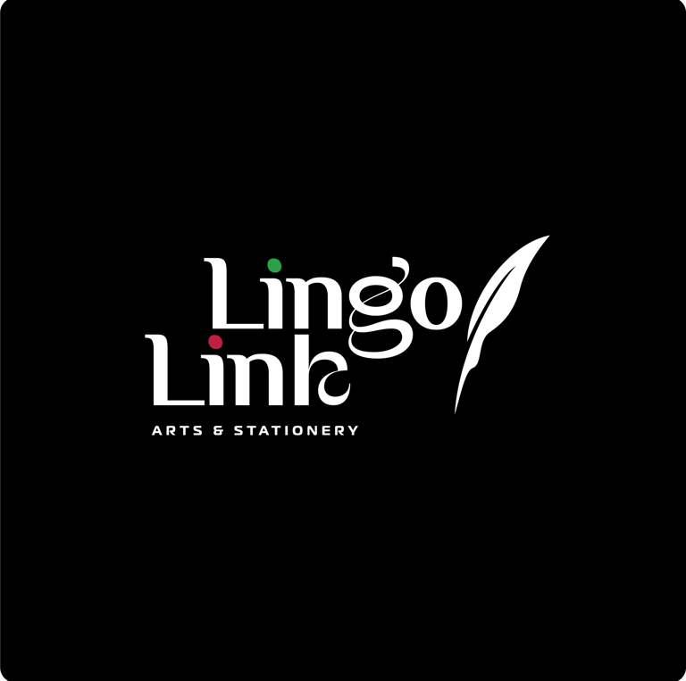
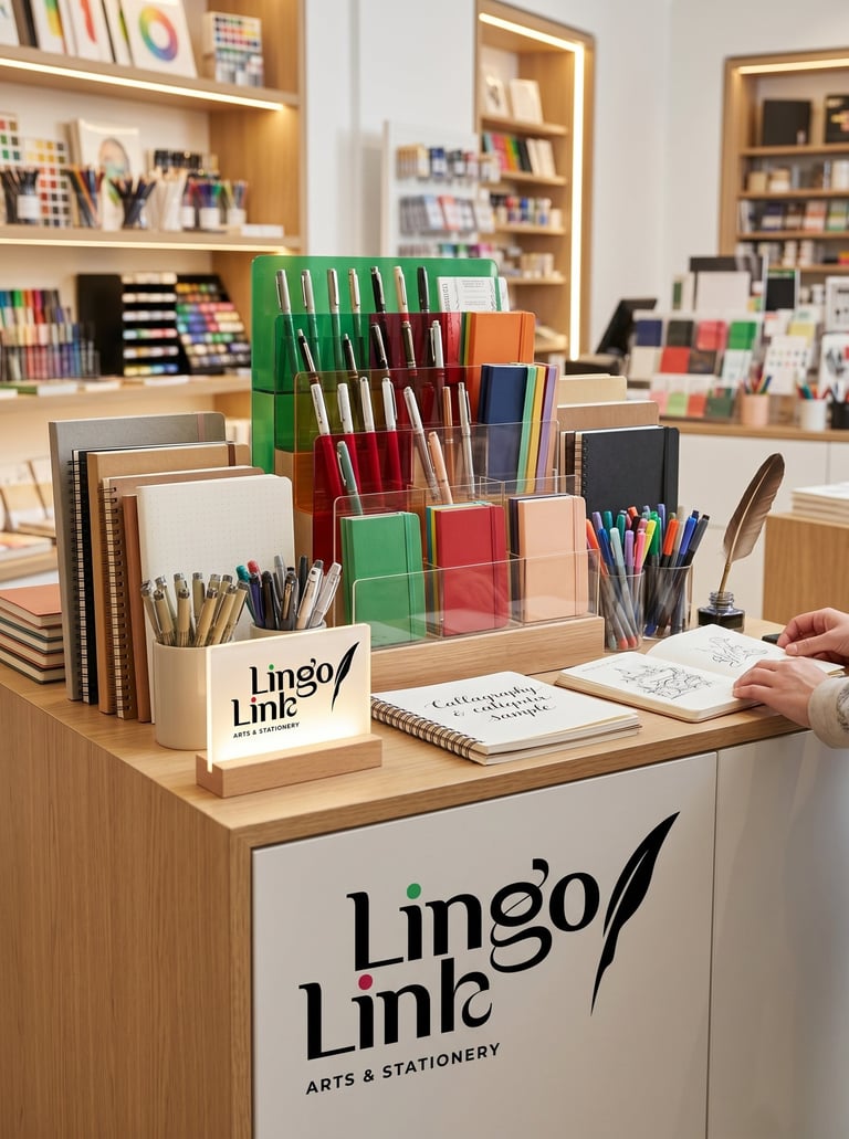
Typography:
The typography combines structure with personality. The strong letterforms establish credibility, while the customized details introduce a sense of individuality and creative thinking. This balance reflects the brand itself—organized enough to support learning, yet flexible enough to encourage imagination.
Colors Psychology
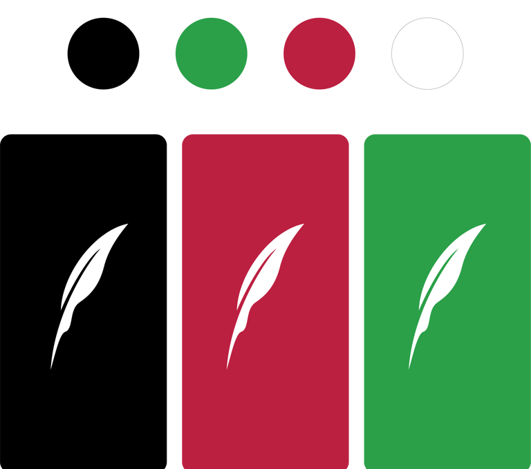

The restrained use of color creates a thoughtful balance between professionalism and creativity. Black provides a sense of confidence, clarity, and permanence. The green accent symbolizes growth, learning, and continuous development, while the magenta accent introduces curiosity and creative energy. Together, these elements reflect the dual nature of stationery as both a practical tool and a medium for self-expression.
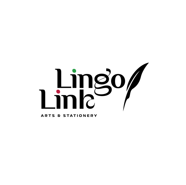

Concept:
This concept is built around the idea that stationery is more than a collection of products—it is a tool for learning, creativity, and communication. The logo combines a refined wordmark with a symbolic feather element to represent the journey from thought to expression. Rather than emphasizing decoration, the identity focuses on the value of ideas, positioning Lingo Link as a place where knowledge, creativity, and craftsmanship intersect.

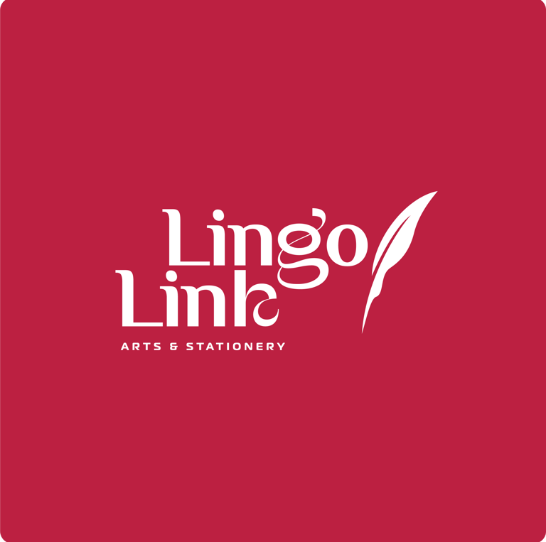

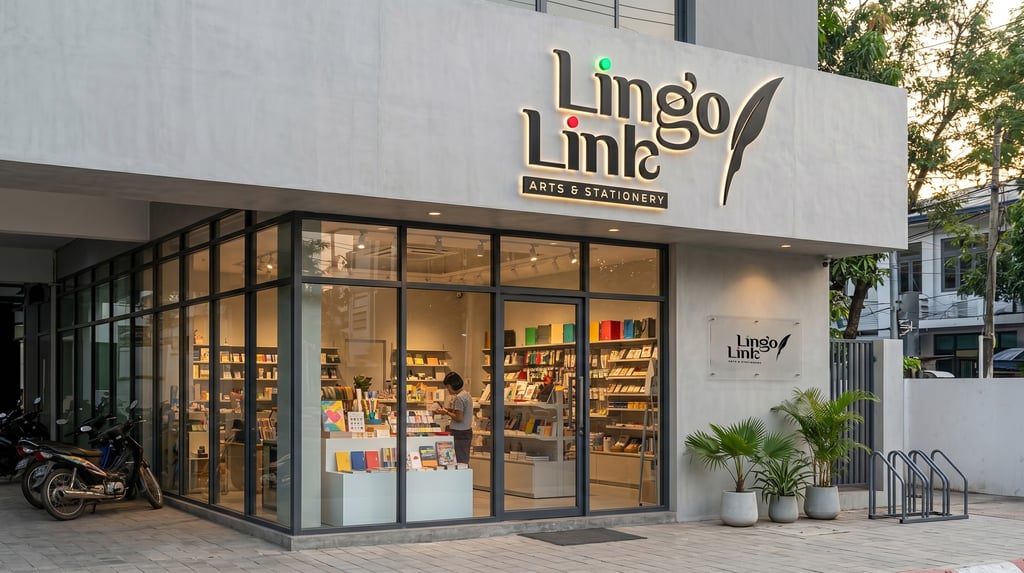


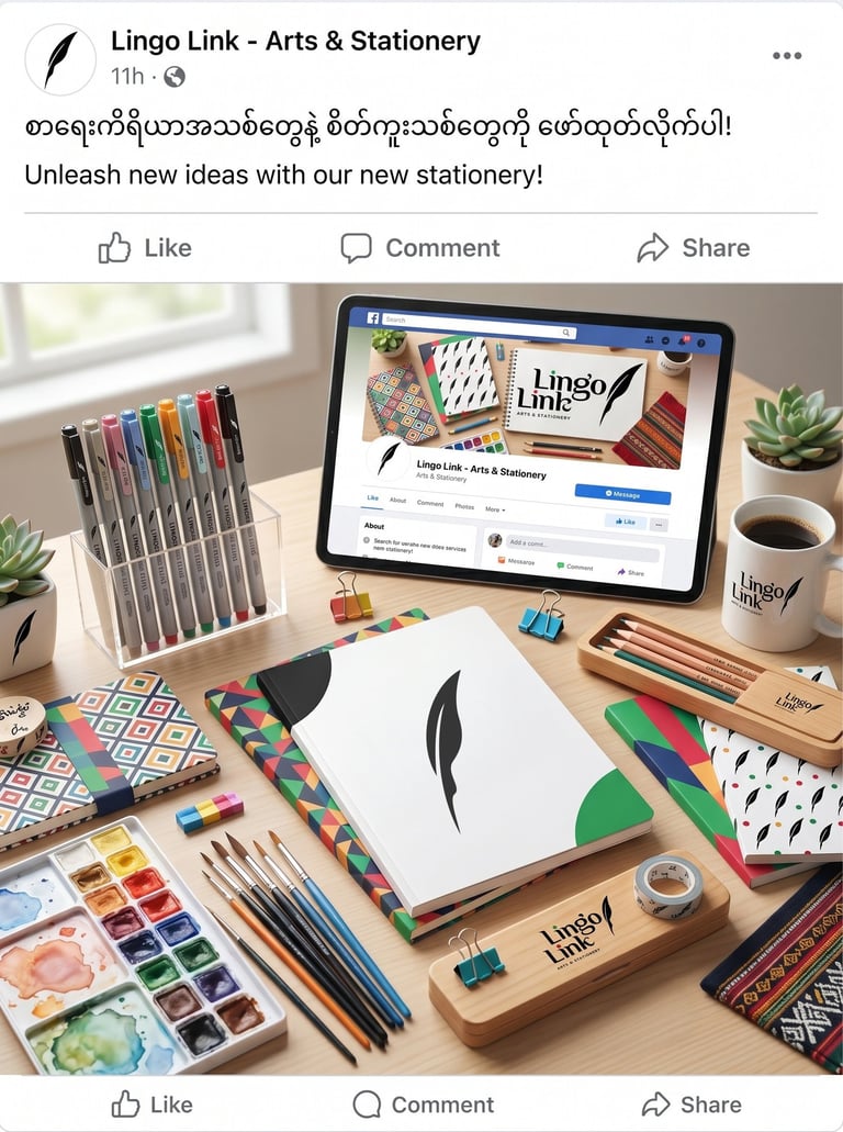
Concept 2: The logo represents the connection between knowledge, creativity, and self-expression. Through its elegant typography and symbolic feather element, the identity reflects the role of stationery as a tool that transforms ideas into meaningful work.
Pikstudio - A studio with heart!
Showcasing premium design for diverse industries.
service@pikstudio.website
+6660685217
© 2024. All rights reserved.