

Concept 1
The Creative Momentum
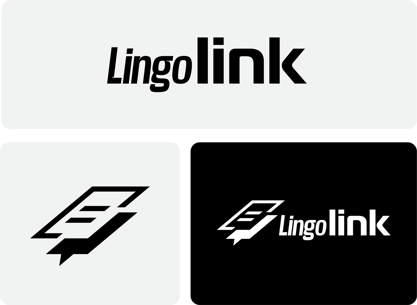
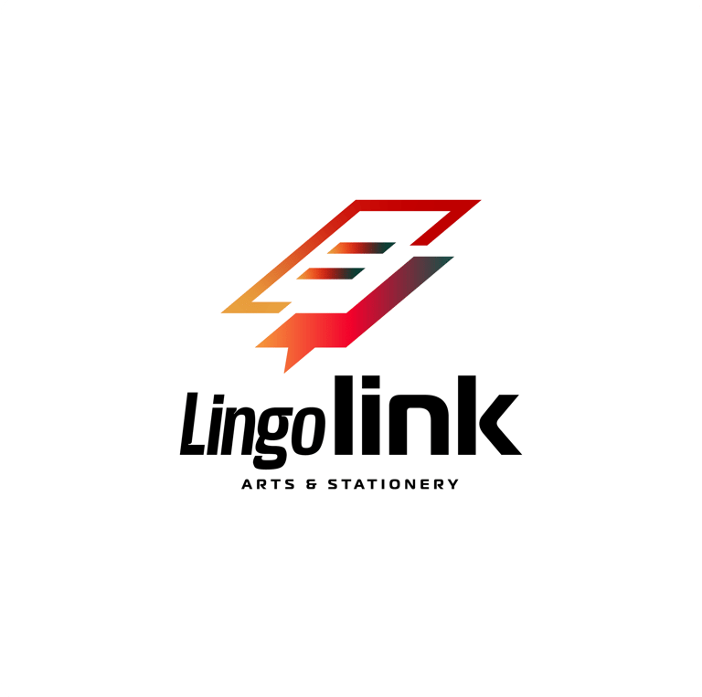
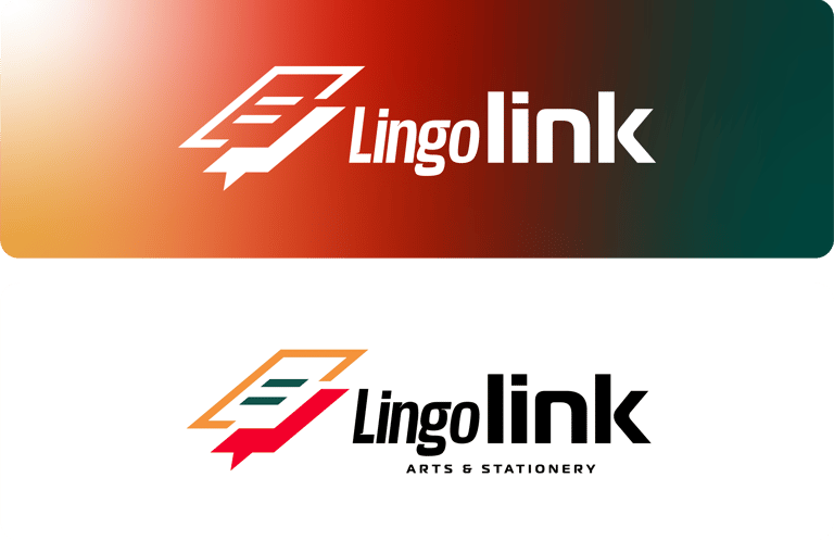
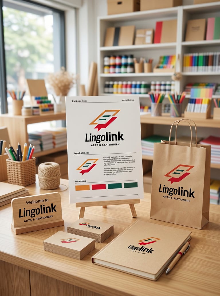
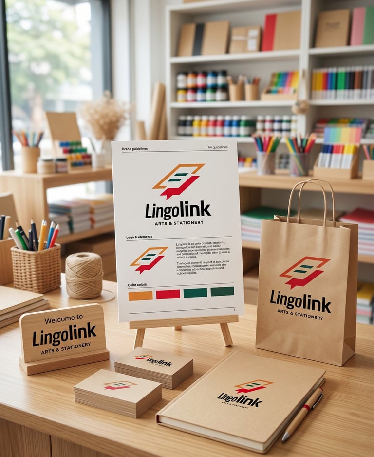
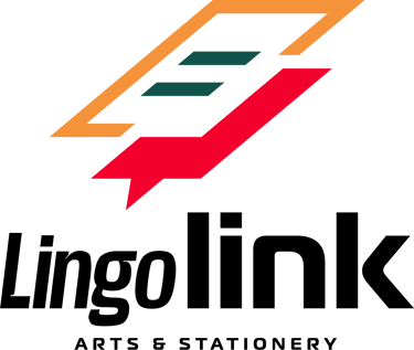
Typography:
The bold sans-serif typography provides clarity and strength, ensuring excellent readability across both physical and digital applications. Its geometric structure complements the symbol and reinforces the modern character of the brand, creating a cohesive identity that feels approachable yet professional.
Colors Psychology


The vibrant color palette reinforces the brand's youthful personality. Orange represents creativity, enthusiasm, and curiosity, while green symbolizes knowledge, growth, and trust. The red element introduces confidence and momentum, creating a sense of action and progress. Together, these colors create an identity that feels lively, optimistic, and inspiring.
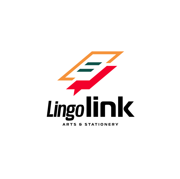

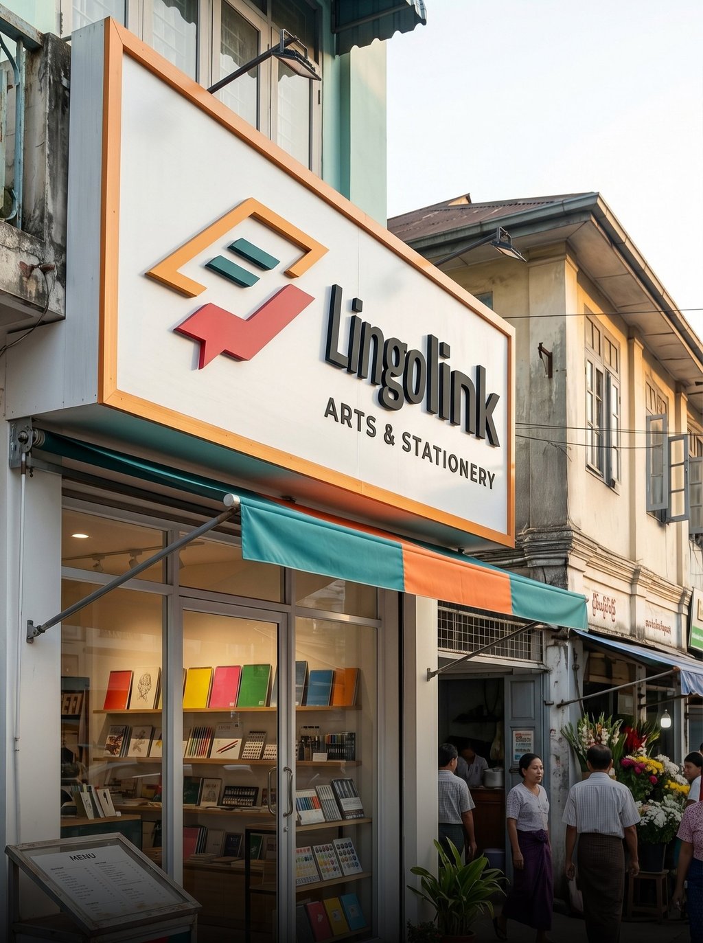
Concept:
This concept is built around the idea of progress, creativity, and forward movement. The geometric symbol creates a dynamic visual form that suggests growth, direction, and continuous development. Its angular structure introduces a contemporary aesthetic that reflects the energy of modern learning and creative exploration, making it highly suitable for a stationery brand serving students, young professionals, and creative individuals.


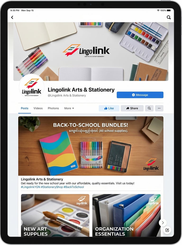
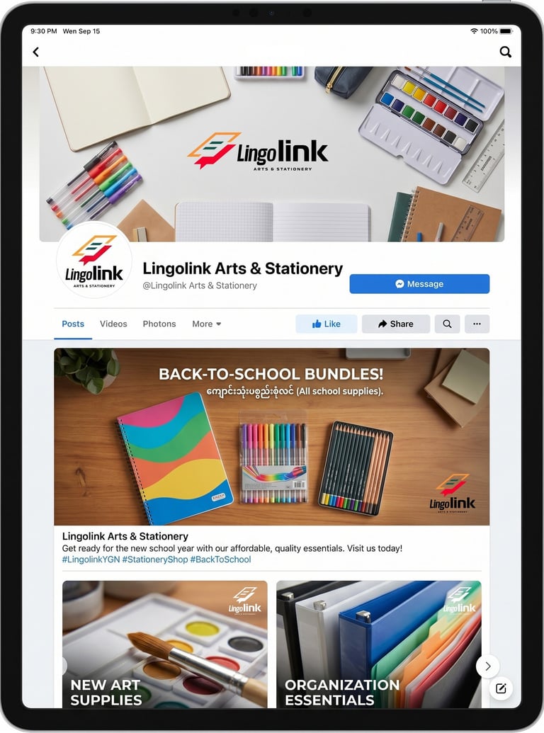


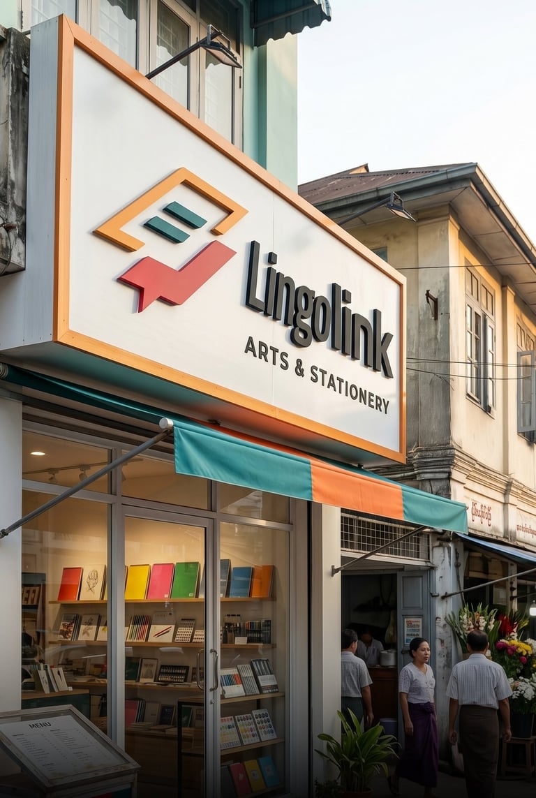
Concept 1: Inspired by movement and progress, this concept represents growth, creativity, and forward thinking. The dynamic symbol and bold typography create a modern identity that encourages learning, innovation, and the pursuit of new ideas.
Pikstudio - A studio with heart!
Showcasing premium design for diverse industries.
service@pikstudio.website
+6660685217
© 2024. All rights reserved.