

Concept 4
ShelterMark
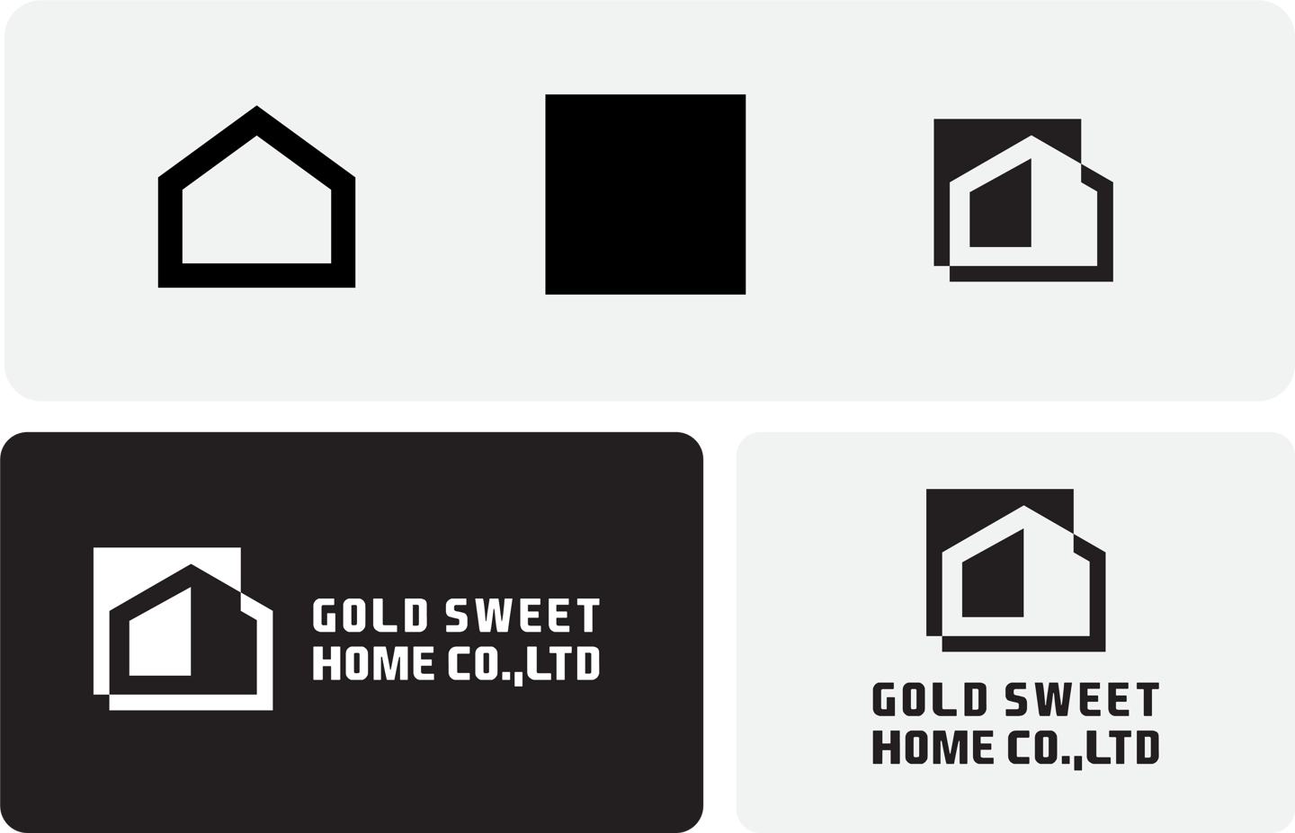

Concept Idea:
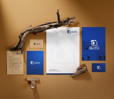
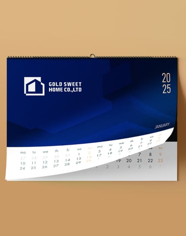
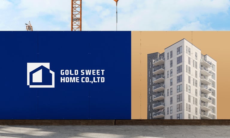
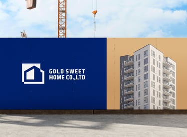
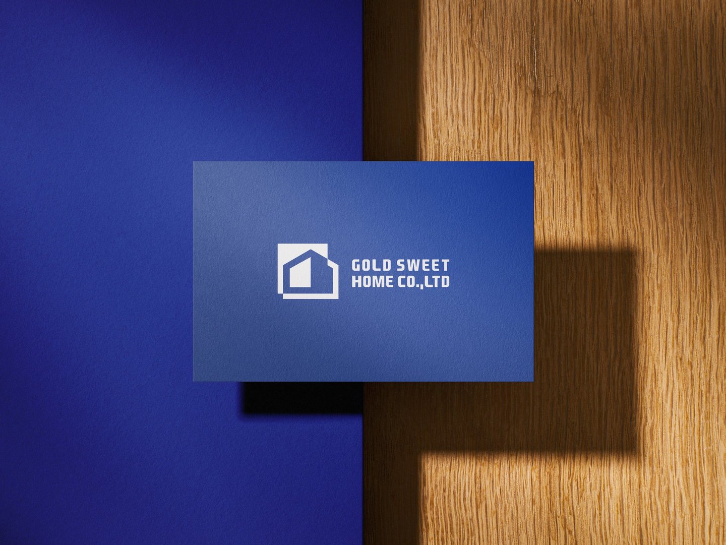
Gold Sweet Home Co., Ltd. is a construction company that brings together solid craftsmanship and a warm, homely promise. The logo is not only clean and geometric—it also leverages the principles of white space to deliver a message of clarity, stability, and refined professionalism.
Typography:
Modern, Bold Sans-Serif
The typeface is bold, square-cut, and mechanical, which gives it a solid, dependable personality essential in the construction industry. The all-uppercase treatment strengthens the impression of confidence and durability.
Rounded terminals add a subtle softness, balancing the strength with a bit of approachability again linking back to the "sweet home" concept.

Color Psychology :
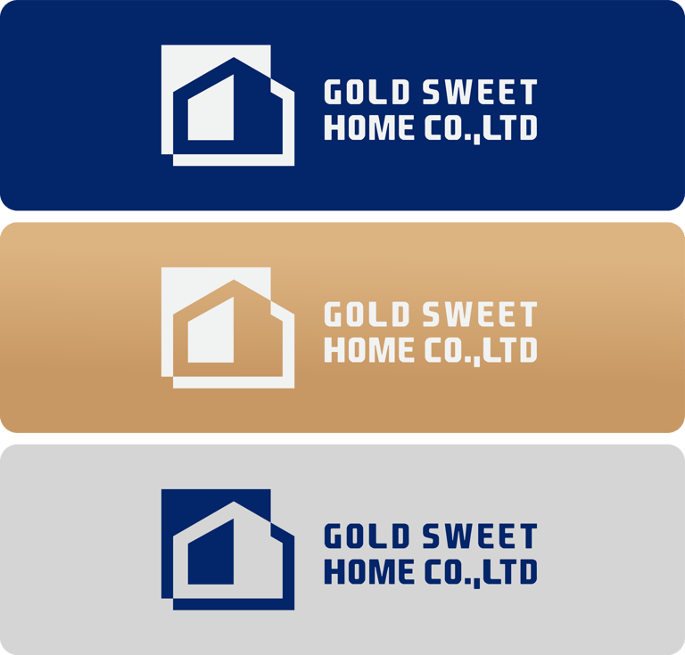
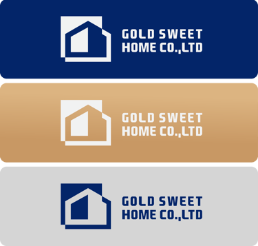
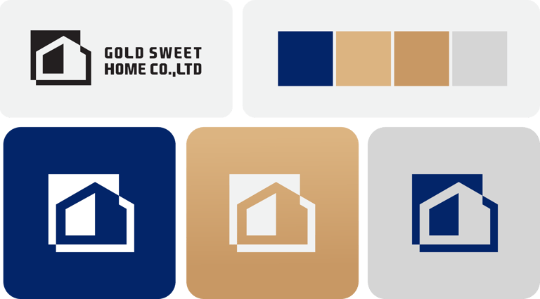
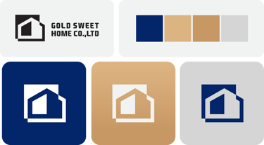
Royal Blue (Trust & Stability)
The deep blue in the logo projects professionalism, trust, and authority qualities clients look for in a construction partner.
It gives a calm, controlled, and reliable impression, perfect for a serious industry like housing.
Gold/Champagne Beige (Luxury & Warmth)
Gold tones subtly signal value, excellence, and premium quality, aligning with the word “Gold” in the name. The warmth of this tone also reflects comfort and livability, not just cold steel and cement.
White & Grey (Clarity & Clean Design)
These neutral colors create balance and help the main tones stand out.
They emphasize simplicity, clean design, and transparency, enhancing the brand’s honest, straightforward feel.
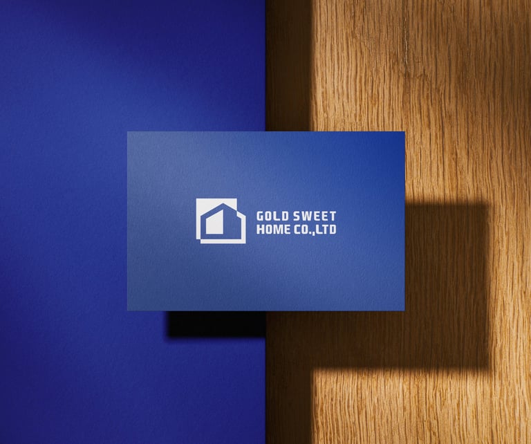
Concept 4: This concept idea is well-positioned to grow into a premium, community-trusted construction company, while maintaining a brand that feels personally invested in each home.


Pikstudio - A studio with heart!
Showcasing premium design for diverse industries.
service@pikstudio.website
+6660685217
© 2024. All rights reserved.