

Concept 1
Minimalist Essence
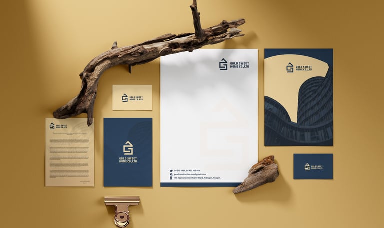
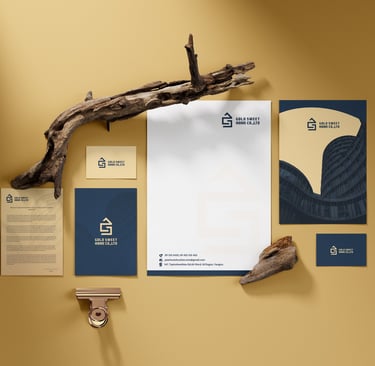
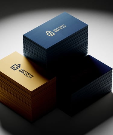
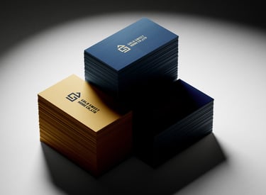
Concept:
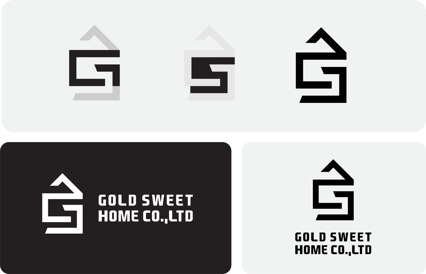
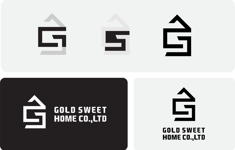
This design embodies the core principles of minimalism—clarity, functionality, and efficiency. The interwoven “G” and “S” form a structured, home-like shape, symbolizing solid foundations and seamless design. The clean lines reflect trust, reliability, and a forward-thinking approach to construction.
Typography:
A bold, industrial-style sans-serif font enhances readability and reinforces the construction industry’s strength.
The text is slightly condensed, symbolizing compact and efficient design.

Colors Psychology
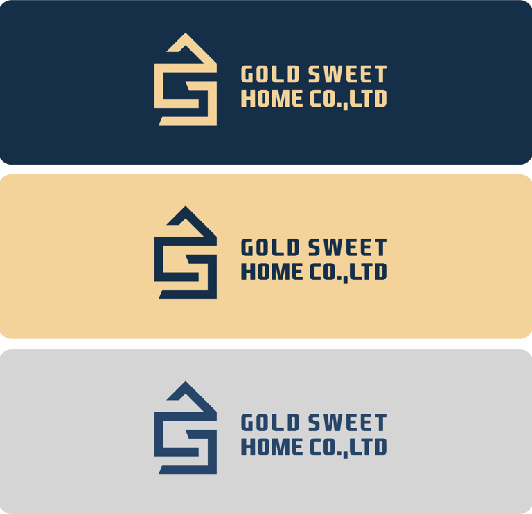
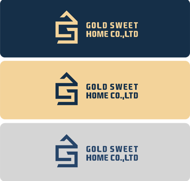
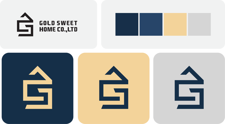
Navy Blue & Beige: Navy blue represents trust, stability, and professionalism, while beige adds warmth and approachability, making the brand feel both reliable and inviting.
Gray: Enhances premium aesthetics, reinforcing high-quality service.
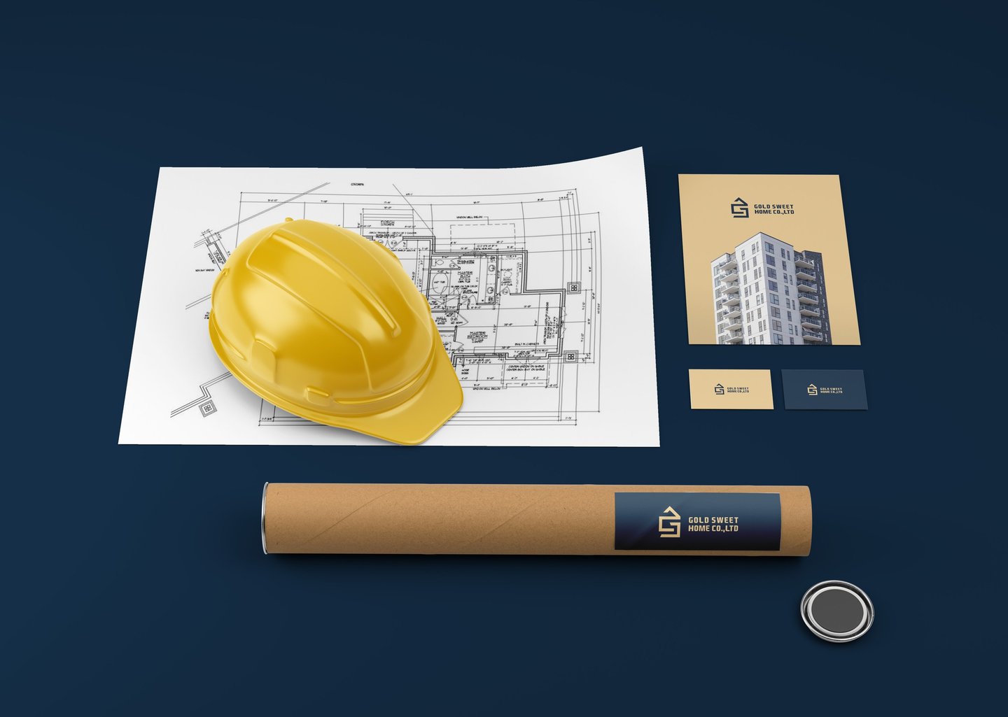
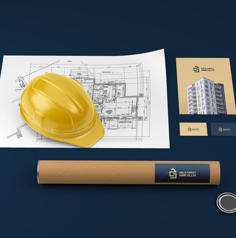
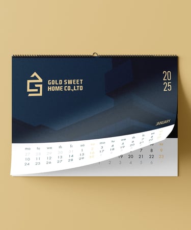
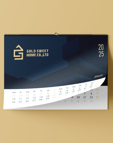
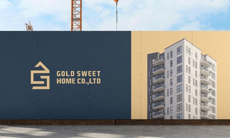
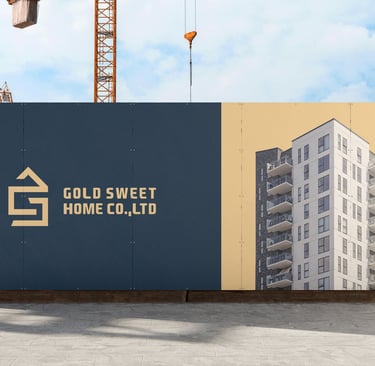
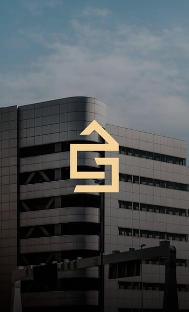
Concept 1: This logo features an abstract “GS” shaped like a home, cleverly integrating the company’s initials while visually representing a house. The sharp angles and geometric lines reflect precision, stability, and modern construction expertise.


Pikstudio - A studio with heart!
Showcasing premium design for diverse industries.
service@pikstudio.website
+6660685217
© 2024. All rights reserved.