

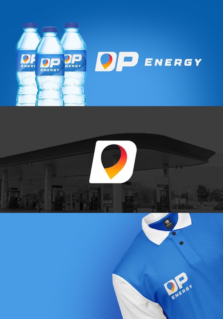
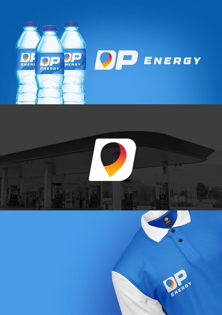
Concept 1
"Fuel Spot"
Concept:
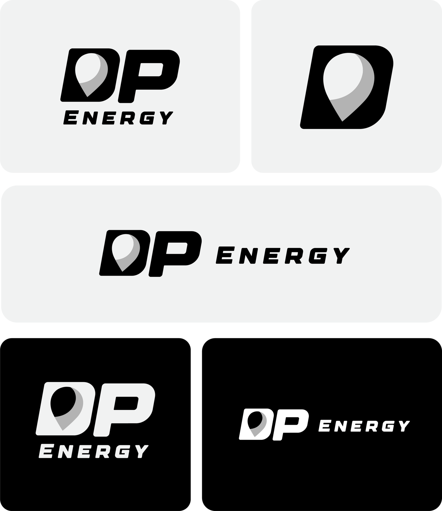
This logo incorporates a dynamic location pin to emphasize accessibility, navigation, and nationwide presence. The abstract pin hints at fuel flow and brand centrality — perfect for a gas station aiming to be recognized and trusted across regions.
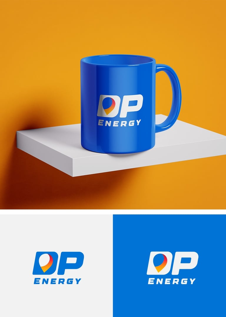
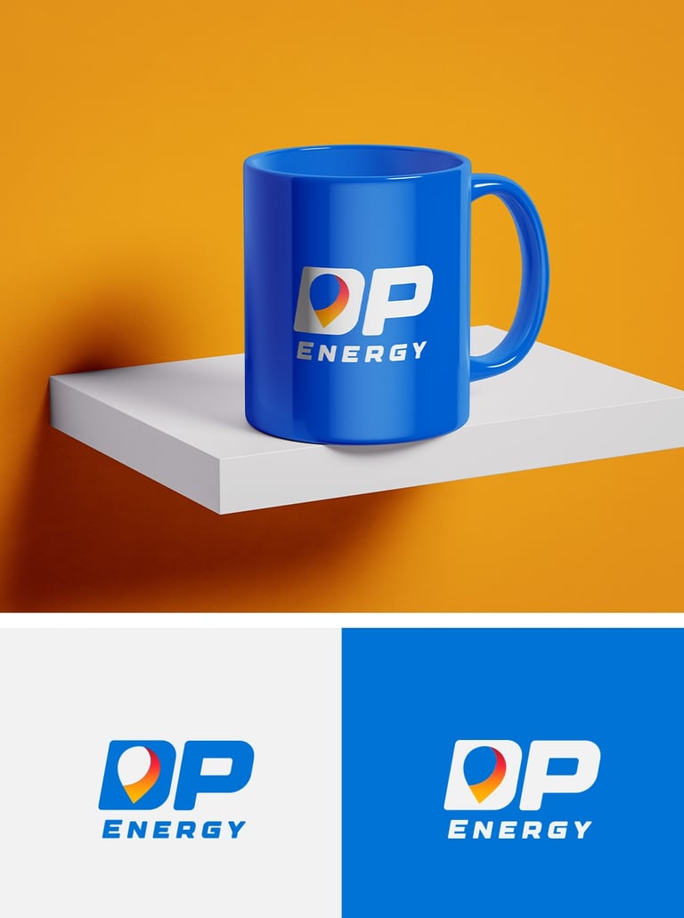
Typography:
Strong, angular sans-serif with forward-leaning italics reflects momentum and strength.
Compact spacing symbolizes fuel efficiency and compact service.
Colors Psychology
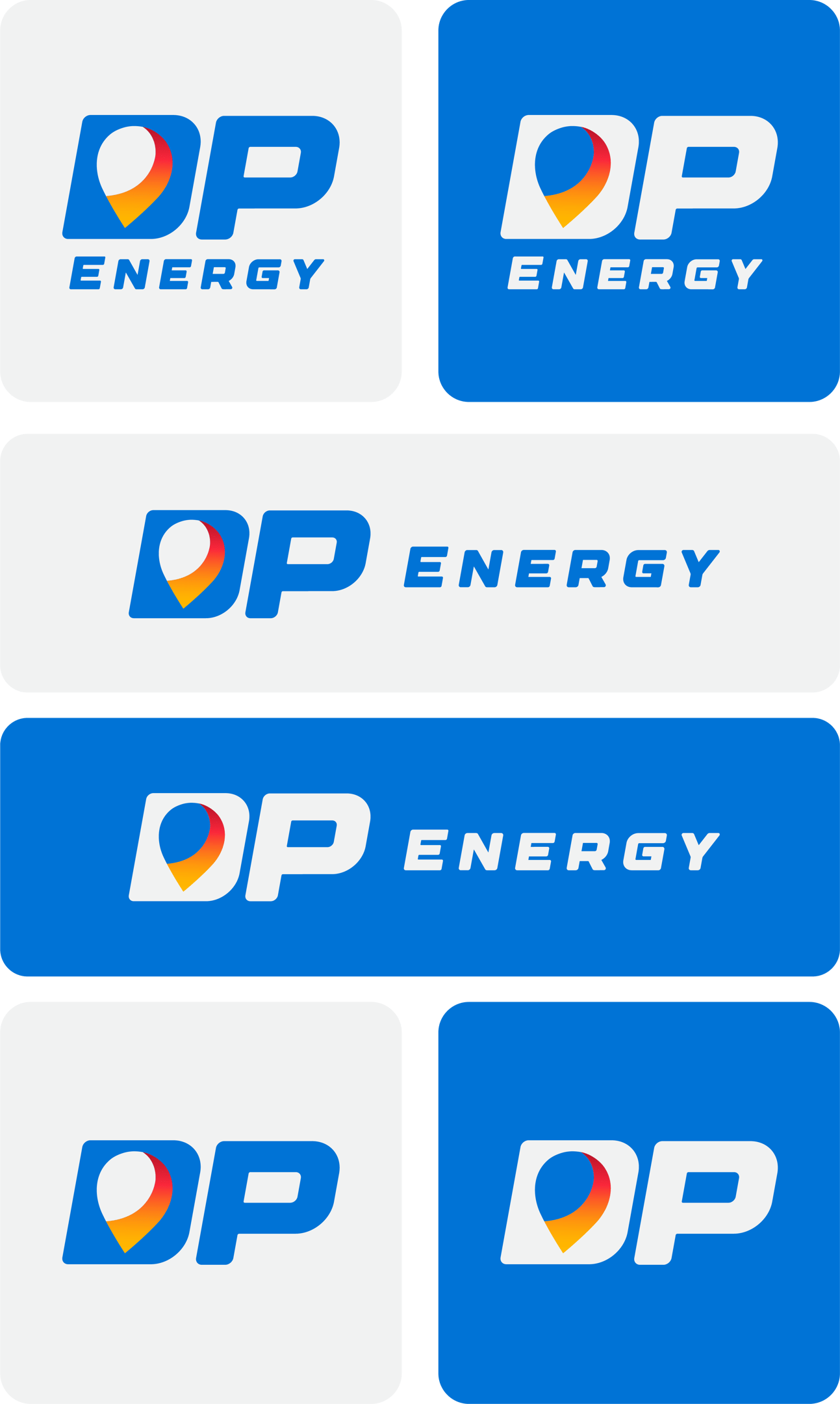


Blue: Represents trust, professionalism, and energy stability.
Orange–Red Gradient: Suggests fuel combustion, movement, warmth, and vitality — key emotions tied to travel and mobility.
White: Cleanliness and transparency.
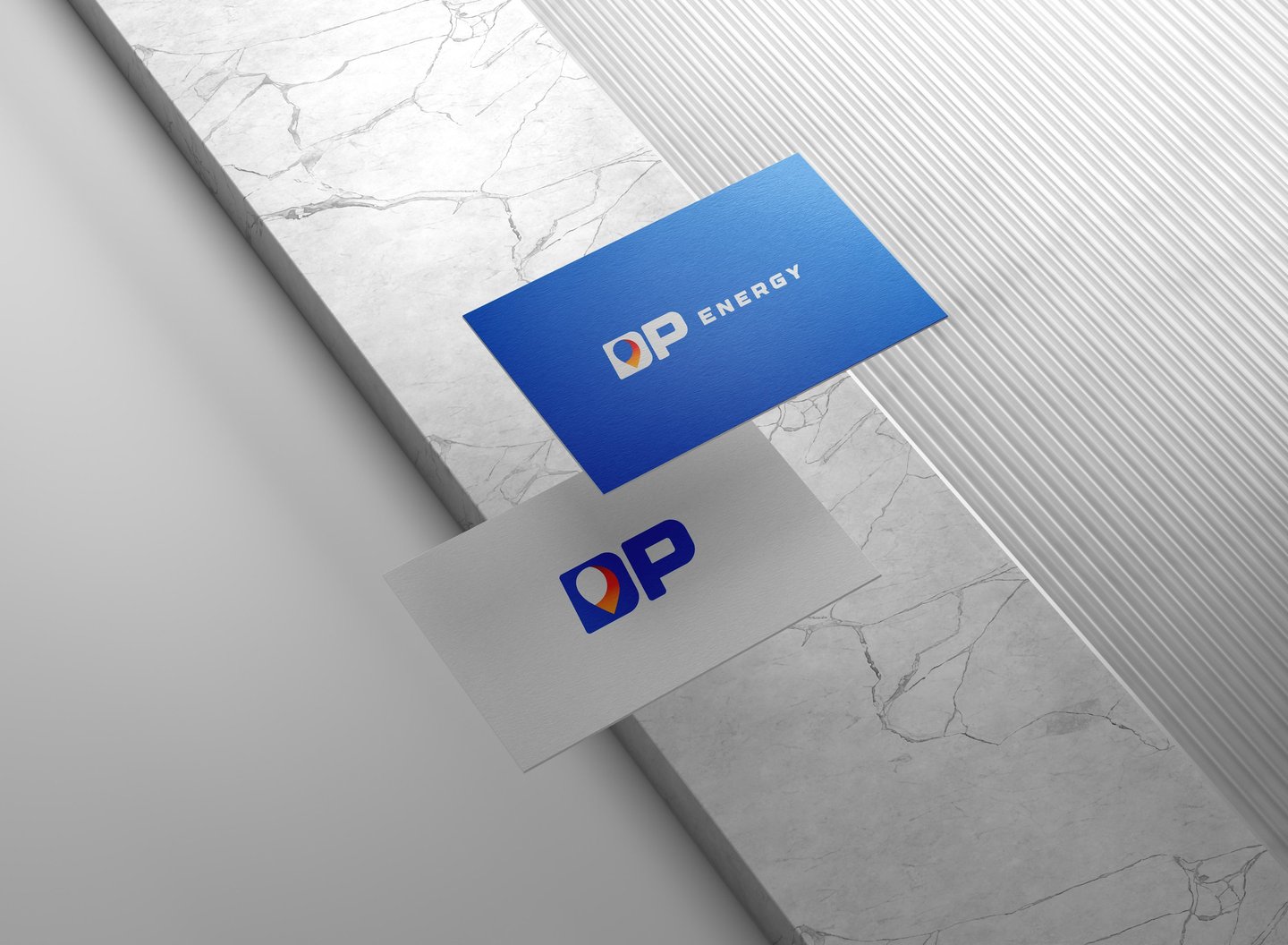
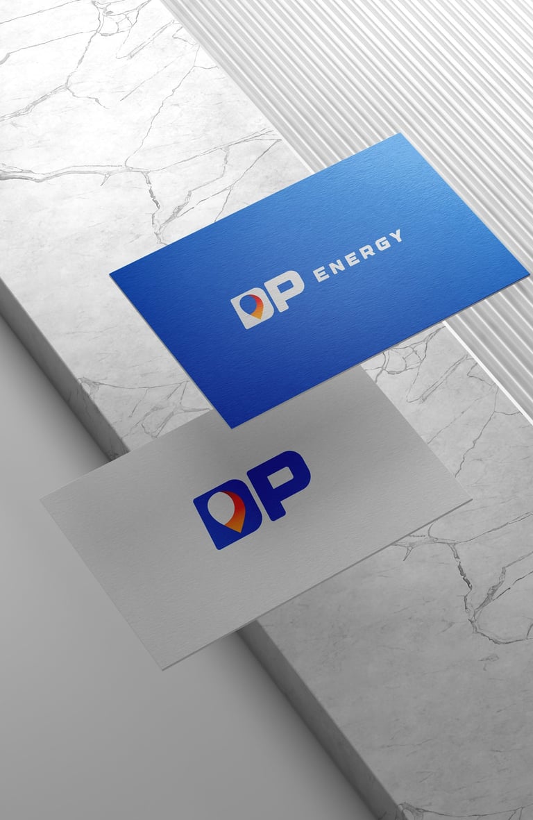
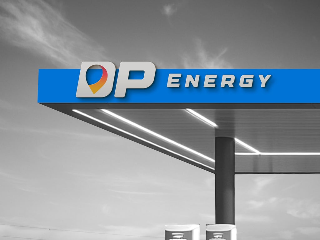
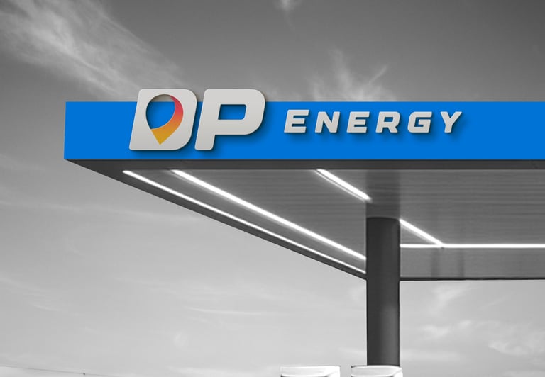
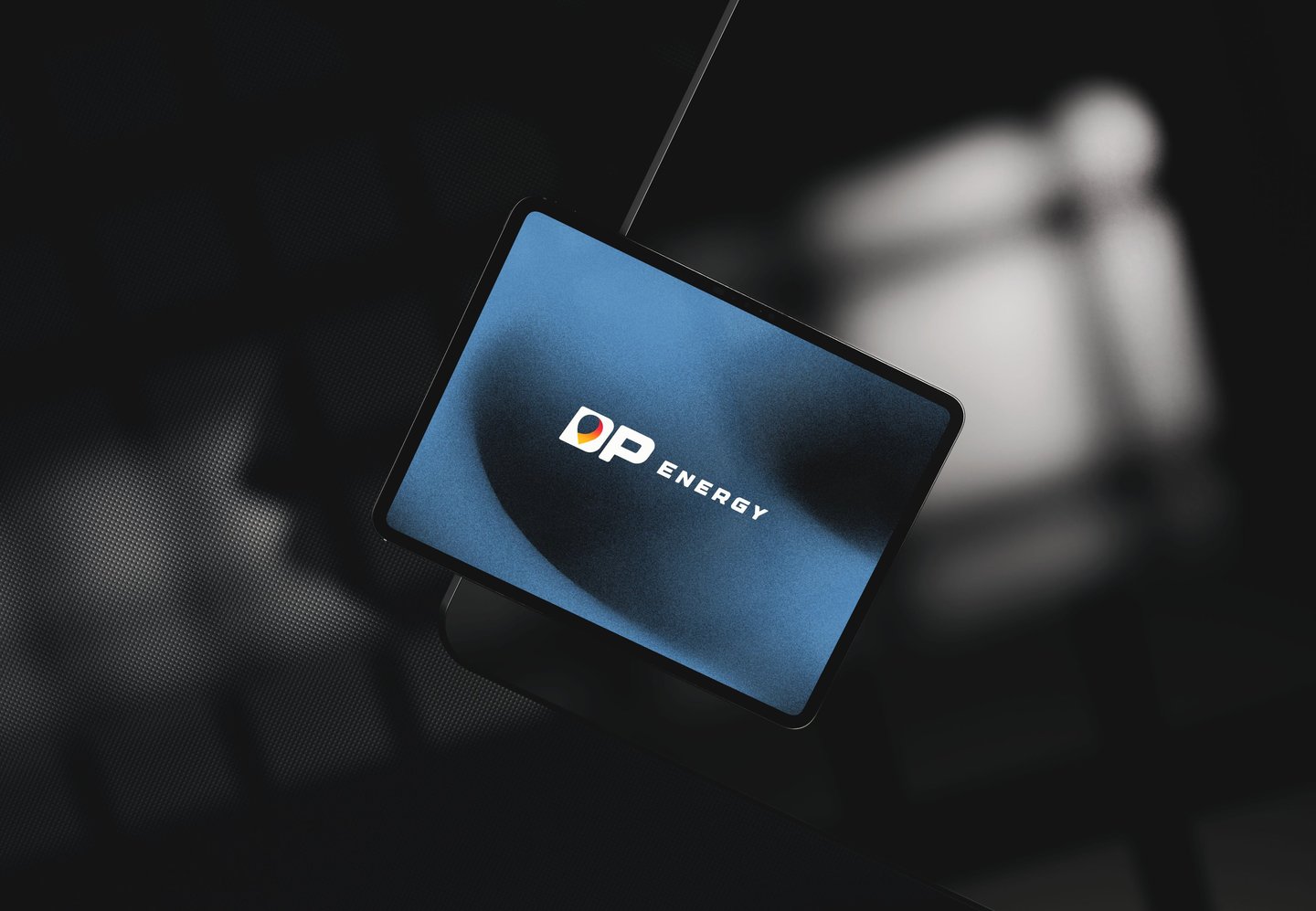
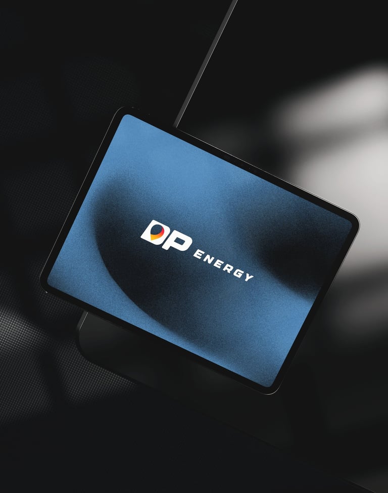
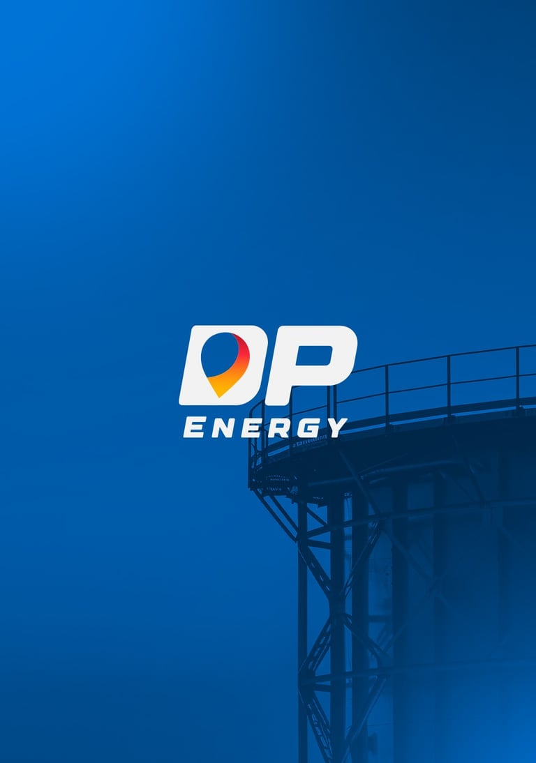
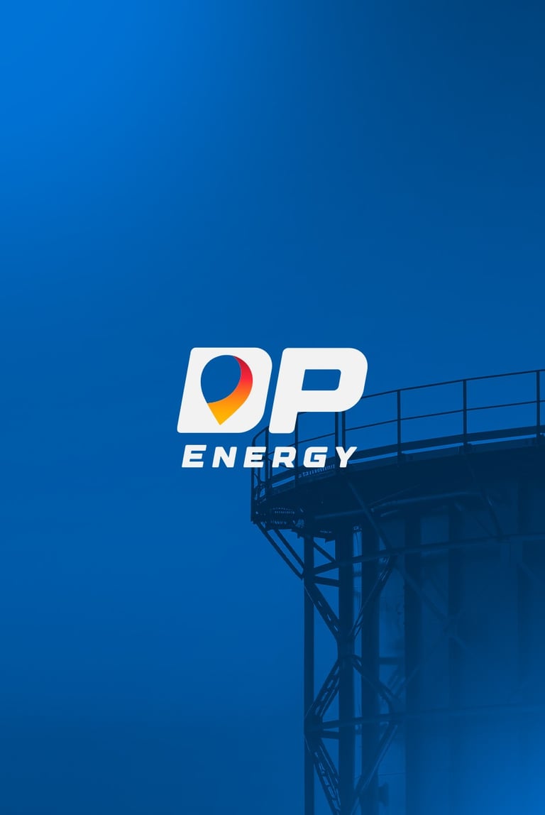
Concept 1 : This design features a location pin integrated into the letter "D", symbolizing direction, presence, and accessibility. It reflects DP Energy’s mission to be a dependable station at every destination — modern, energetic, and easy to find.


Pikstudio - A studio with heart!
Showcasing premium design for diverse industries.
service@pikstudio.website
+6660685217
© 2024. All rights reserved.