Concept 2
Ribbon in Motion
Design Philosophy
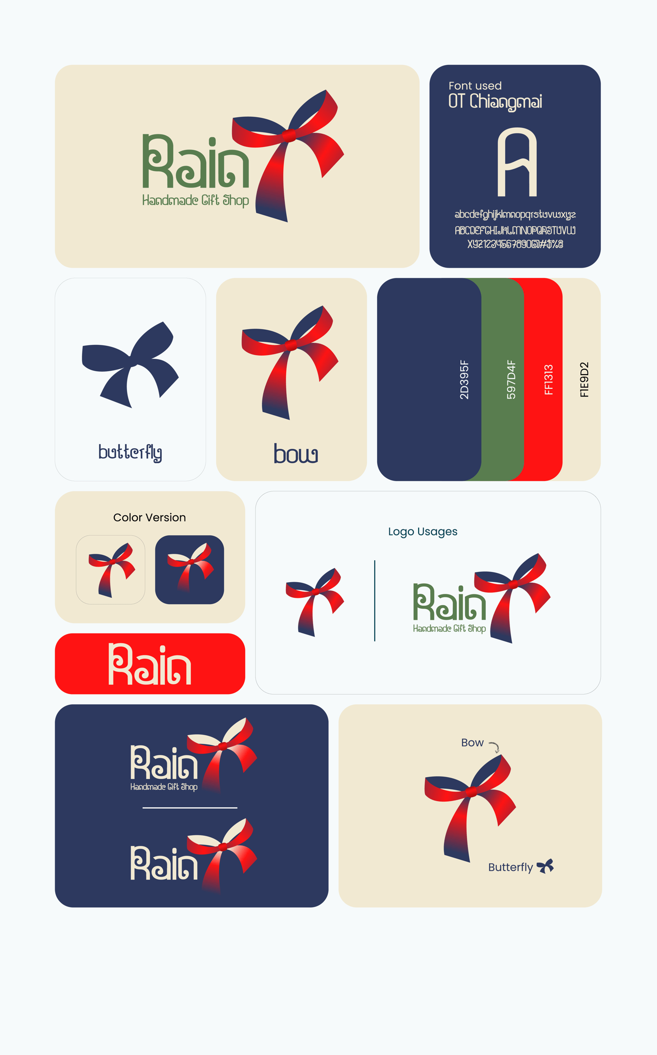
The symbol combines:
A flowing ribbon
A tied gift bow
Butterfly wings
Organic movement
The dynamic curves represent creativity, craftsmanship, and emotional connection.
The design suggests that every handmade gift carries a personal story waiting to unfold.
Colors Psychology
Navy Blue (#2D395F)
Navy represents:
Trust
Reliability
Professionalism
Stability
It provides balance while elevating the handmade products with a refined appearance.
Forest Green (#597D4F)
Green communicates:
Nature
Sustainability
Handcrafted authenticity
Growth
Calmness
This reflects the careful craftsmanship behind every handmade gift.
Bright Red (#FF1313)
Red symbolizes:
Celebration
Love
Passion
Excitement
It reinforces the emotional joy of gifting.
Warm Cream (#F1E9D2)
Cream softens the palette by introducing:
Comfort
Warm hospitality
Handmade warmth
Timeless elegance
Brand Concept:
Ribbon in Motion celebrates the emotional moment of gift giving through a flowing ribbon that gracefully transforms into a butterfly. The movement within the symbol creates a sense of life, excitement, and celebration, making the logo feel dynamic and memorable.
Rather than using rigid geometric construction, this concept embraces fluid movement, expressing the handmade care behind every product.
Typography:
OT Chiangmai
The custom-inspired display typeface brings individuality to the brand.
Its unique characteristics include:
Rounded geometric construction
Decorative personality
High memorability
Friendly proportions
Boutique appearance
The typography supports the handcrafted nature of the business while remaining distinctive and approachable.
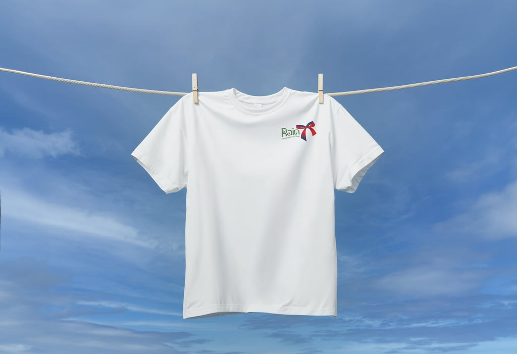

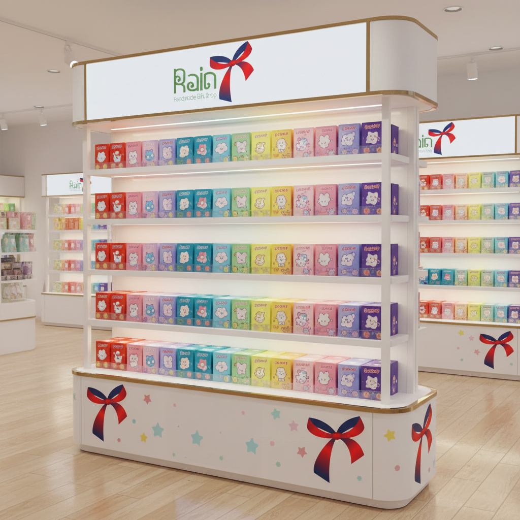
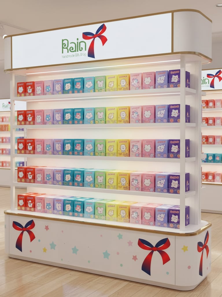
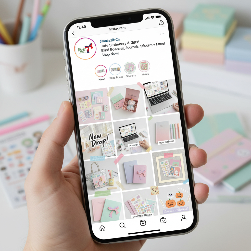
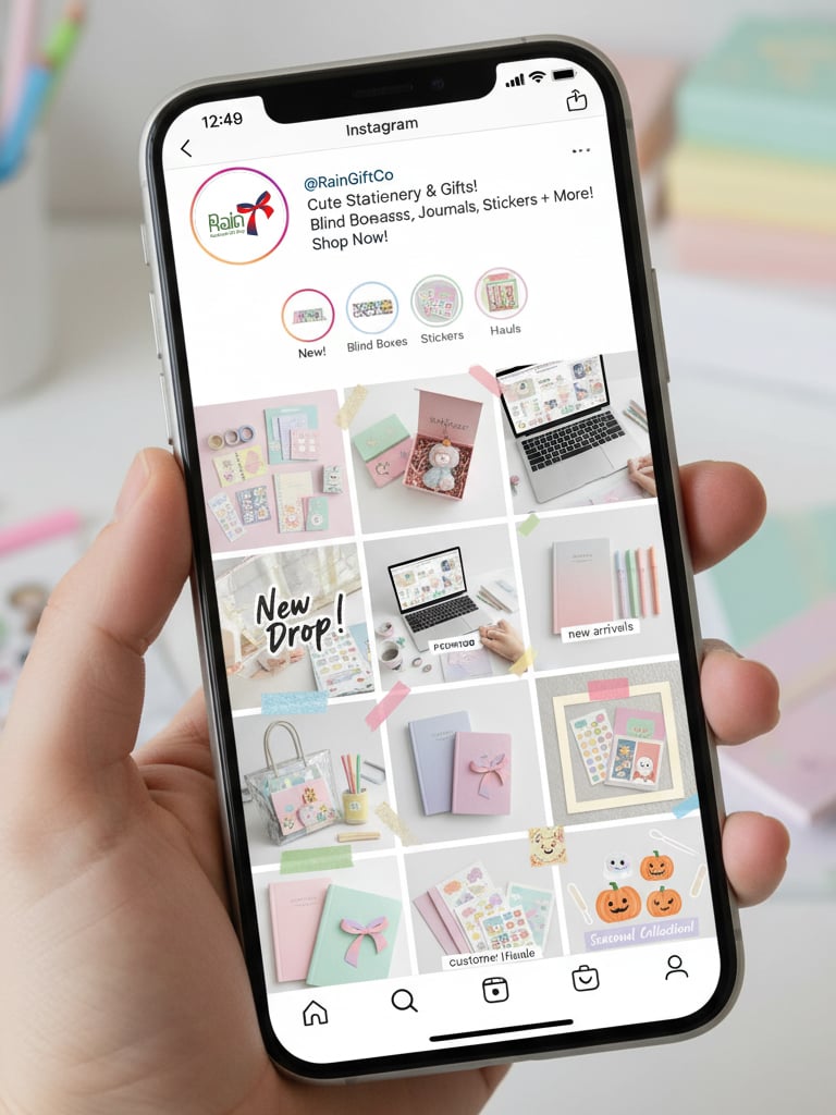
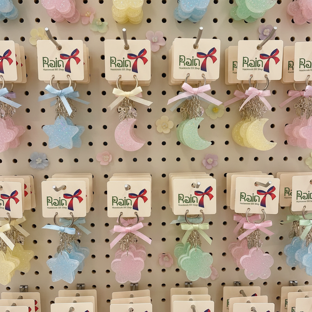
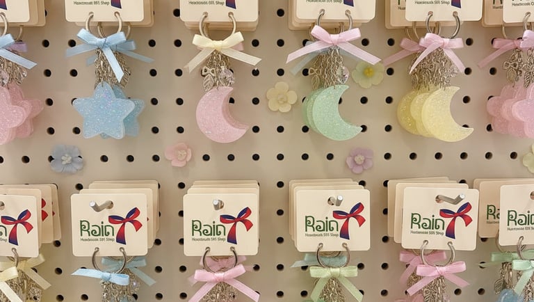
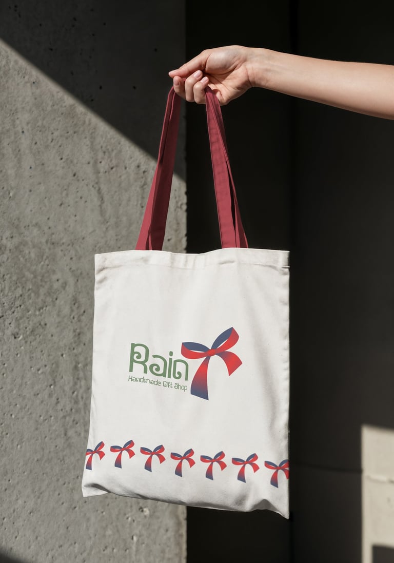
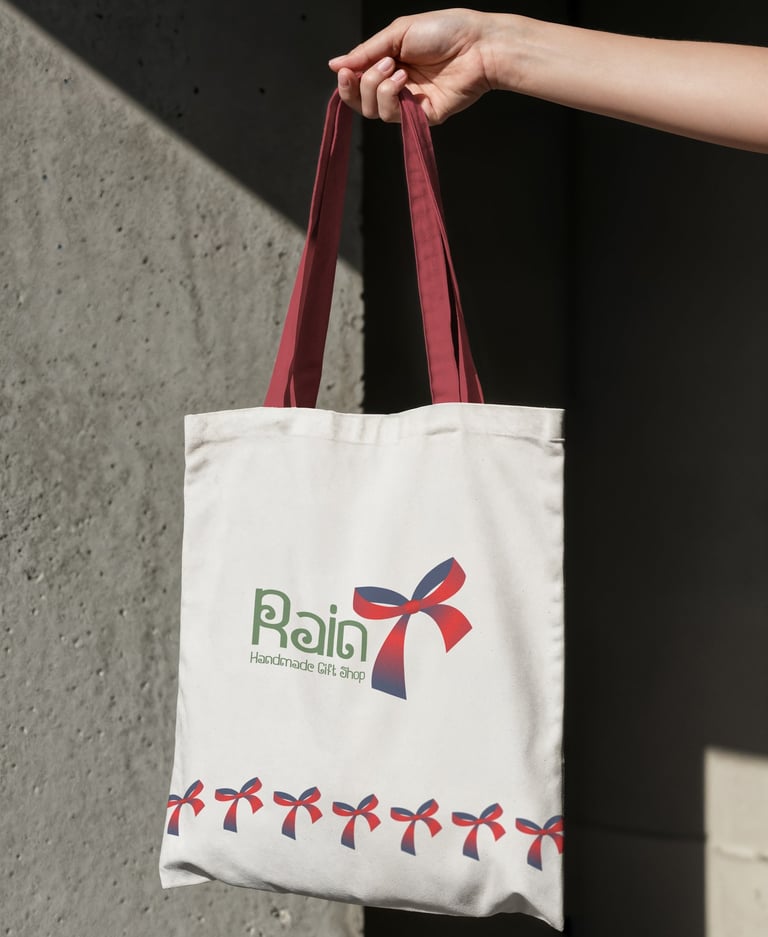
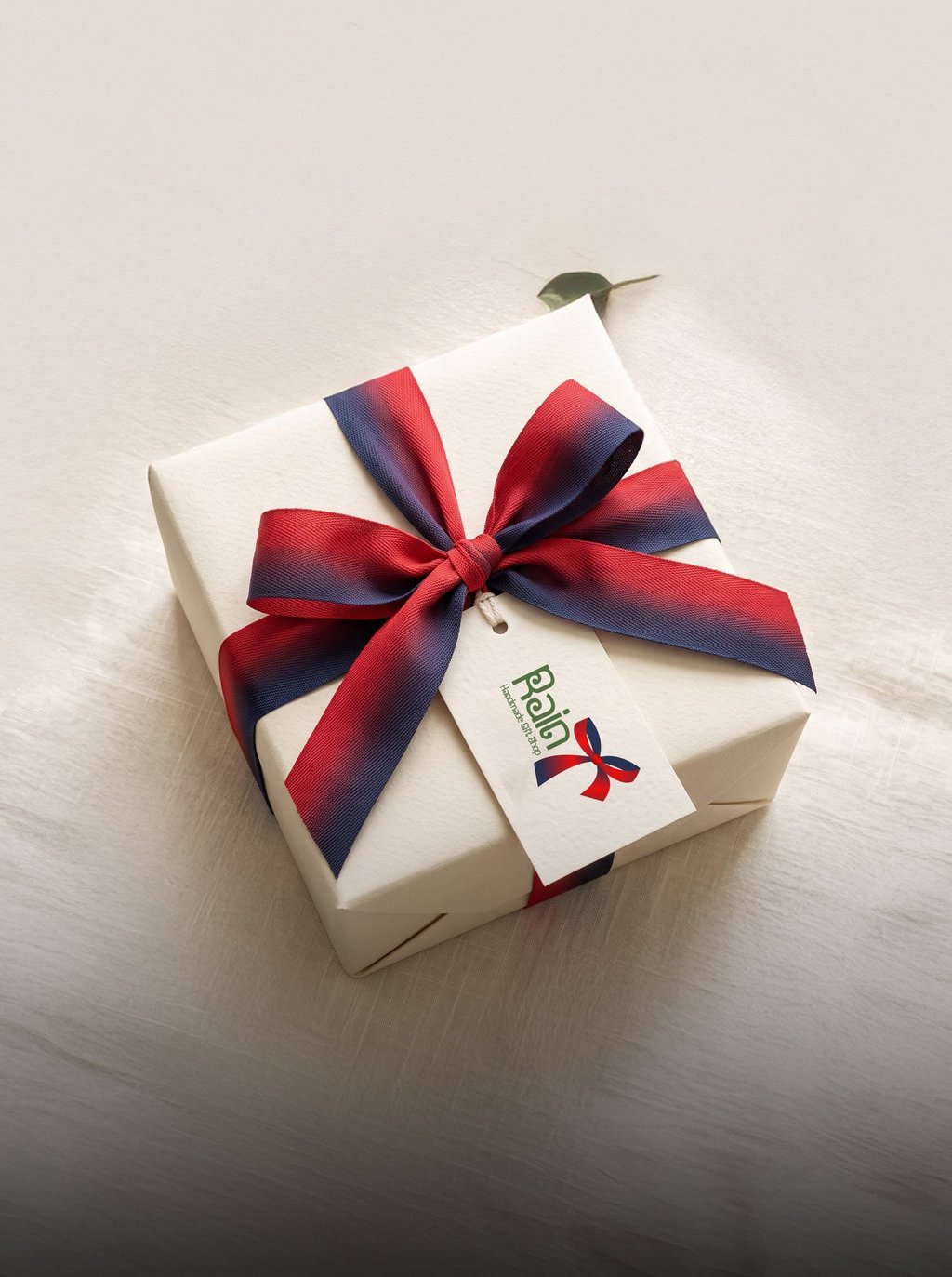
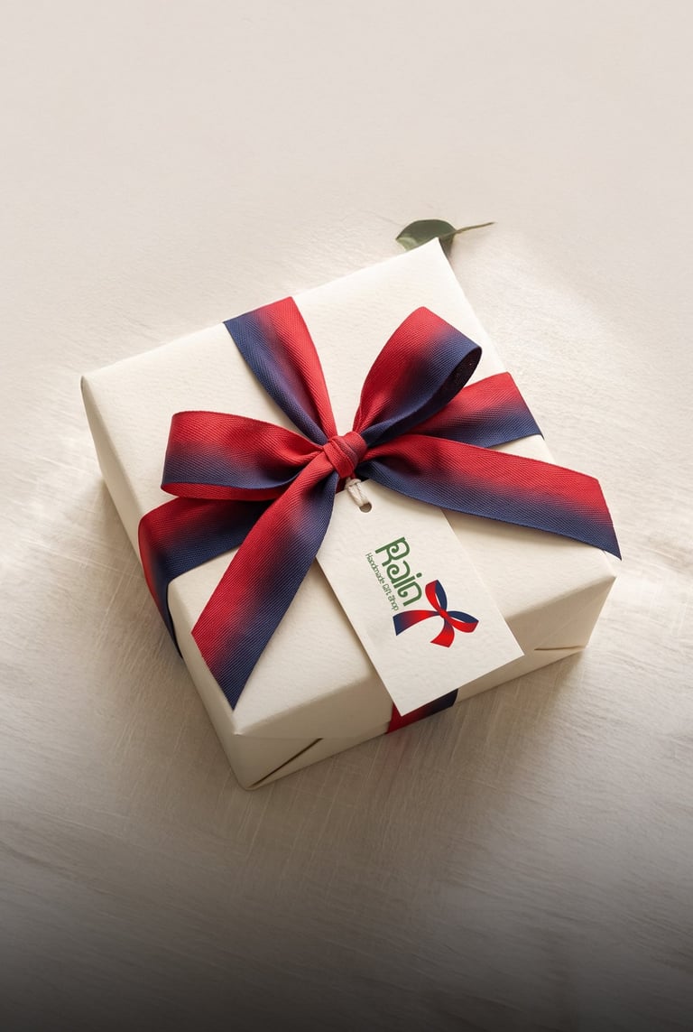
Concept 2: transforms the traditional gift ribbon into an expressive visual language. The identity conveys craftsmanship, warmth, and celebration, making every interaction feel personal and heartfelt.

Pikstudio - A studio with heart!
Showcasing premium design for diverse industries.
service@pikstudio.website
+6660685217
© 2024. All rights reserved.