Minimalist House with an Arrow Accent
Concept I


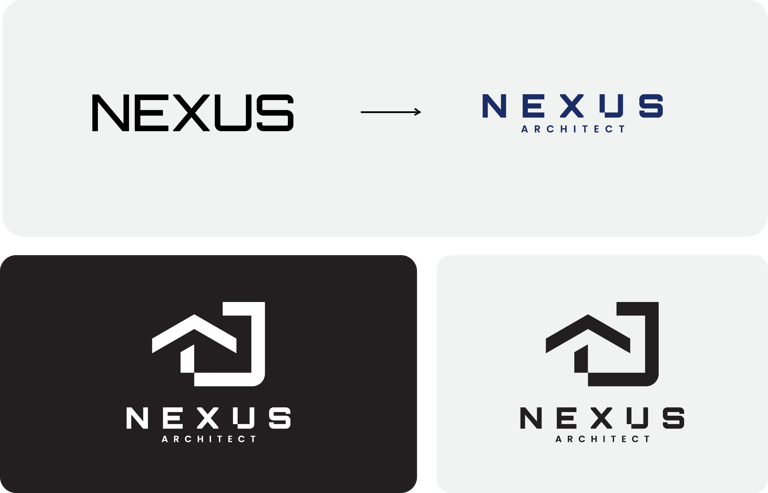
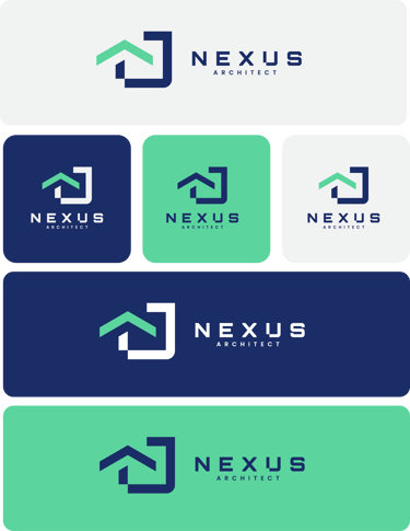
This design combines simplicity and modernity. The arrow-like roof element represents forward-thinking innovation, while the clean geometric shape conveys stability and professionalism. It’s a timeless representation of an architect brand.
A clean sans-serif font has been selected for its readability and modern look, balancing simplicity with sophistication.
The bold weight adds strength to the overall design, complementing the geometric elements.
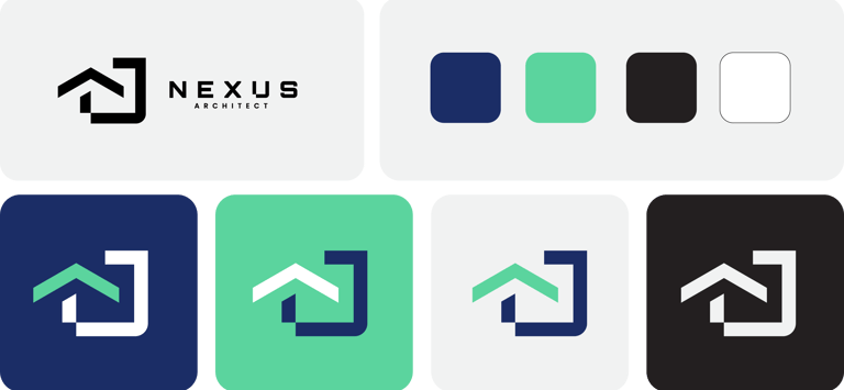

Navy Blue: Represents trust, stability, and expertise.
Teal Green: Adds a fresh, innovative vibe.
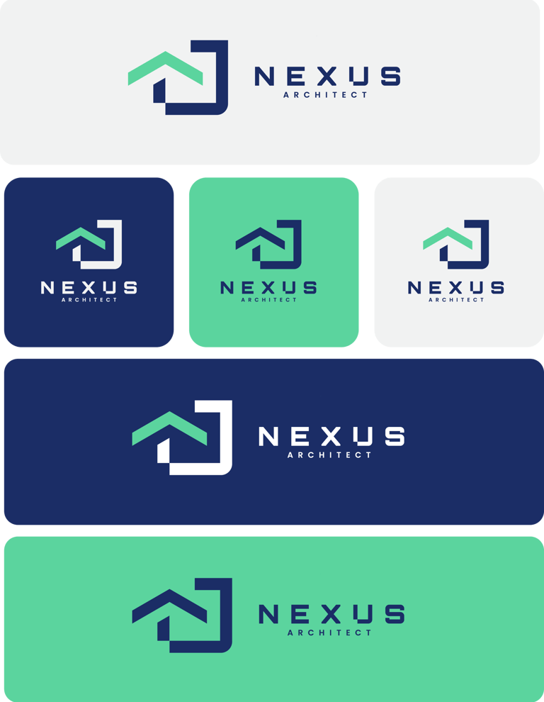
Recognition: The universal house symbol creates instant association with architecture.
Forward Thinking: The arrow communicates growth, progress, and continuous innovation, resonating with the slogan.
Versatility: Works effectively on both large-scale signage and intricate architectural documents.


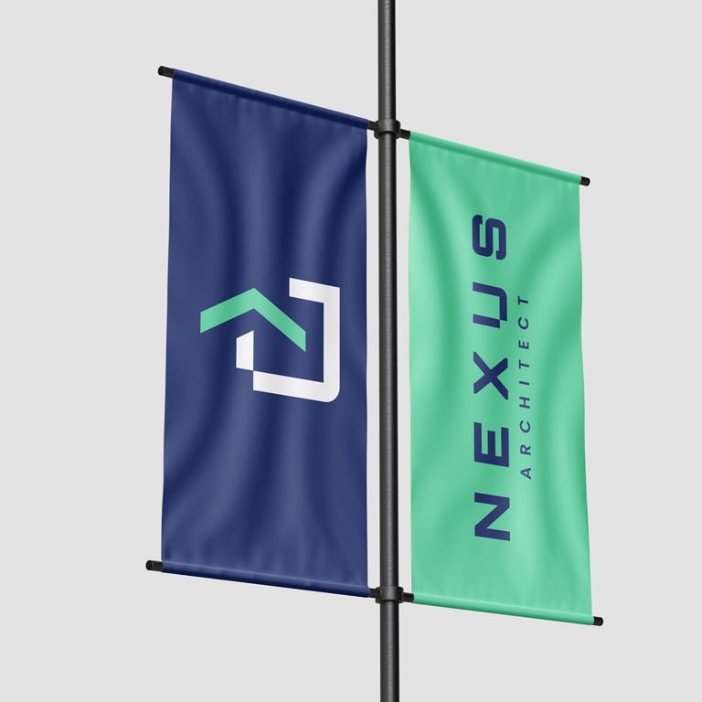

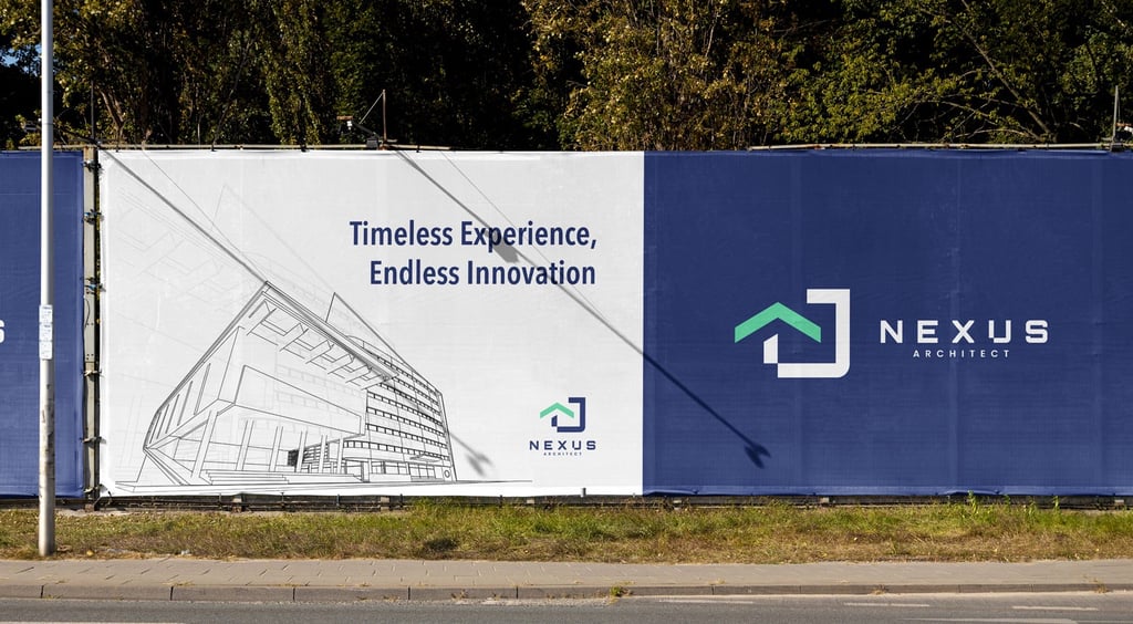
This logo shines in corporate and professional settings, such as blueprints, contracts, and digital branding. It conveys your expertise and innovative spirit at a glance.


