Concept II
iPOWER


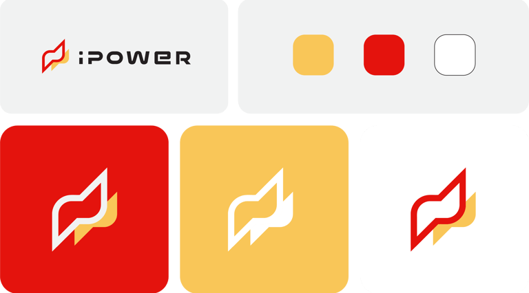
Logo Design:
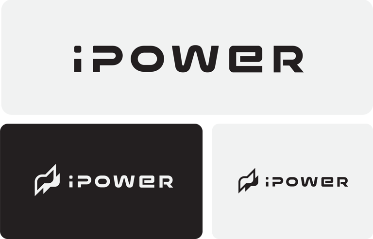
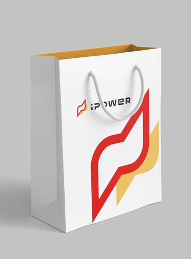
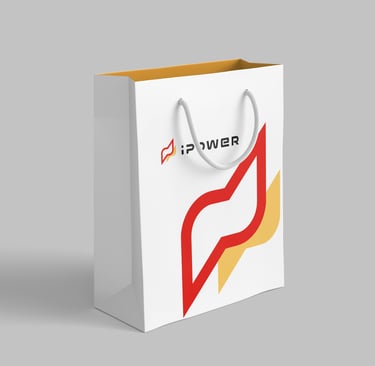
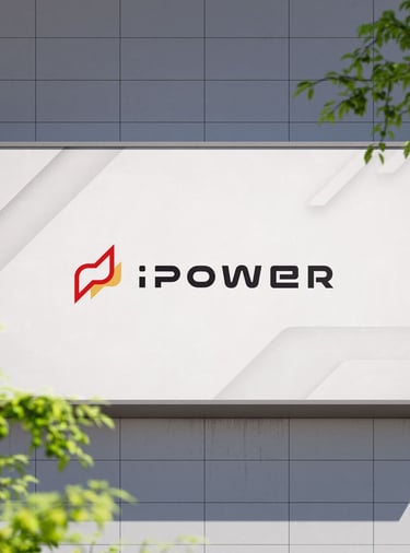
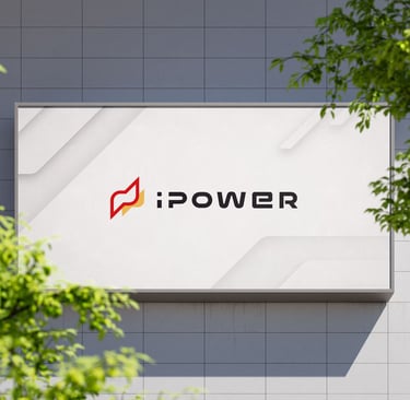
The logo symbolizes forward motion and growth. The curved lines in the icon suggest smooth communication, and the angular shape implies strength and reliability.
Typography:
A bold sans-serif typeface is used to convey confidence and clarity. Its rounded corners balance the strong lines of the logo, creating a sense of approachability while remaining professional.
Color Palette:
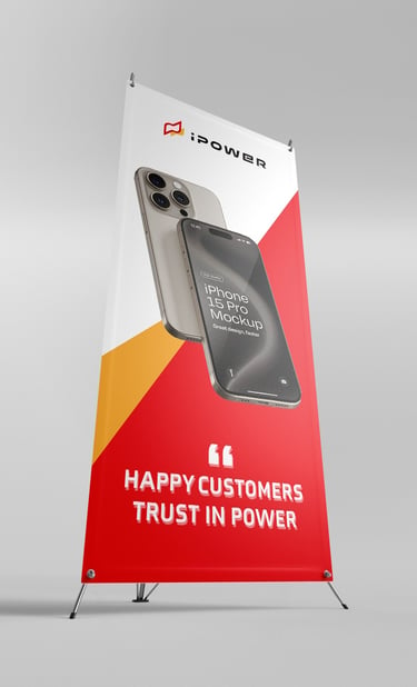
Red: Represents energy, passion, and strength.
Black: Adds sophistication and balance.
Yellow Accent: Symbolizes optimism and innovation.
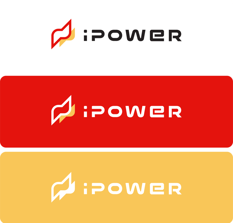
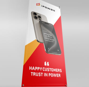
Usage: Ideal for storefronts, digital platforms, and promotional materials. The bold contrast ensures strong visibility in various applications.
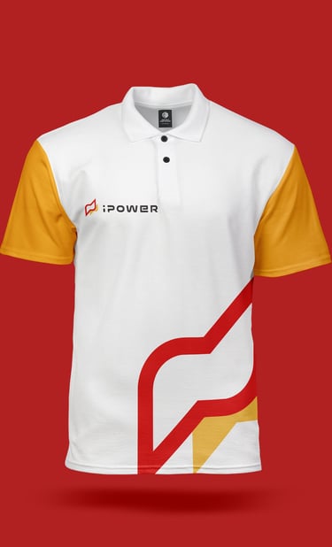
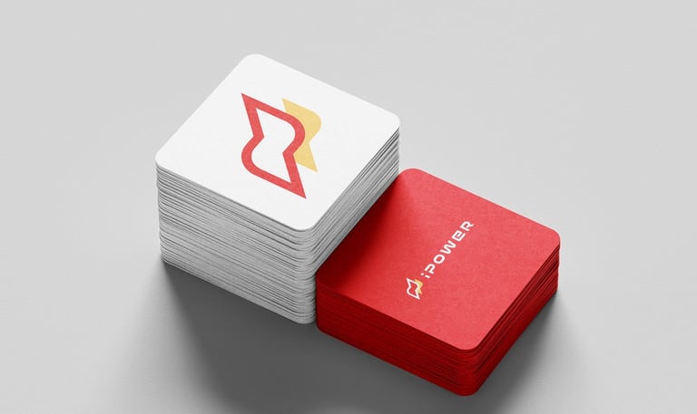
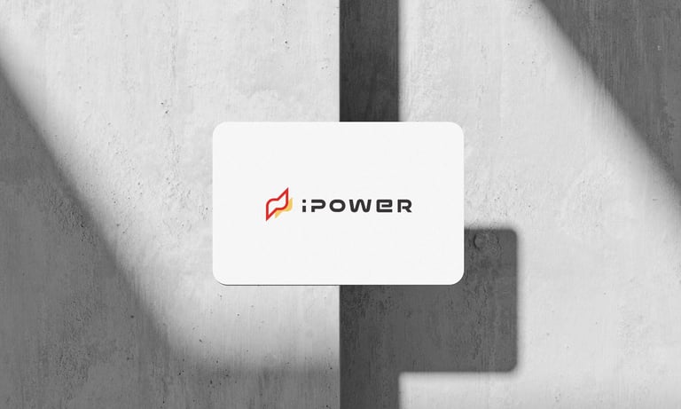


Concept 2 is tailored for digital-first environments, targeting tech-savvy users.


