Concept 1
" TalkMark "
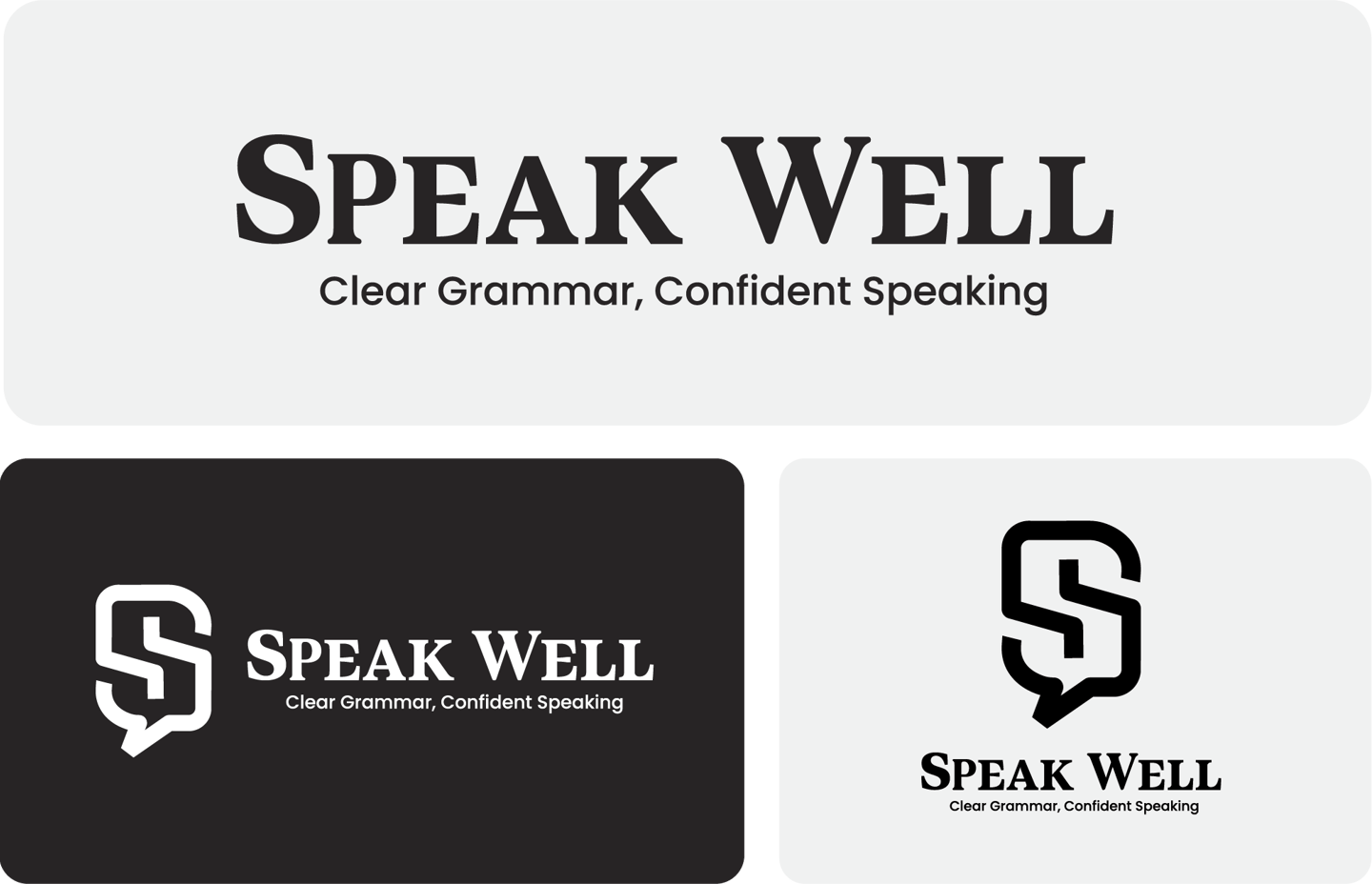
Concept:
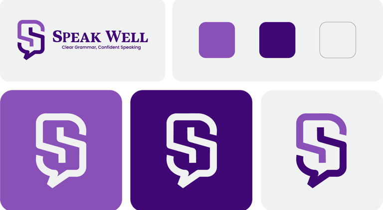
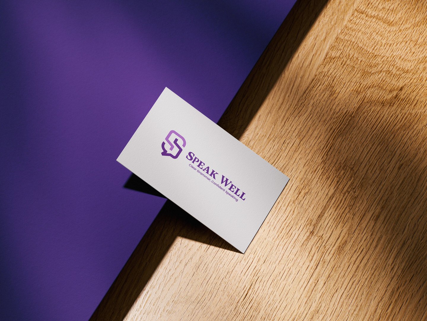
The emblem in this design can be conceptually named "TalkMark" — a fusion of:
Speech Bubble = Communication, dialogue, expression.
S-Shape Monogram = Represents “Speak”
This monogram serves as a badge of clarity, encapsulating both conversation and instruction in a single iconic form.
Font Characteristics:
Speak Well Typeface (Serif and Sans Pairing)
The primary brand font is a classic serif typeface—chosen for its academic, trustworthy, and confident presence.
Serif fonts carry a sense of credibility and authority.
The subtitle font is a rounded modern sans-serif, adding approachability and modern balance.


Color Psychology
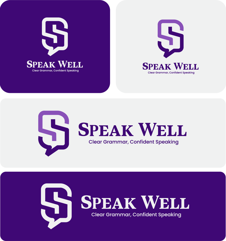
Purple Gradient (Main Brand Color)
Purple balances stability (blue) with energy (red), making it ideal for education, and ambition.
Represents intellect, language mastery, and a calm, confident presence—a perfect fit for learners overcoming their fear of speaking.
The gradient effect adds a modern touch, reflecting progress and flexibility in learning styles.
White and Soft Greys
The white and light grey backgrounds help the purple mark stand out sharply.
They symbolize clarity, simplicity, and a clean mental workspace.
Overall Impression
Speak Well is more than an English learning center—it’s a space for individuals to master language with clarity and express with confidence. This brand builds around the idea that clear grammar leads to confident communication, empowering learners at all levels to find their voice in English.
The logo system, visual identity, and typography are thoughtfully developed to communicate clarity, structure, and support—fundamentals of language learning.
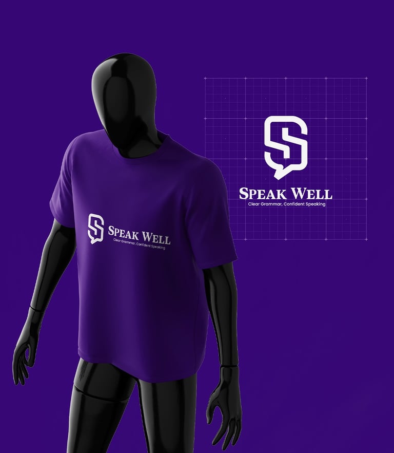
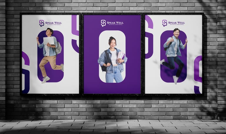
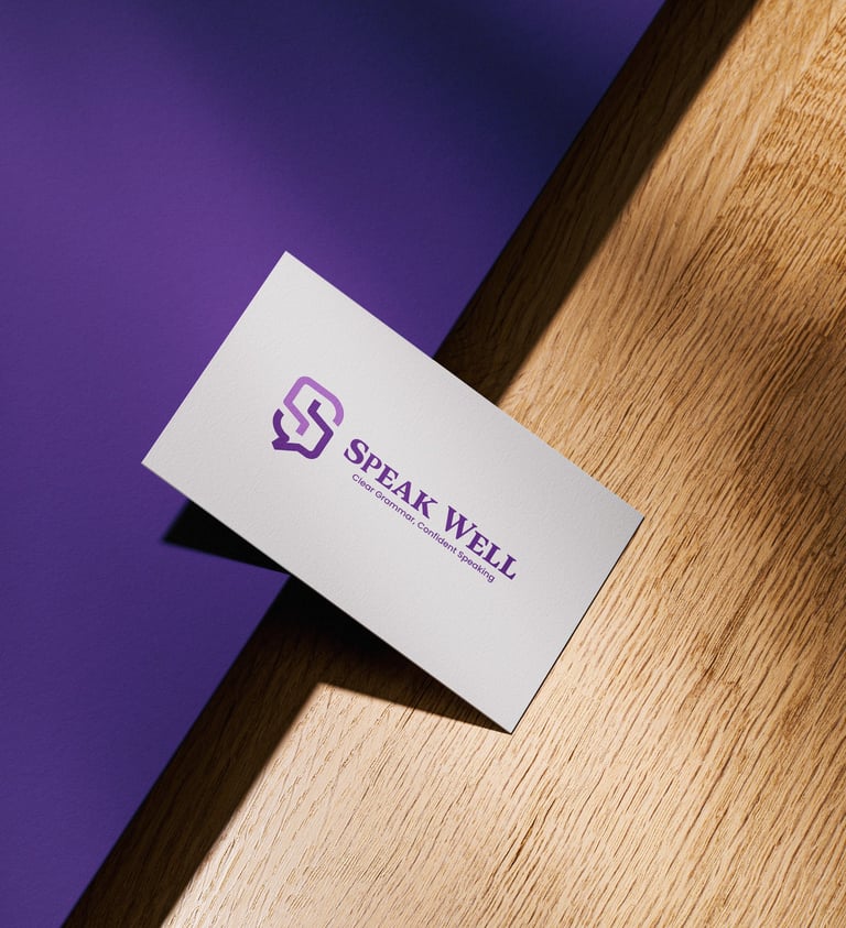

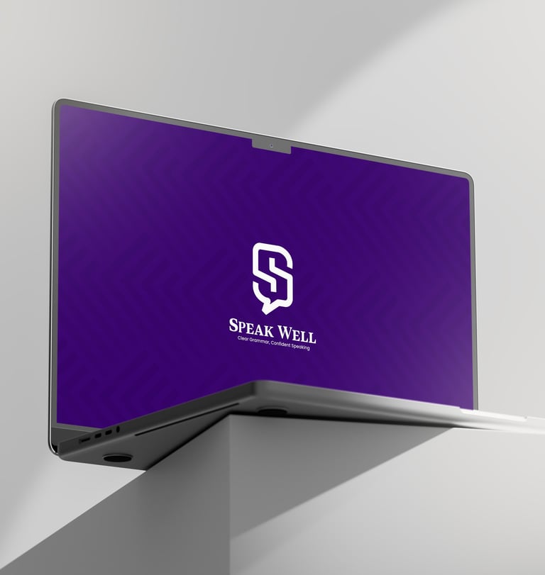
This brand identity is a modern, elegant, and meaningful that reflects the mission to equip students with clear, correct, and confident English—the kind that opens doors around the world.


