

Concept 1
"The Harmony Bloom"

Concept:
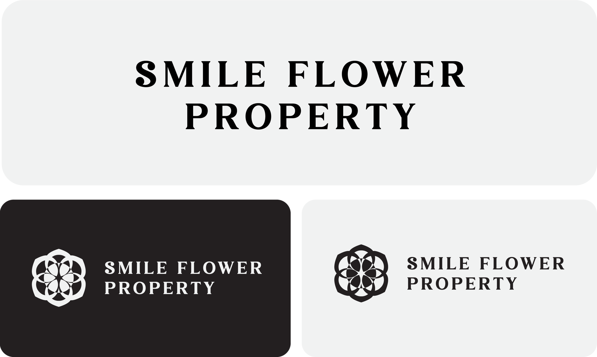
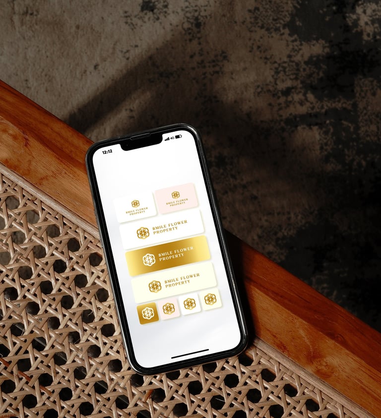
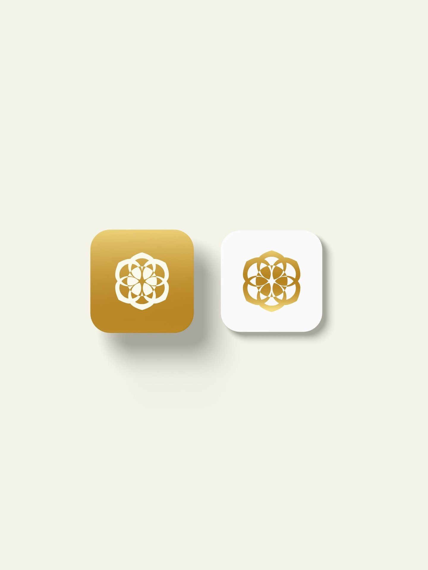
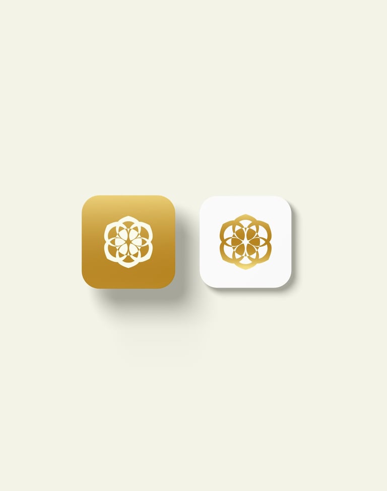
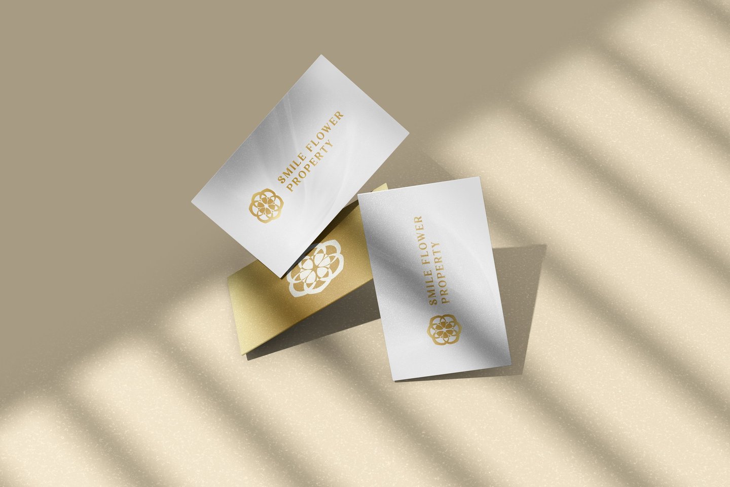
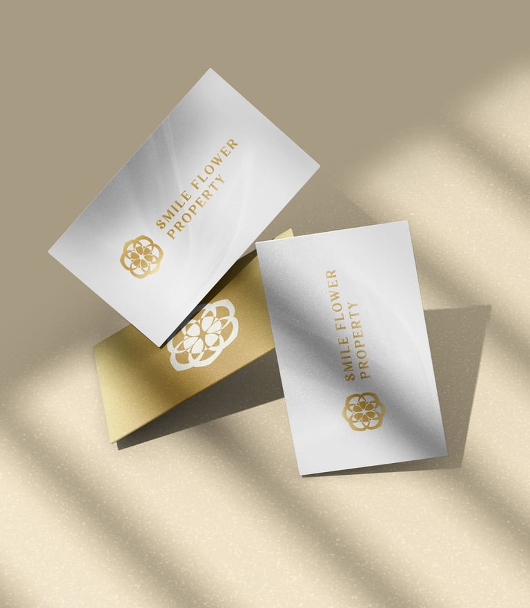
At the heart of the "Smile Flower Property" logo lies a geometric elegance—a flower composed of six perfectly aligned circles, symbolizing unity, balance, and intentional growth. This design forms a modern, stylized blossom, conveying both the natural beauty of life and the structure of architectural harmony.
Typography:
The logotype uses a classic serif font in uppercase, which conveys:
Stability and Strength – Ideal for instilling confidence in property investments.
Elegance and Tradition – Aligning with the timeless appeal of well-designed homes and communities.
The typographic pairing with the floral emblem elevates the logo into a luxurious but accessible brand mark.


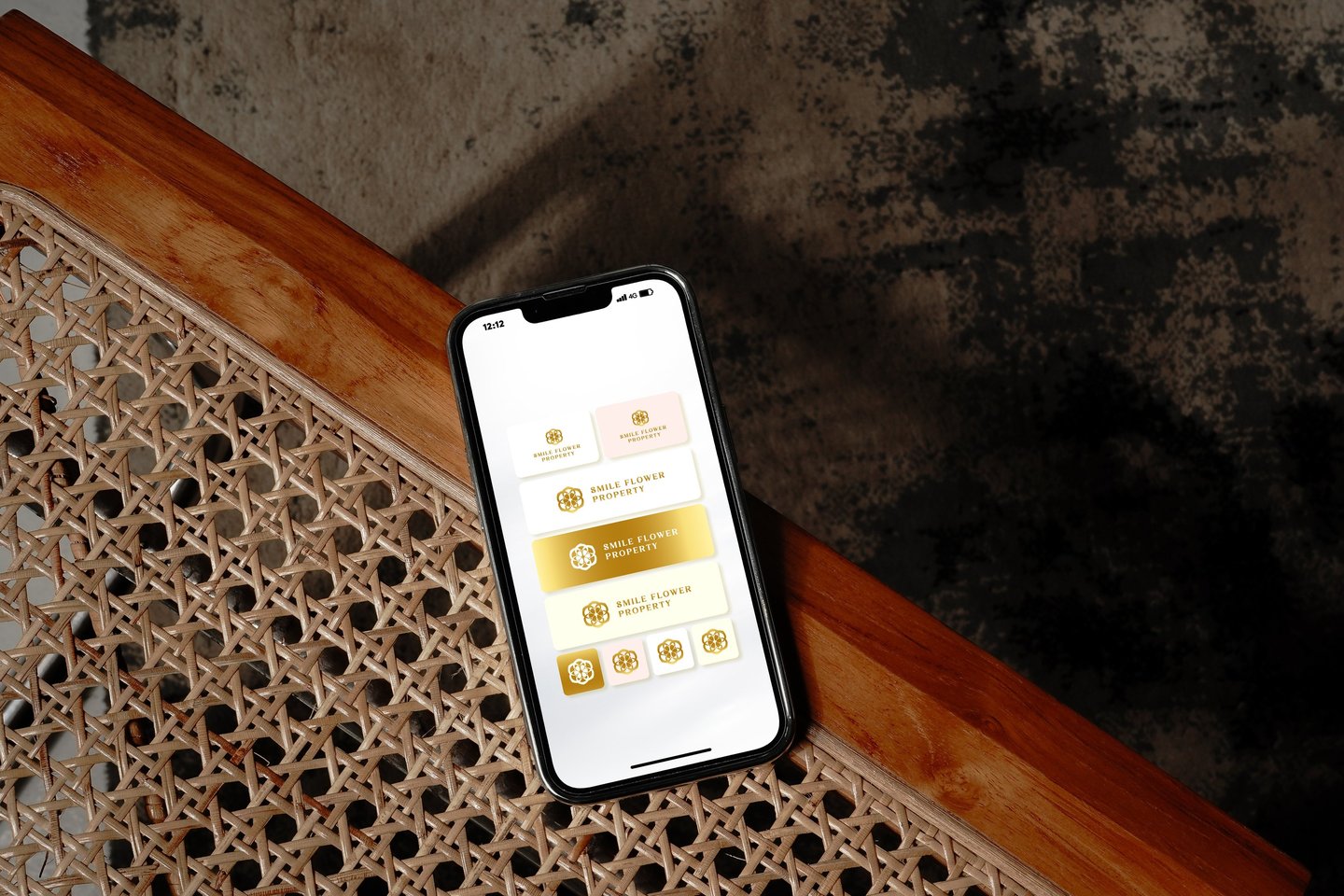
Colors Psychology
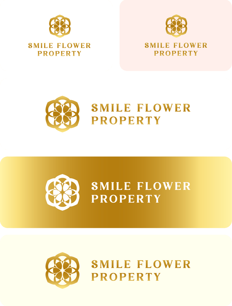
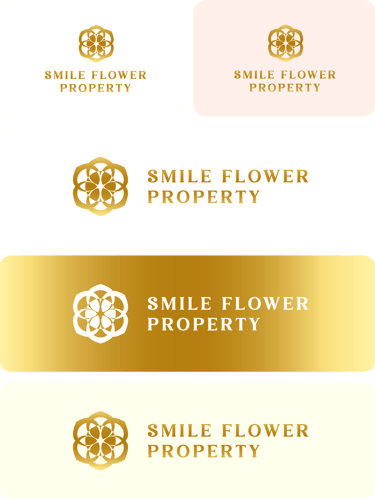

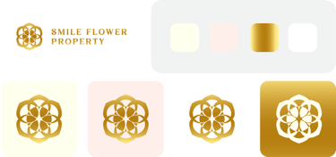
The chosen color palette consists of soft neutrals paired with a rich gold gradient, creating an aesthetic that balances trust, warmth, and luxury.
White Sandal Wood Color - Conveys purity, simplicity, and cleanliness. Gives an impression of a safe, nurturing foundation, akin to a fresh canvas or new beginning.
Pale Blush - Brings a gentle human warmth to the brand. Evokes feelings of comfort, care, and personal touch, ideal for property dealings.
Gold Gradient - Symbolizes wealth, success, and prestige. The gradient effect adds depth and modernity, reflecting a progressive and premium image.
White - Emphasizes clarity, openness, and trustworthiness. Enhances the visual contrast and amplifies the sense of space and light—important attributes in real estate design and property listings.
Emotional Tone :
The Harmony Bloom logo touches both the mind and heart.
It’s structured enough to inspire confidence, soft enough to convey care, and elegant enough to promise a beautiful lifestyle.
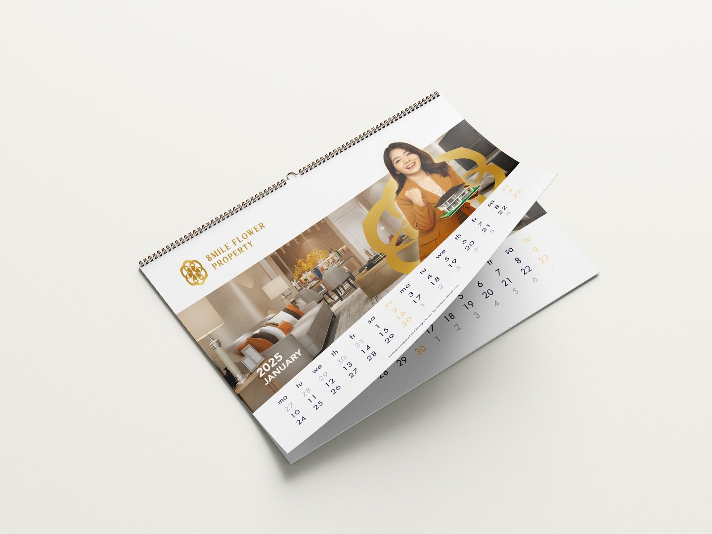
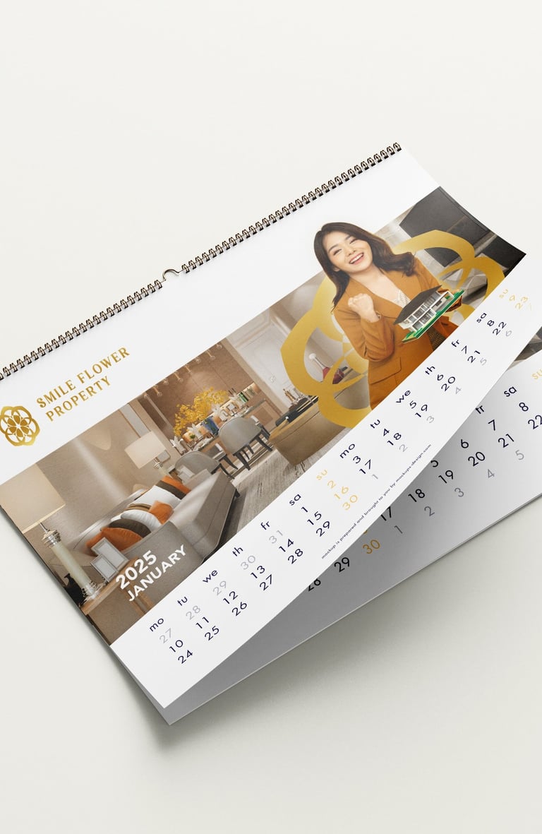


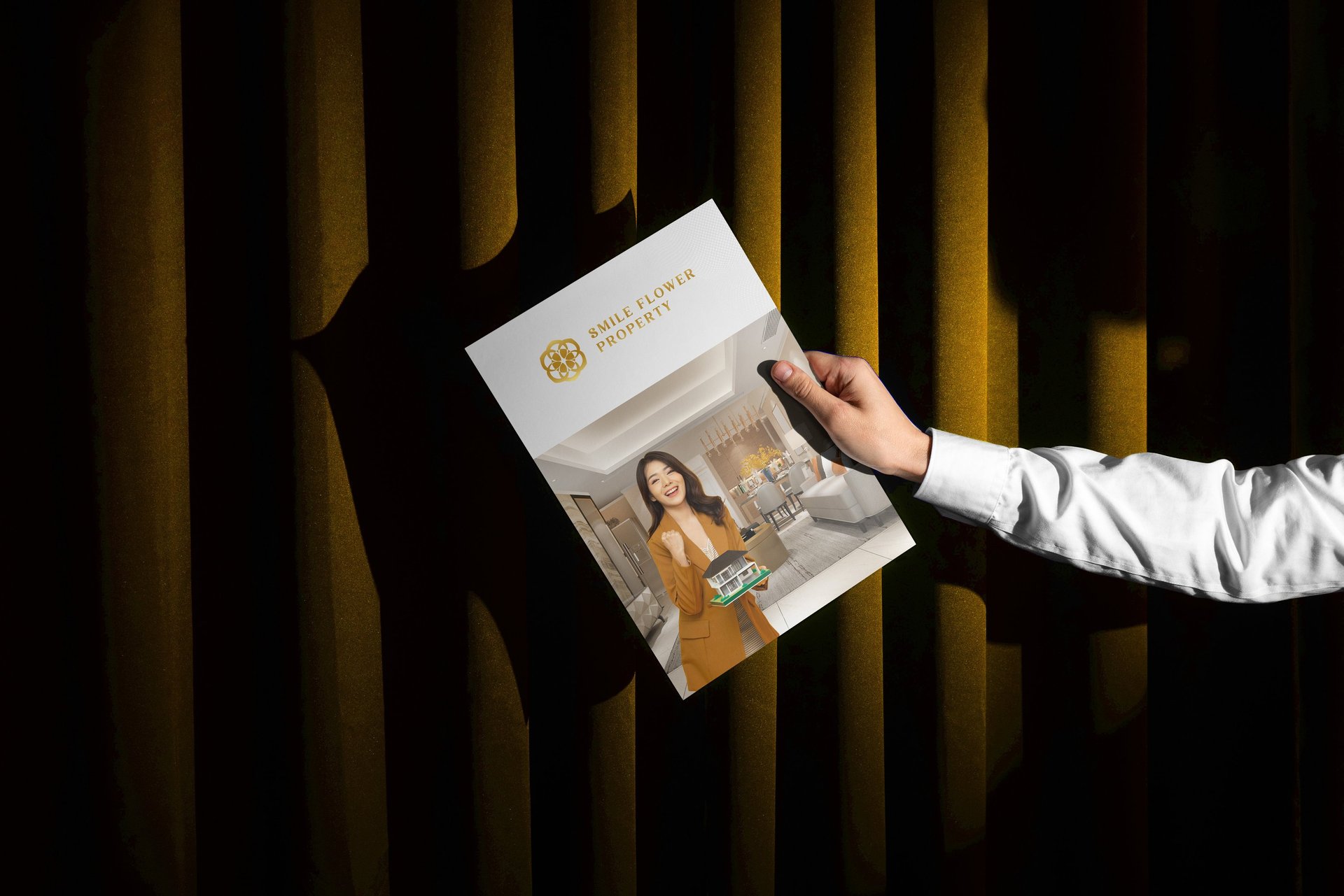
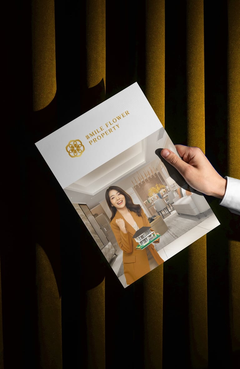
Concept : “The Harmony Bloom” logo for Smile Flower Property blends nature-inspired geometry with refined luxury, creating a distinct identity in the property industry.


Pikstudio - A studio with heart!
Showcasing premium design for diverse industries.
service@pikstudio.website
+6660685217
© 2024. All rights reserved.