

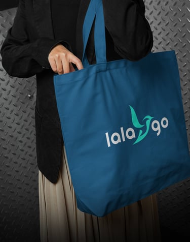
Concept 1
"LALAGO"
(Freedom & Exploration)
Concept:
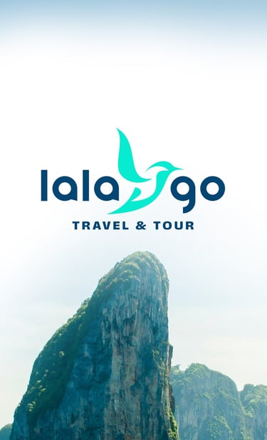
The logo presented reflects a modern, aspirational, and free-spirited identity, ideal for a Travel & Tour brand. The visual merges elegant simplicity with dynamic motion, conveying a brand that is approachable, trustworthy, and forward-moving.
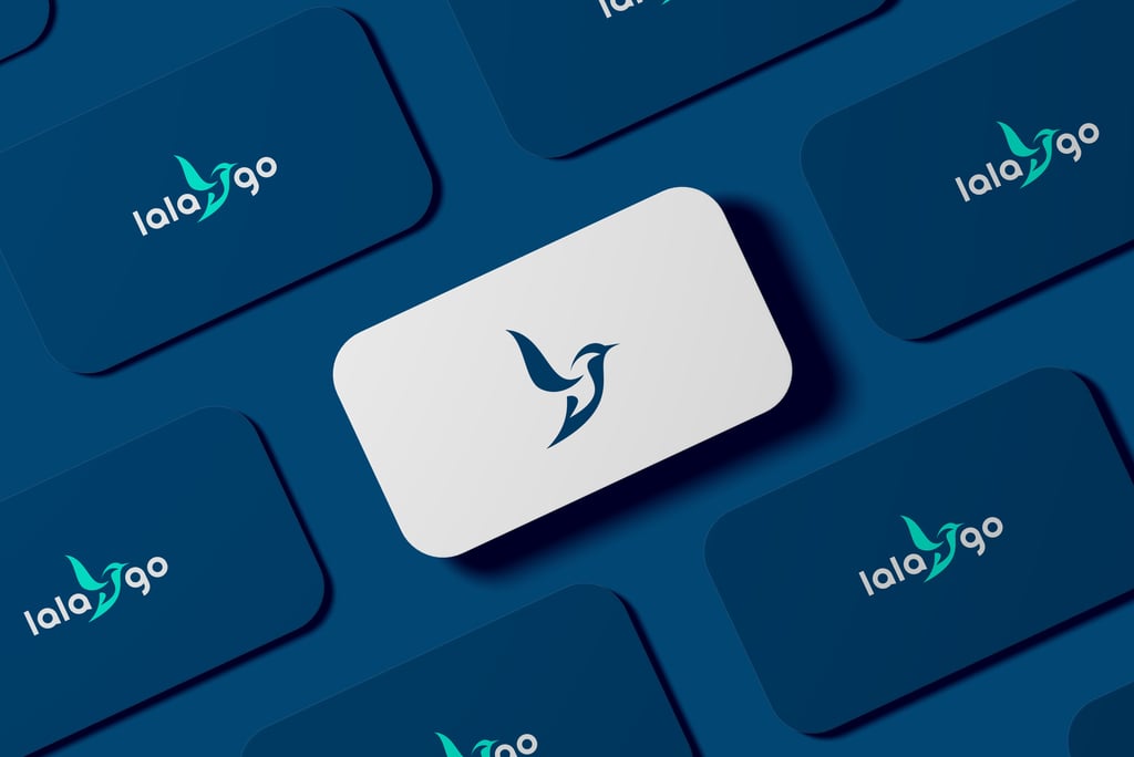
The bird is crafted using clean, fluid curves — highly symbolic of:
Freedom & Exploration (core values of travel)
Graceful Movement (mirroring air or sea travel)
Optimism & Aspiration, with its upward-facing design
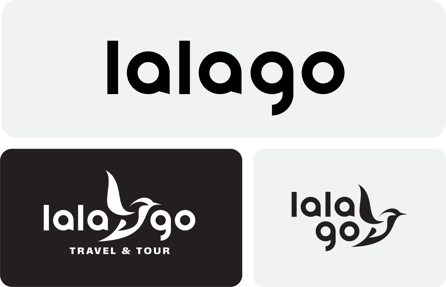
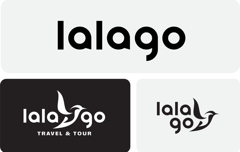
The form cleverly integrates into the typography by wrapping around and between the letters, making it both decorative and functional — a sign of intelligent branding.
Font Characteristics:
Rounded sans-serif style: feels modern, friendly, and accessible.
Lowercase usage gives the brand a casual, friendly tone, great for a travel company that wants to feel personal rather than corporate.
Letter "g" in "go" stands out with its dynamic tail — echoing the curves of the bird, subtly reinforcing the logo's flight motif.
Emotional Tone:
Easy-to-read typography makes it suitable for international audiences.
Evokes a conversational tone — like a friend recommending an adventure.

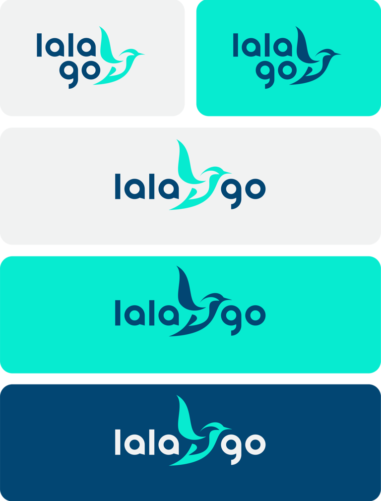

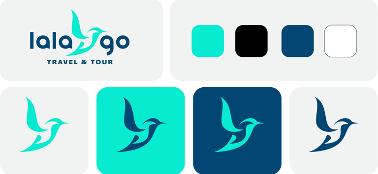
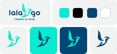
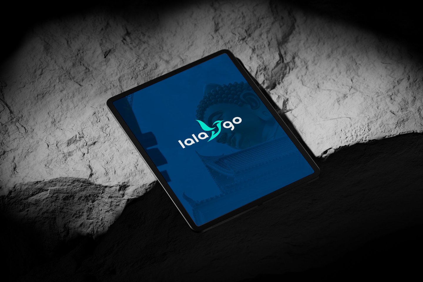
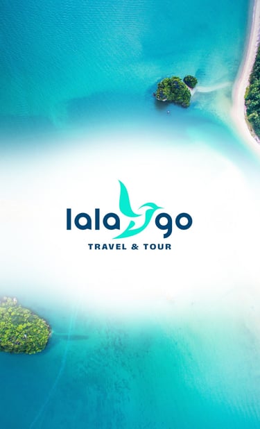
Color Psychology
1. Turquoise / Aqua Blue
Represents the sea and sky, invoking ideas of vacation, freedom, and clarity.
It appeals to both the adventurous and relaxed traveler.
Conveys trust, calmness, and youthful energy.
2. Deep Navy Blue
Grounds the brand with a sense of professionalism and reliability.
Associated with depth, wisdom, and experience — important for a tour brand that needs to feel credible.
Paired with aqua, it creates a modern and versatile palette that's easy on the eyes.
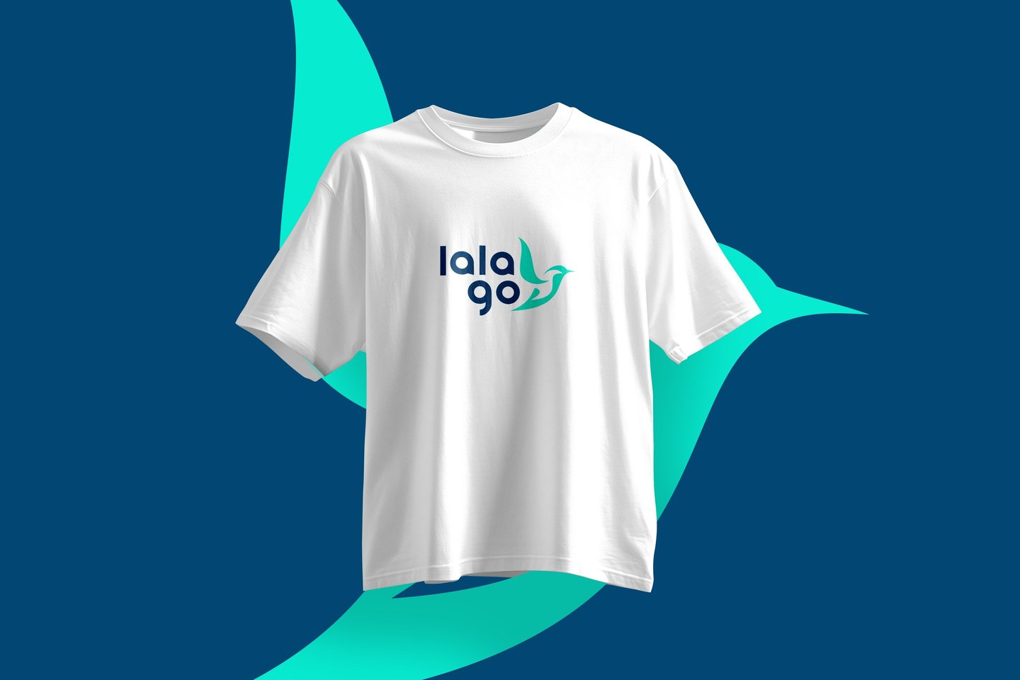
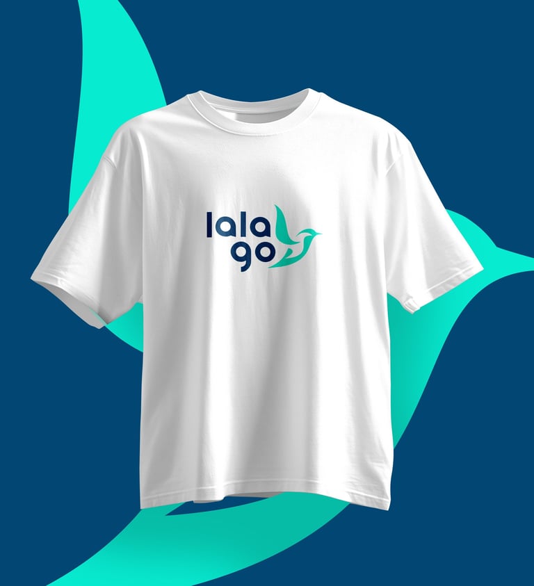
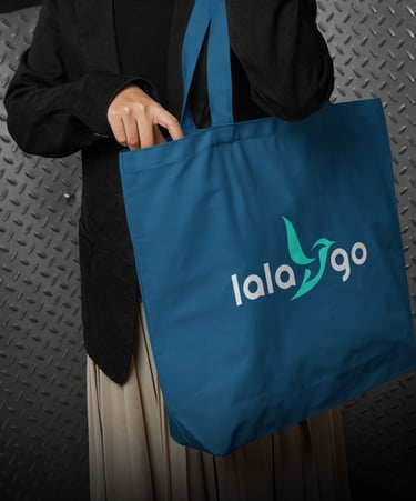
This color duo helps the brand feel fresh but dependable, suitable for digital use, signage, print, and merchandise.
Overall Impression
First Impressions:
Modern & memorable — The form is clean and easily identifiable.
Emotionally uplifting — thanks to color and bird symbolism.
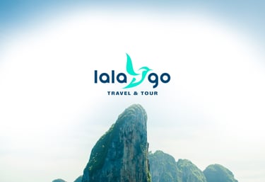
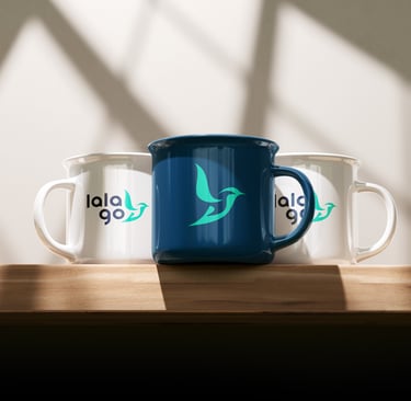
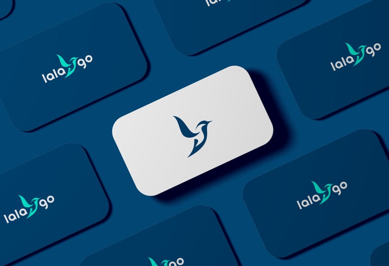
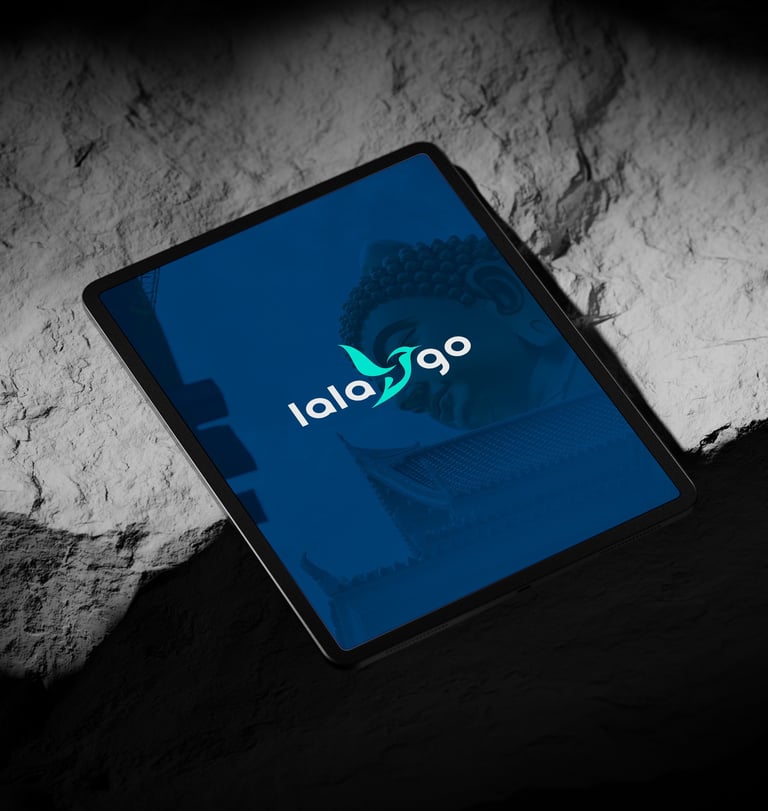
Versatile — the logo works on both light and dark backgrounds, which is crucial for brand consistency across media.
Versatility:
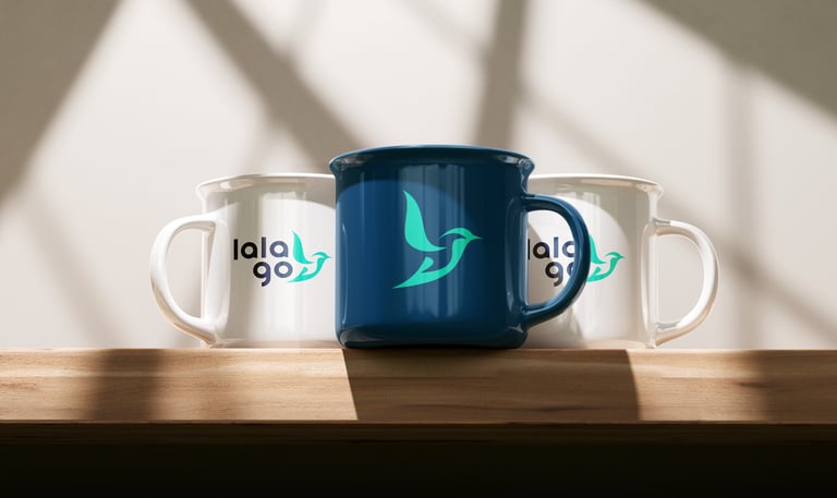
Strong in monochrome and color.
The symbol can stand alone as a favicon, app icon, or badge.
This brand identity is a beautifully balanced fusion of emotion, direction, and clean design — ideal for a travel company that wants to speak to a young, curious, and global-minded audience. The name “LalaGo” captures joy and movement, while the logo establishes trust and professionalism.


Pikstudio - A studio with heart!
Showcasing premium design for diverse industries.
service@pikstudio.website
+6660685217
© 2024. All rights reserved.