Concept 1
Freely you

Concept:
At the heart of the logo lies a stylized “Y”, representing both the brand name and the essence of freedom. Its shape, reminiscent of a minimal bird, conveys lightness, independence, and an unbound spirit. This aligns seamlessly with the brand’s core message—empowering individuals to dress in a way that feels natural and liberating.
Typography:
Sans-serif (“freely”) – Modern, clean, and easy to read, representing approachability and clarity.
Italic serif (“you”) – Adds a touch of personal flair, sophistication, and human warmth, reinforcing the brand’s intimate connection with its customers.
The combination subtly mirrors the dual nature of the brand: everyday wearability (sans-serif) and stylish individuality (serif italic).
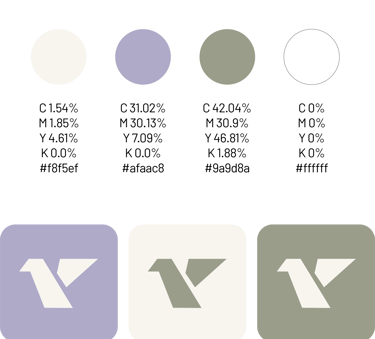
Color Psychology :
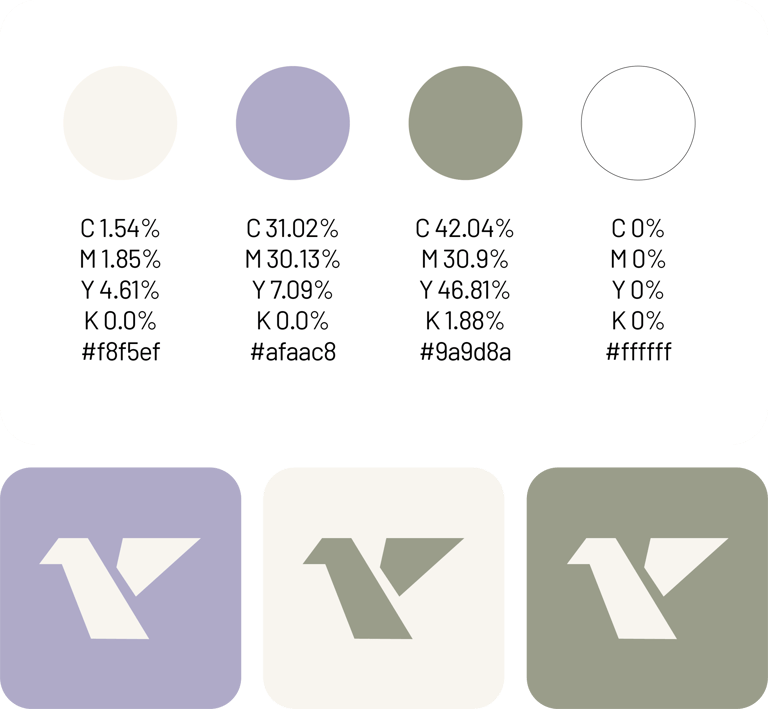
The brand employs a soft yet confident color scheme, thoughtfully chosen to balance elegance with approachability:
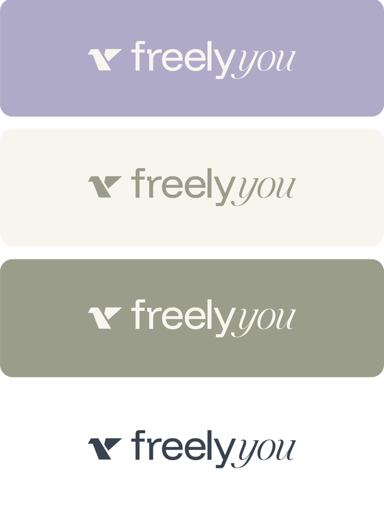
Charcoal Gray – Symbolizes sophistication, stability, and timeless style. It reflects reliability and quality, essential traits for a clothing brand.
Muted Sage Green – Suggests calmness, balance, and a natural, earthy connection—perfect for a brand that values authenticity.
Lavender Gray – Brings a hint of softness and creativity, suggesting individuality and modern sensibility.
Warm Off-White – Provides a clean, breathable canvas that amplifies the feeling of openness and comfort.
These tones ensure the logo is versatile across fabrics, tags, packaging, and both online/offline branding, while also evoking emotional warmth and trust.
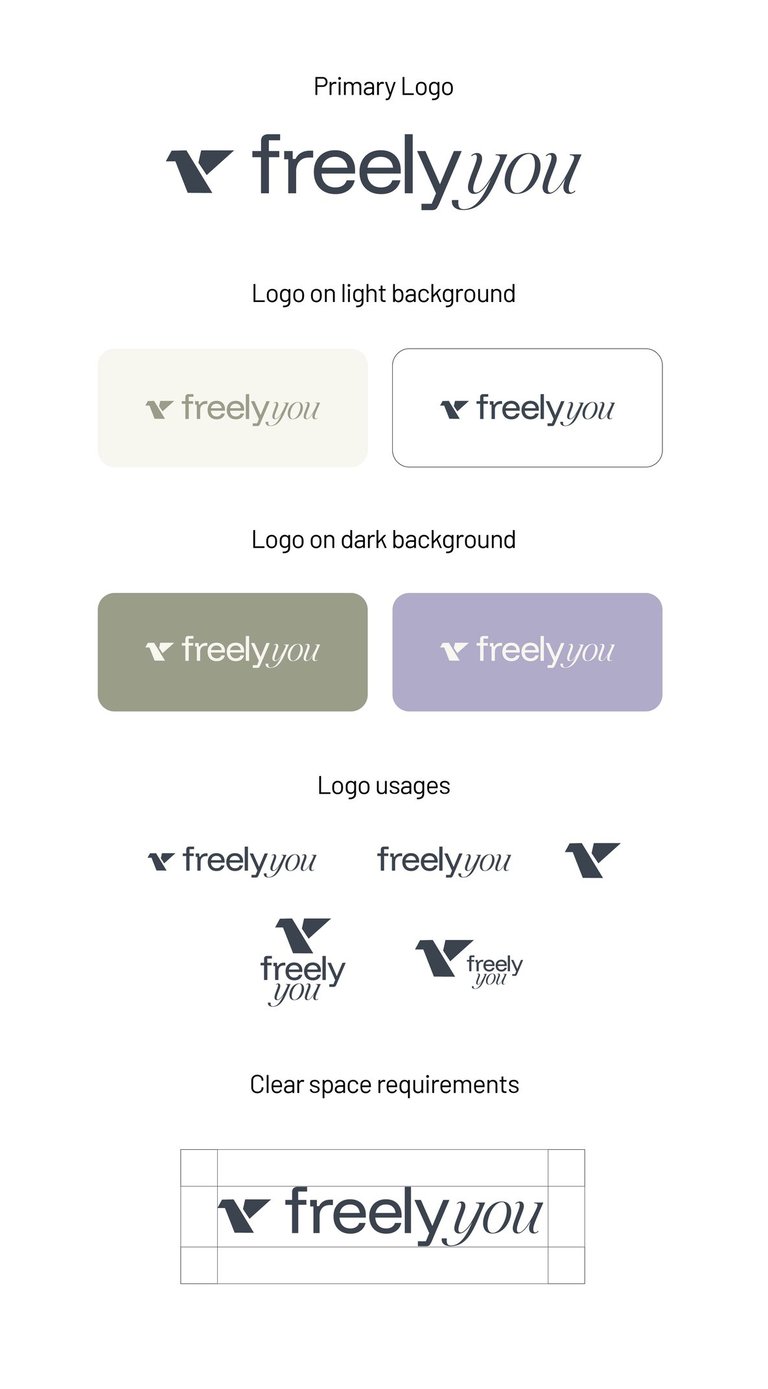

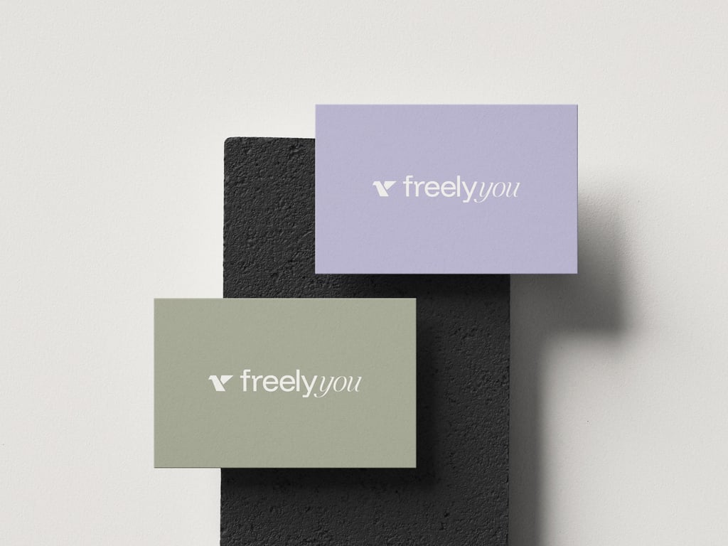
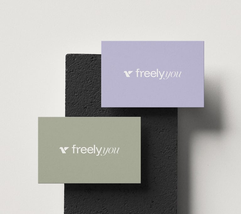
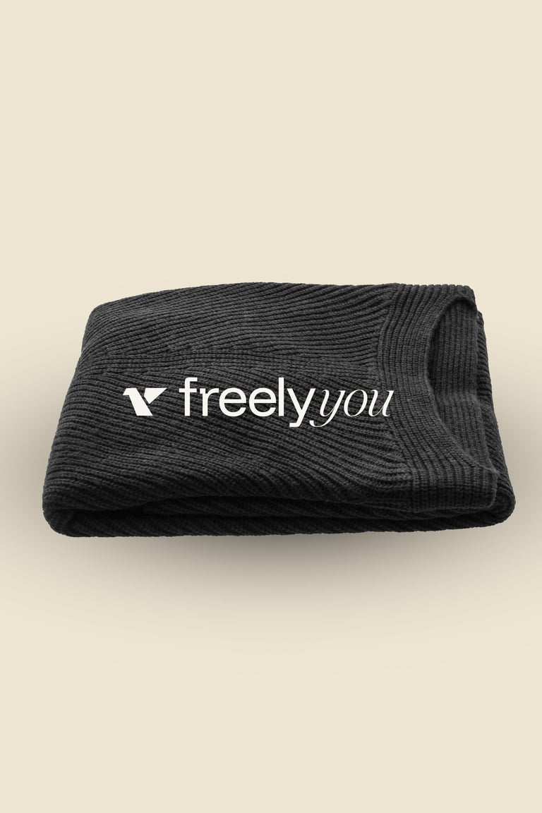
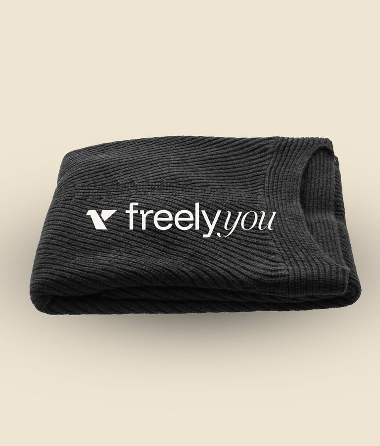
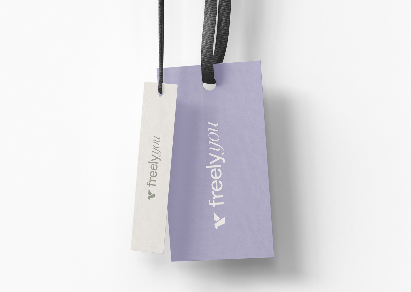
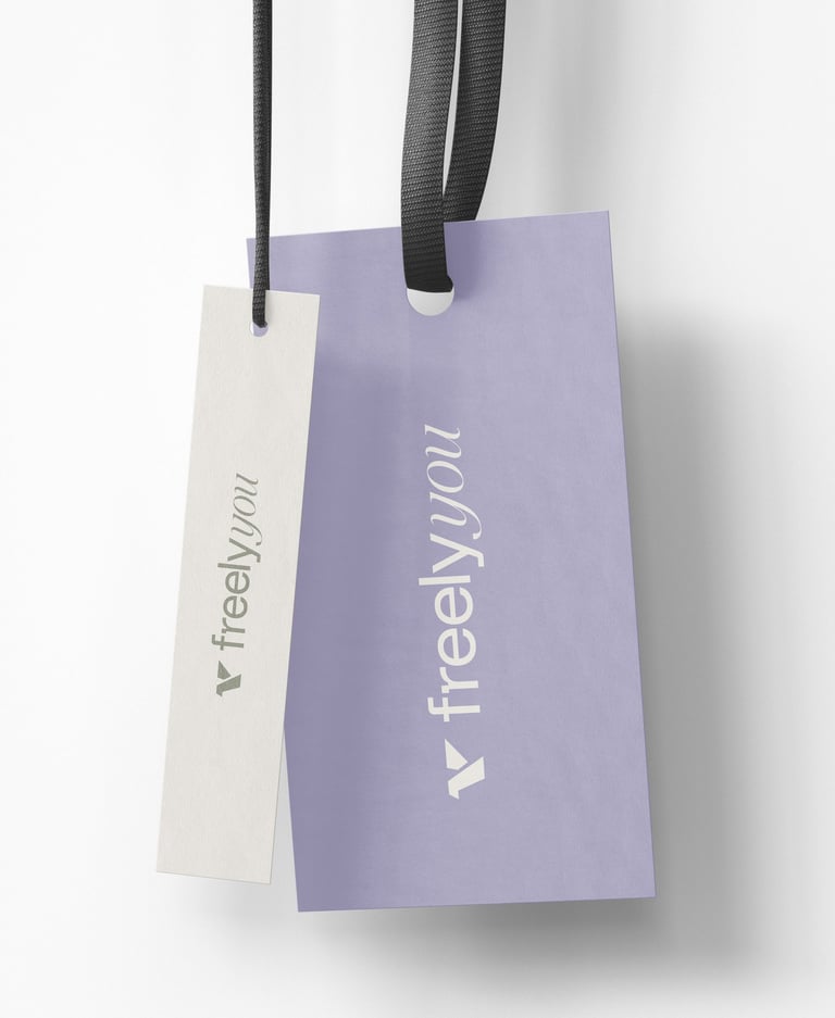
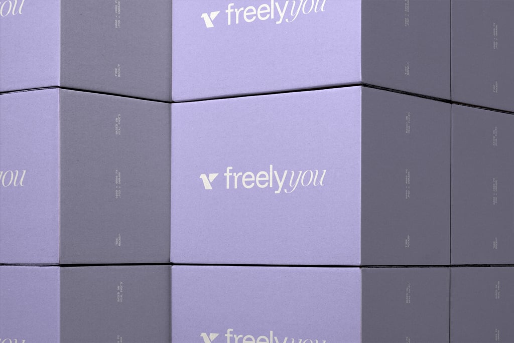
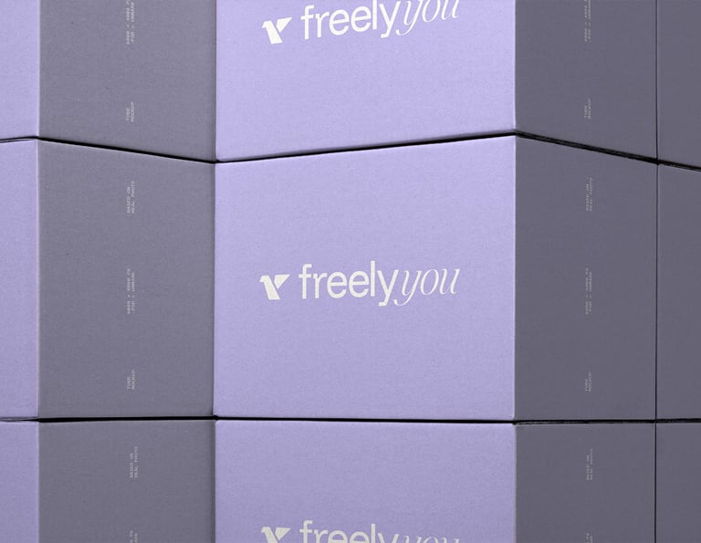
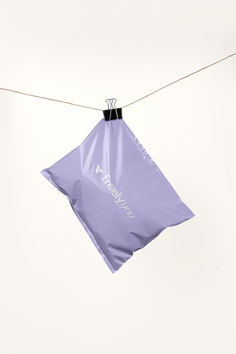
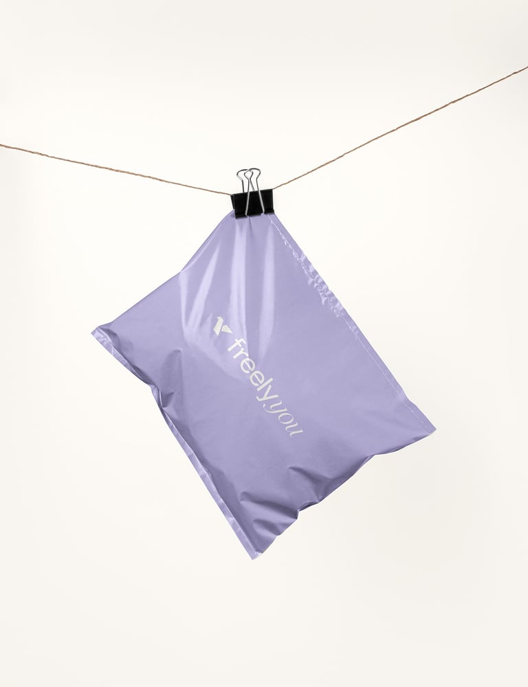
Concept 1: The logo captures a sense of ease, elegance, and authenticity, positioning Freely You as a clothing brand that understands both style and comfort. By merging a symbolic bird with a thoughtful color and typography system, it offers a recognizable, versatile, and emotionally resonant identity for Myanmar’s evolving fashion market.


