

Concept 1
Rhythm Pulse
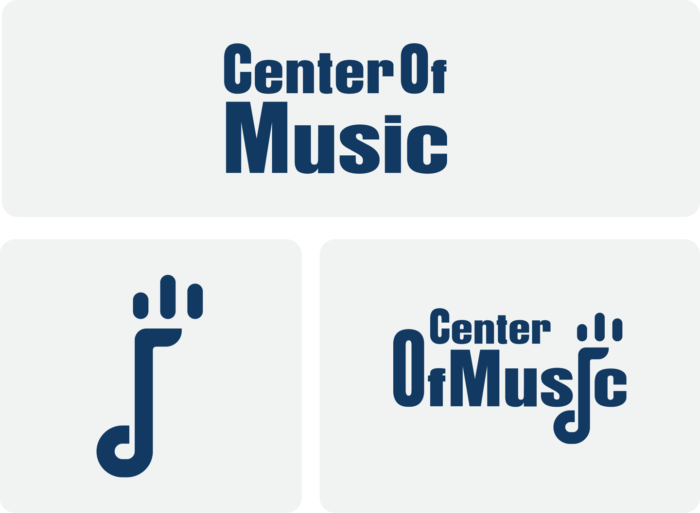
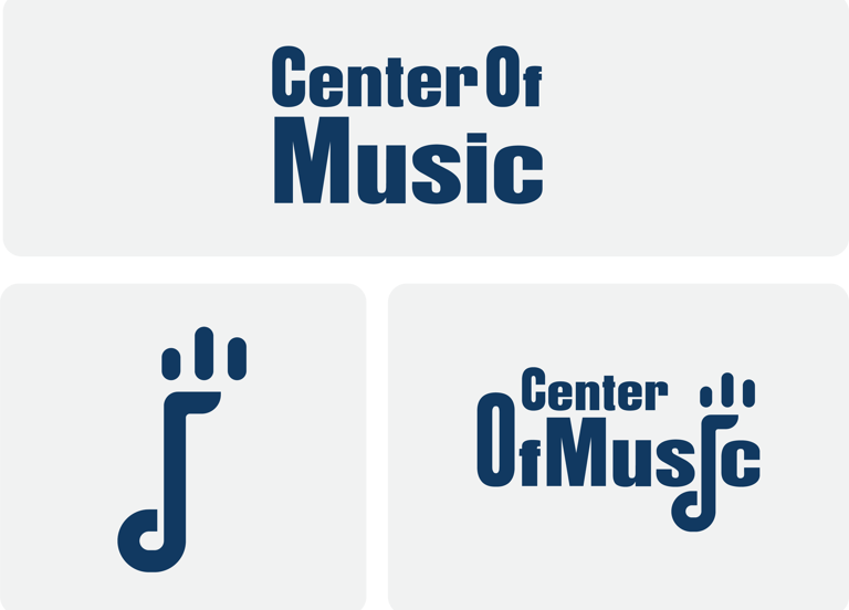
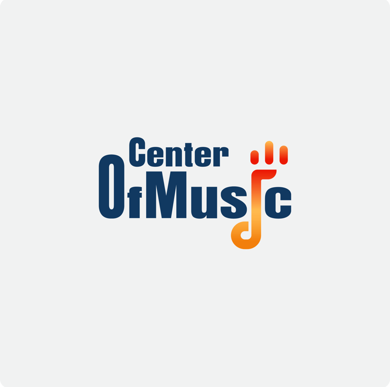
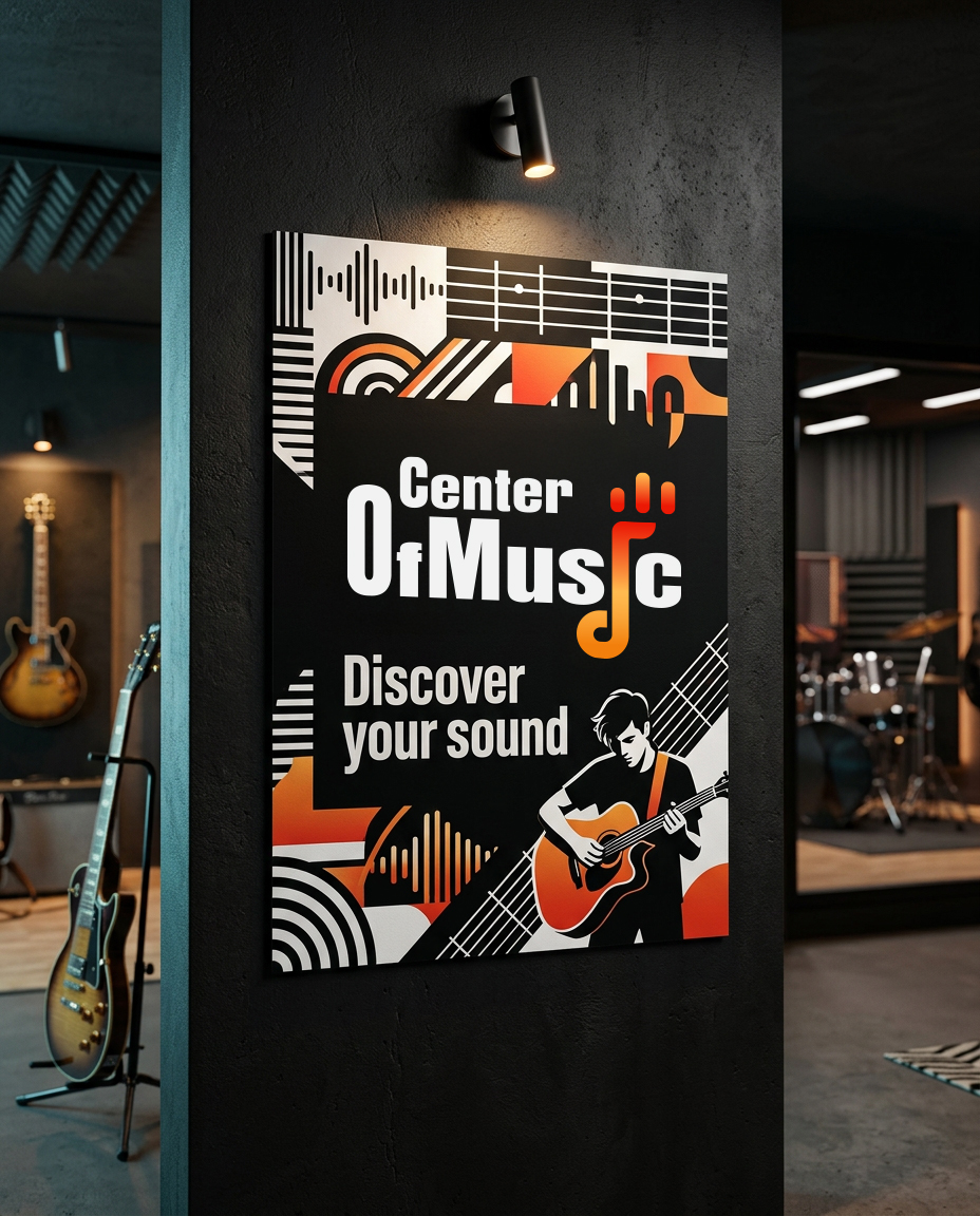
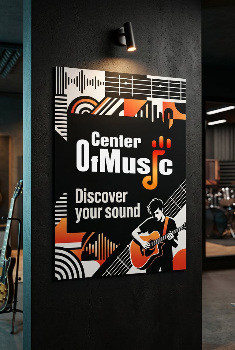
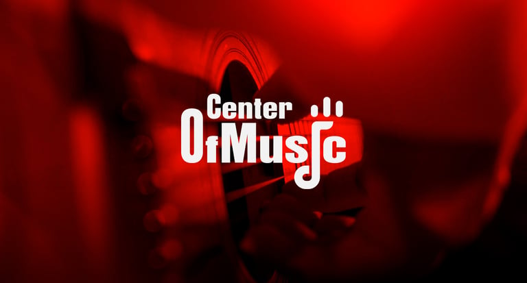
Typography:
The typography uses a bold geometric sans-serif style that delivers:
High readability
Strong visual impact
Contemporary branding appeal
The balance between thick forms and clean spacing creates a confident identity suitable for both digital and physical applications.
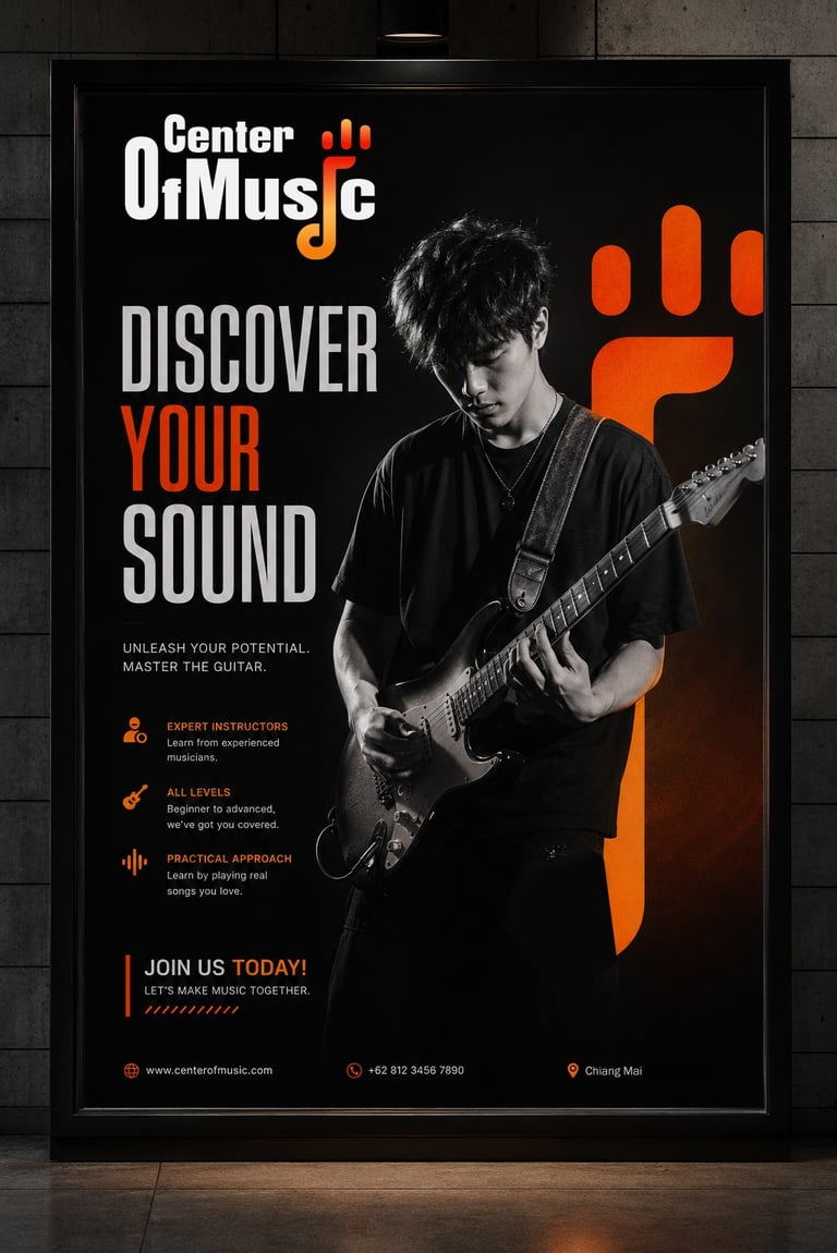
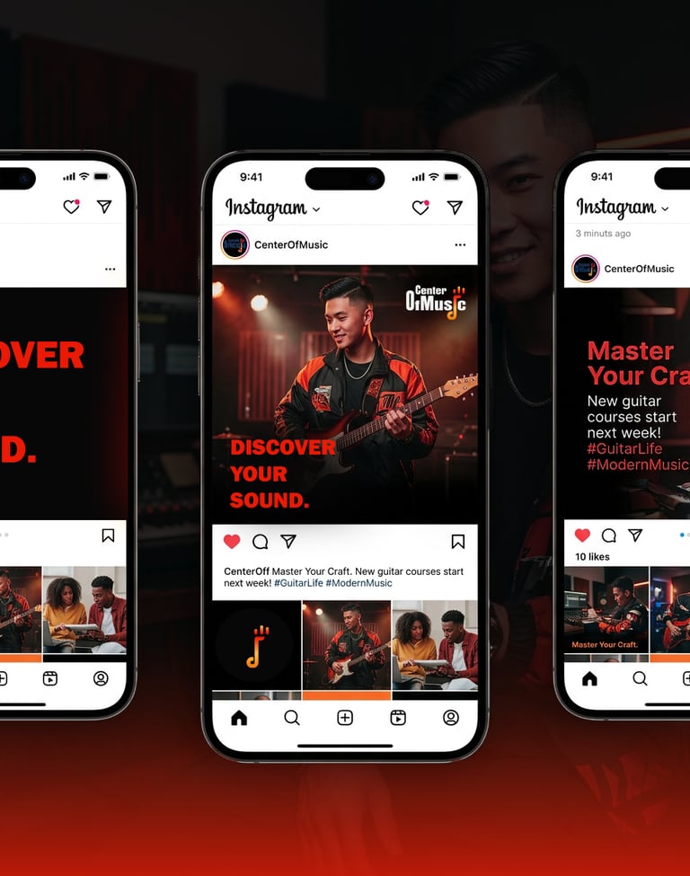
Colors Psychology
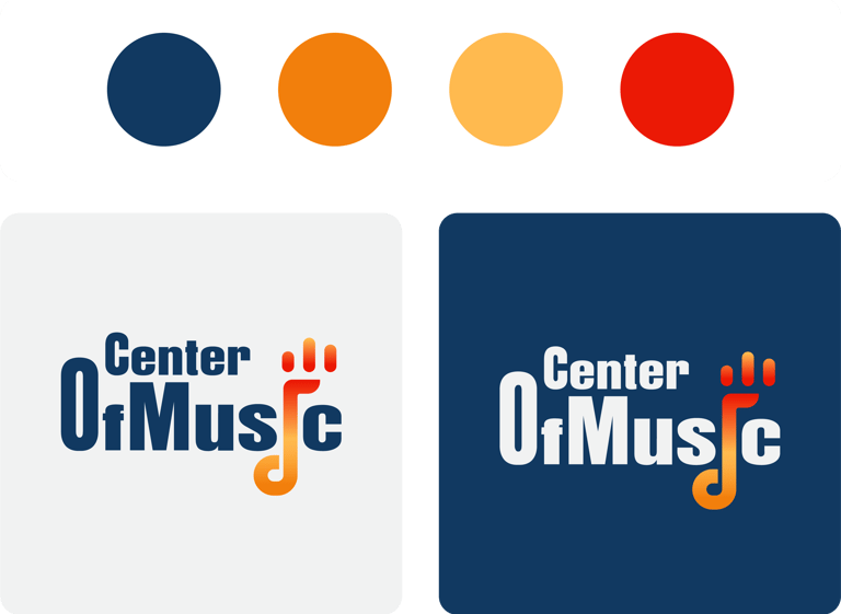
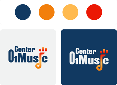
Deep Navy Blue: gives the brand educational credibility while maintaining a premium and modern appearance. It also helps balance the energetic orange, creating harmony between creativity and structure.
Vibrant Orange Gradient: adds passion and movement, reinforcing the emotional experience of music and live performance.

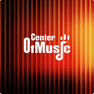

Concept:
The “Rhythm Pulse” logo concept represents the emotional energy, rhythm, and movement of music through a modern and minimal visual identity. Designed specifically for a contemporary instrument school, the concept combines musical symbolism with youthful confidence to create a brand that feels inspiring, energetic, and professional.
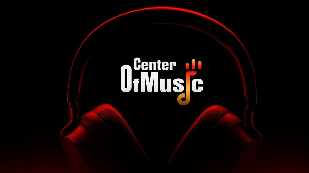
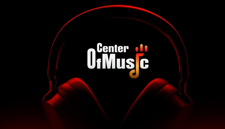
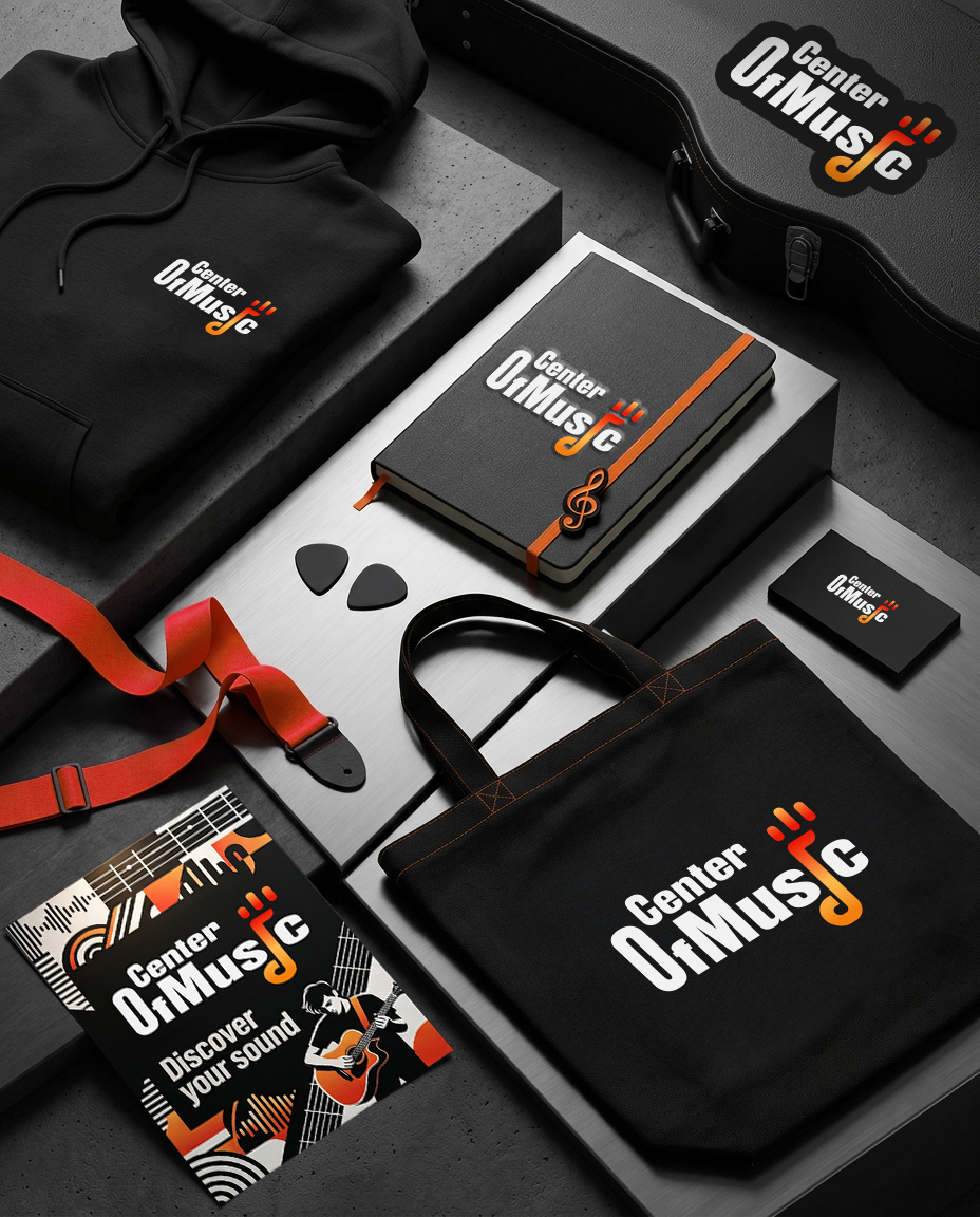
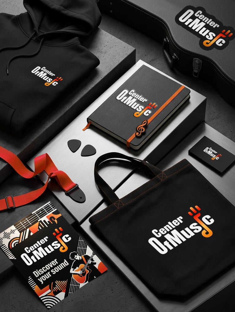
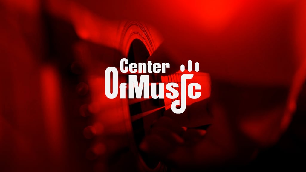


Concept 1: The overall structure of the logo communicates creativity, passion, and growth — positioning the school not only as a place to learn instruments, but as a platform where students discover their identity through music.
Thank you!
Pikstudio - A studio with heart!
Showcasing premium design for diverse industries.
service@pikstudio.website
+6660685217
© 2024. All rights reserved.