

Concept 1
Joyful Heat
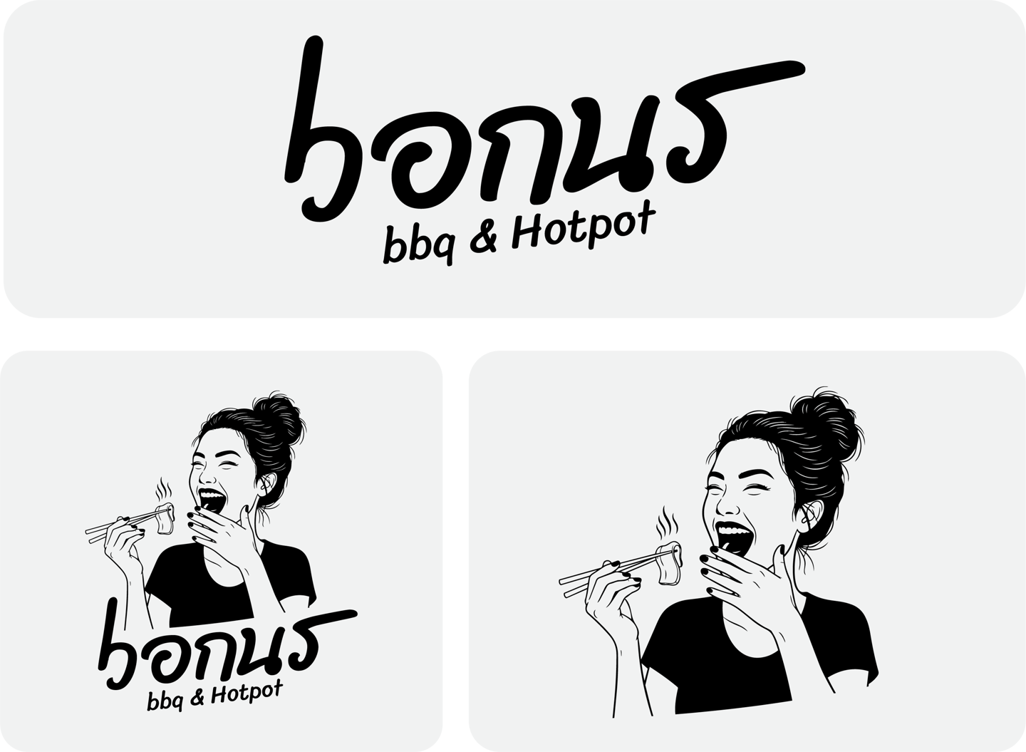
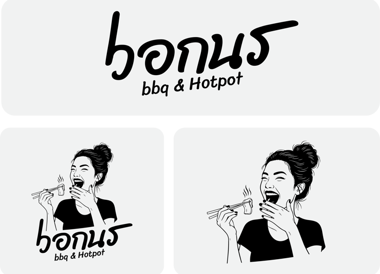
Concept:
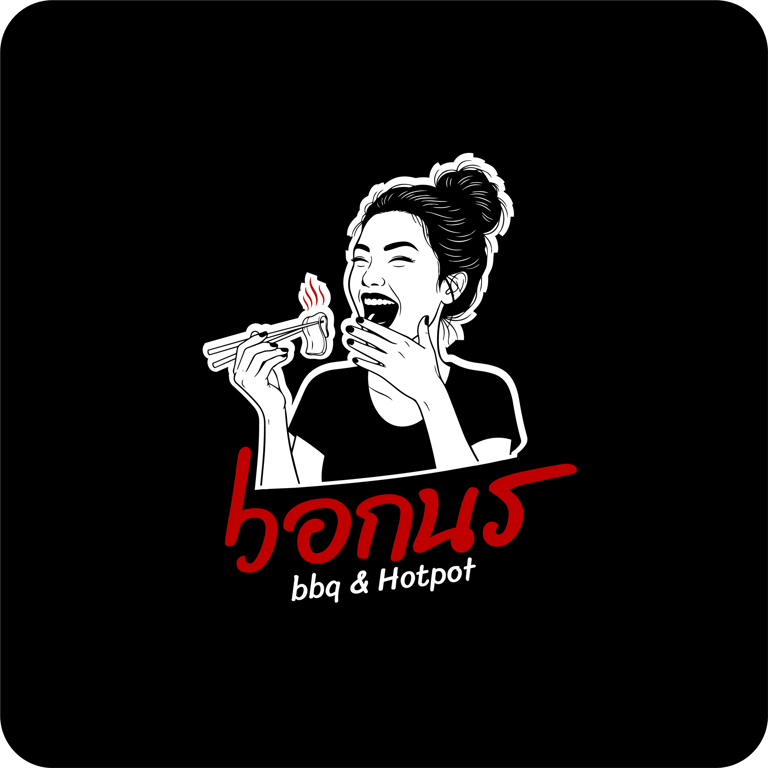
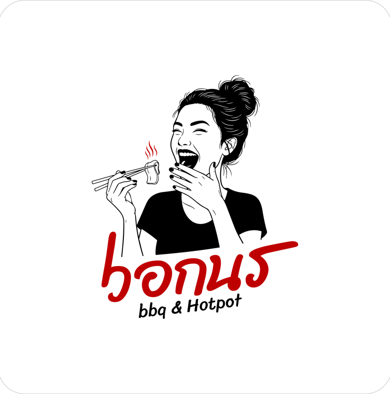
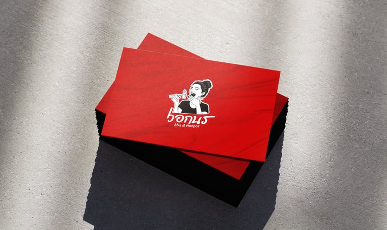
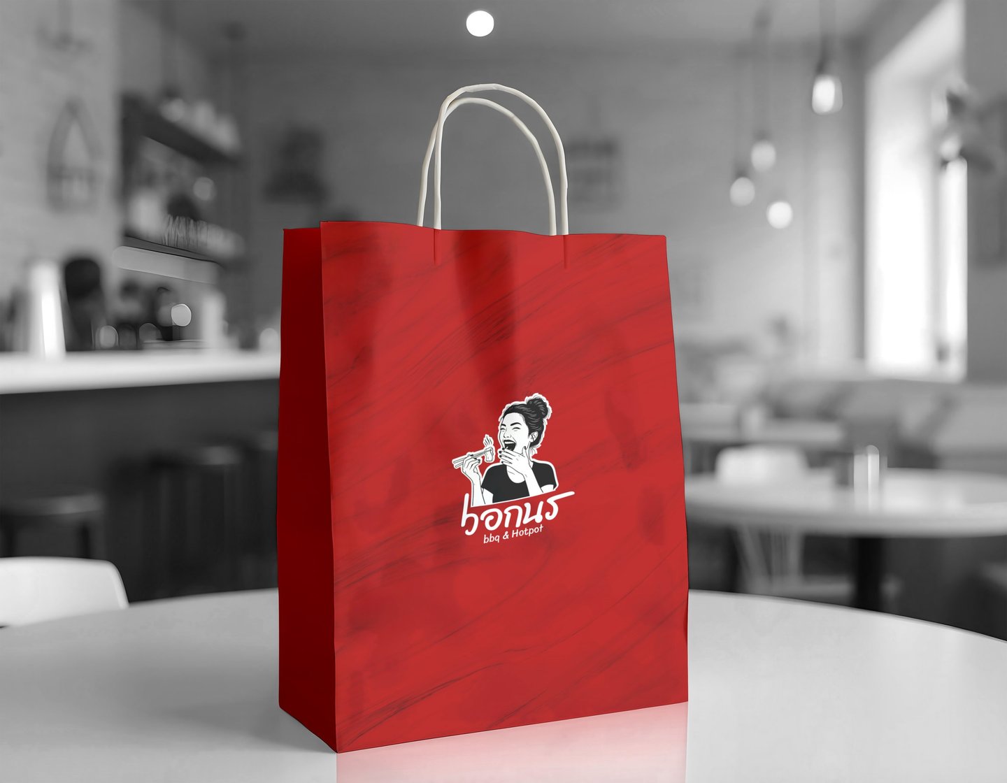
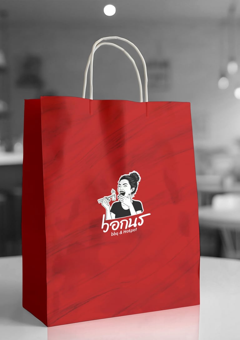
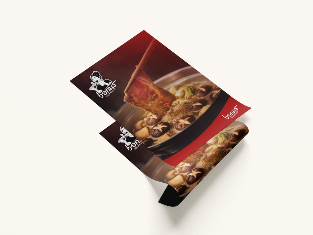
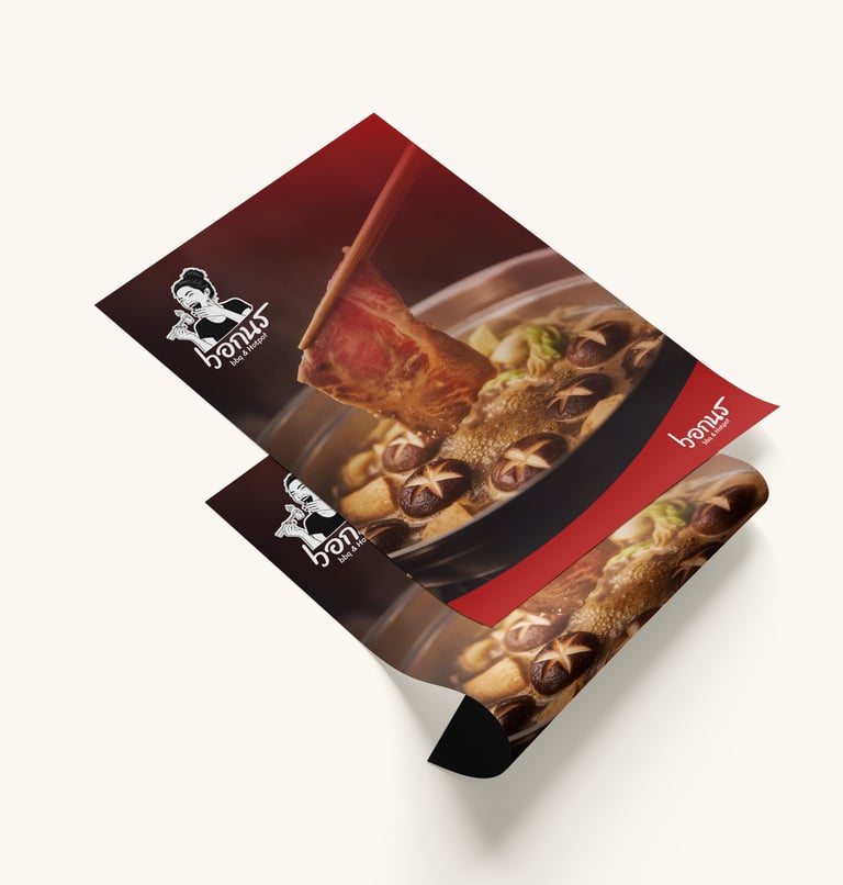
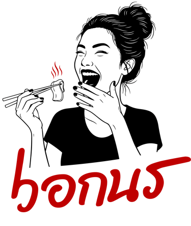
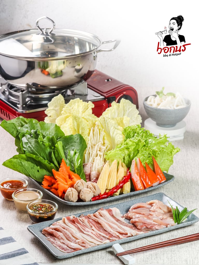
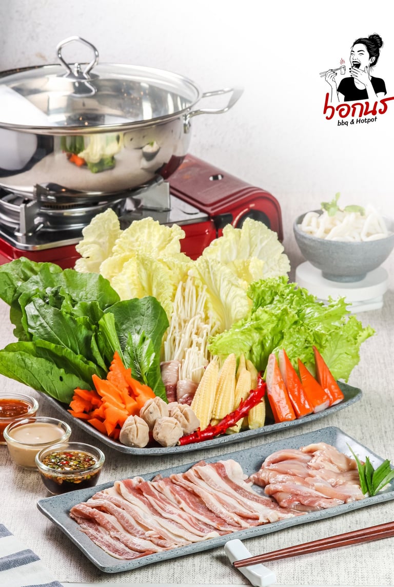
The Joyful Heat logo is built around the emotional core of hotpot and BBQ dining — enjoyment, warmth, and shared moments. The illustrated character actively engaging with food becomes a visual storyteller, capturing the pleasure of eating freshly cooked meat straight from the grill or pot. This human-centered approach reflects the social ritual of buffet dining, where food is not only consumed but experienced together. The expressive illustration paired with handwritten-style typography gives the brand a lively, approachable personality while remaining bold and memorable.
Typography:
The typography is bold, handwritten, and expressive, reinforcing the brand’s casual and friendly nature. Its fluid strokes echo movement and spontaneity, much like the act of cooking and eating together. The informal structure avoids rigidity, ensuring the brand feels lively rather than institutional. This typographic choice strengthens emotional connection and supports high visibility across signage, menus, and promotional materials.
Colors Psychology
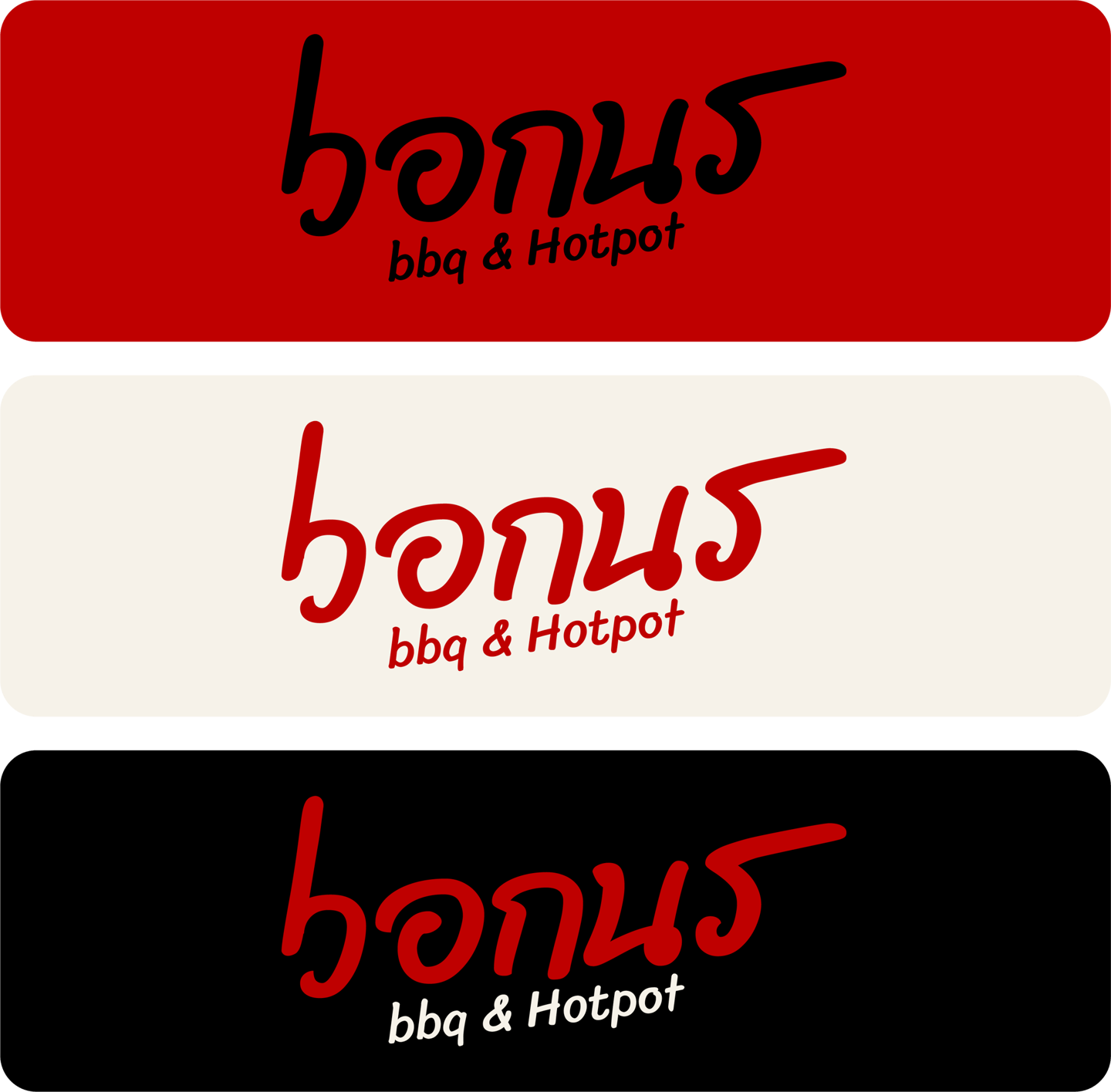
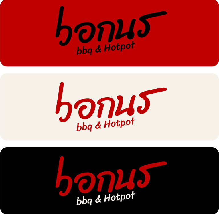

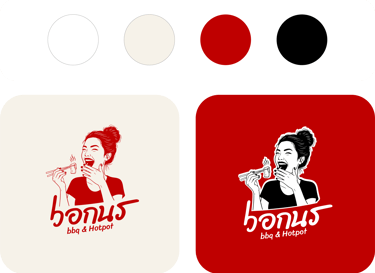
Red is the dominant color, symbolizing heat, fire, and appetite. It stimulates hunger and excitement, directly connecting to grilling flames and boiling hotpot.
Cream and off-white tones soften the intensity of red, creating warmth and approachability while evoking comfort and balance.
Black adds contrast and strength, grounding the visual identity and enhancing clarity and readability.
Overall, the palette reflects energy, warmth, and bold flavor — a visual expression of hot, satisfying, and joyful dining.


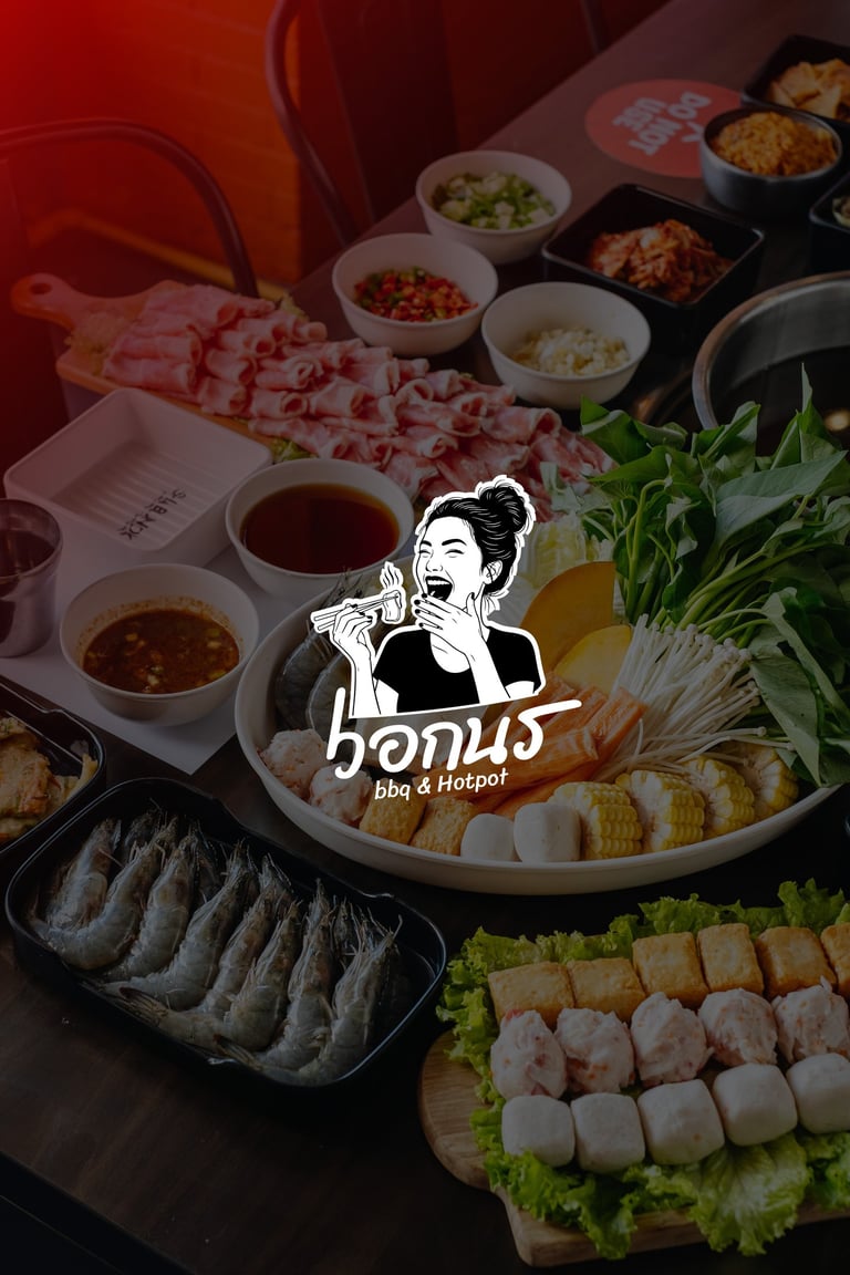
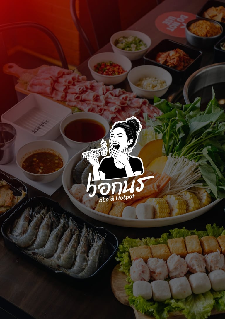
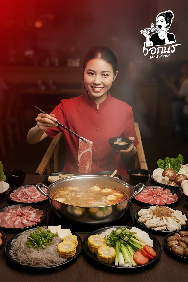
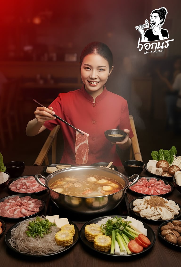
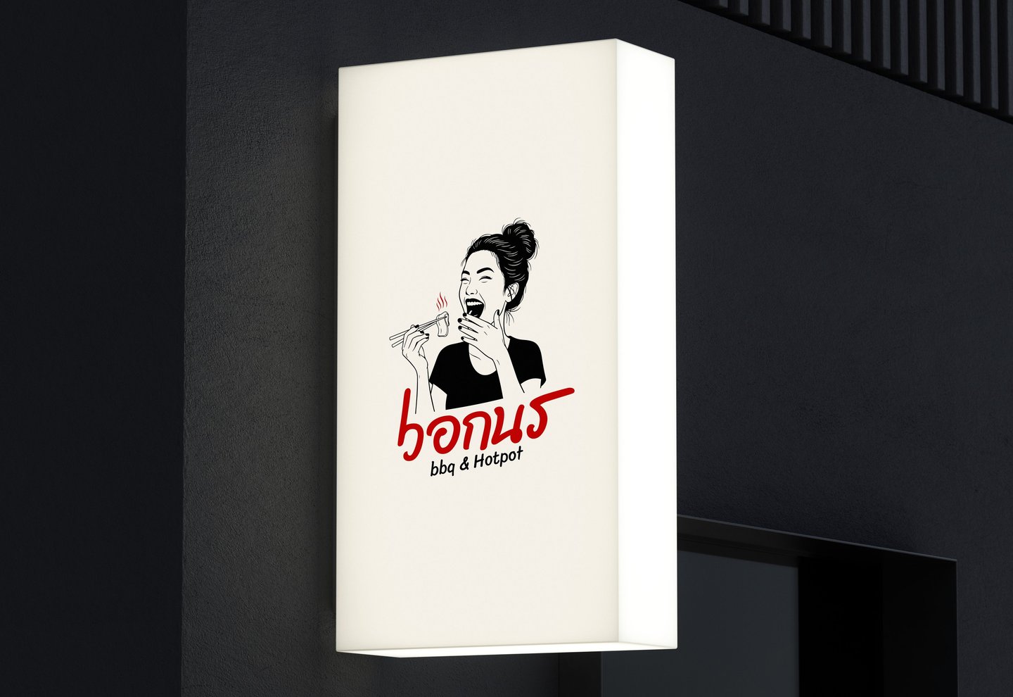
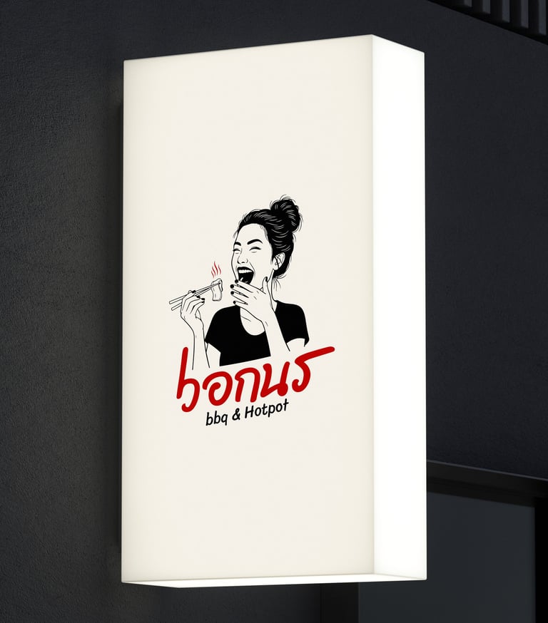
Joyful Heat captures the spirit of hotpot and BBQ buffet dining — shared heat, shared laughter, and shared satisfaction. The logo communicates a dining experience that is lively, flavorful, and memorable, positioning the brand as a warm, energetic gathering place where food and joy come together.

Pikstudio - A studio with heart!
Showcasing premium design for diverse industries.
service@pikstudio.website
+6660685217
© 2024. All rights reserved.